Augsburg was never a major typefounding center. However, the city was one of the earliest locations for printing in Western Europe. Augsburg was a Roman foundation – a military encampment was established about 15 years before the Common Era – named after Caesar Augustus. About a millennium and a half later, the city was the fourth-largest city in the Holy Roman Empire. Its location positioned Augsburg on trade routes to cities in northern Italy – especially Milan, Verona, and Venice. Today many Germans are probably most familiar with it as the last ICE stop before Munich. You can study type design at the Hochschule Augsburg with Maurice Göldner and typography with Michael Wörgötter.
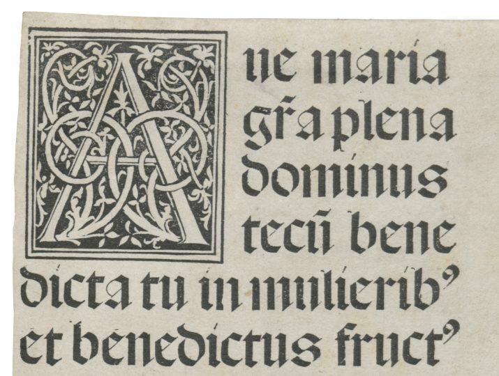
In this post, I’ve translated and annotated the chapter on Augsburg from Friedrich Bauer’s Chronik der Schriftgießereien (1928). It is the second entry in my “Friedrich Bauer project.” You can catch up on my first entry for J. D. Trennert & Sohn in Altona or read about the project on its landing page. The image above, with several lines of the Ave Maria, shows a woodcut initial and the largest type from Erhard Ratdolt’s 1486 specimen sheet, the oldest known type specimen. However, the hero of this post is Friedrich Schoch, a 19th-century punchcutter and typefounder.
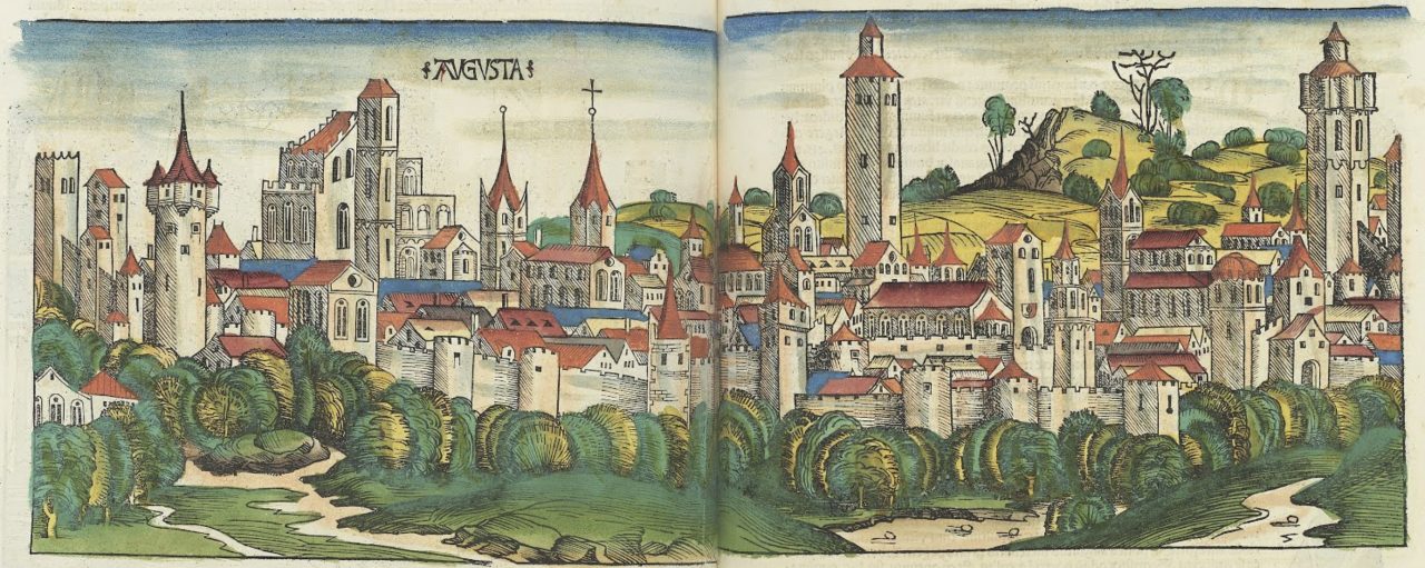
Cropped photograph of the spread showing a hand-colored woodcut illustration of Augsburg, from the Liber Chronicarum, or Nuremberg Chronicle. Printed and published by Anton Koberger in 193. National Gallery of Art, Washington DC and Google Arts & Culture.
Augsburg
Early history
1468
Augsburg holds a prominent place in the oldest period of typefounding history.[1] One knows that its first printers had already been active in the book trades before taking up the printer’s art.[2] As “scribes,” they were certainly also the artistic creators of their unique and beautiful typefaces, for which they learned the appropriate skills to cut and cast them.[3] Günther Zainer,[4] the first Augsburg printer, published his first printed work on 12 March 1468.[5] He died on 13 April 1478.[6] He was a scribe.[7]
1470
Johann Schüssler, the second Augsburg printer, was a city burgher and scribe from 1453 to 1484. His printing activity began in 1470, his last dated print is from 1473,[8] but he will have printed even longer. He sold his five printing presses and their accessories to the Abbey of St. Ulrich and St. Afra for 73 guilders.
1472
Johann Bämler was already a city burgher and scribe in 1453.[9] In 1477 he was called a printer, but already on 22 April 1472,[10] he finished his first printed work, and he still placed an imprint on a book as late as 13 April 1495.[11] The last mention of his is from 1508. The earliest hints of a Schwabacher – a category of typeface that would have great significance in German printing – appear in his works.[12]
1475
Anton Sorg, who printed in Augsburg from 1475 to 1493, was an illuminator and a colorer of religious woodcuts before becoming a printer.[13]
1481
Hans Schönsperger the Elder printed many beautiful works between 1481 and 1523.[14] Most of these were German-language texts, and he decorated his books with woodcuts. Thanks to his skill, he was called to Nuremberg to print the Theuerdank, a book created at the instigation of Emperor Maximilian I, whose first edition was completed in 1517.[15] In terms of its type and illustrations, the Theuerdank was one of the most important printed works of the time. Its second edition was printed in Augsburg by Johann Schönsperger the Younger, who continued his father’s printing business.[16] The Theuerdank typeface was popular with printers for almost two centuries.[17]

Digital collage that I prepared from the single-line showing of a “Teuerdanck Fractur” on a type specimen broadsheet that Konstantin Hartwig published in 1690. The Frankfurt University Library has digitized its copy of that specimen. Hartwig was a typefounder in Nuremberg. He acquired Konrad Baumann’s foundry by marrying Baumann’s widow Kunigunde; Konrad and Kunigunde Hartwig’s son Johann Georg Baumann also had the typeface. He displayed it on his 1690 specimen, kept at the Gutenberg Museum in Mainz.

Hartwig’s “Teuerdanck Fractur,” which appears before the image directly above, is probably not the typeface used in the Theuerdank in 1517. In his article from the Gutenberg-Jahrbuch 1931, “Die deutsche Schriftgießersprache,” Friedrich Bauer wrote that “the typeface from the Teuerdank from 1514 was common as a beloved titling typeface in many re-cuttings until the end of the 17th century […] In 1708, Jeremias Stenglin [actually Hermann Berg, see below] in Augsburg had it as Gebrochene Fraktur and in 1710 Andreas Köhler in Nuremberg had the Teuerdank typeface in two sizes in his type specimen as ‘Gebrochene Text Fractur’ and ‘Gebrochene Parangon Fraktur.’” [p. 287] Köhler’s specimen is viewable here. Bauer’s recollection may not have been entirely correct; in the 1708 Stenglin/Berg specimen, the “Gebrochene Fraktur” is only shown in one size, named Gebrochene Text Fractur, as you can see above. In any event: this typeface is not the same as the one shown above it. There are some similar letters, like the capital E, but otherwise the forms are so different that the differences cannot be explained by any potential over inking on Hartwig’s part. Are these two interpretations of the Theuerdank’s typeface or is one the same as the 1517 book?
1486
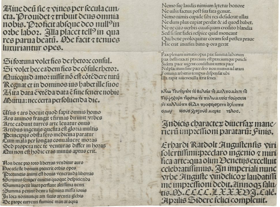
Another Augsburg printer was outstandingly active in the development of printing: Erhard Ratdolt (born in 1447). Ratdolt came from a family of artists, and he first practiced the art of printing in Venice from 1476 to 1486.[18] Then he appeared again in Augsburg. His last print is dated 1516. He died around 1528. Ratdolt created the first known typeface specimen. The folio sheet was printed (while he was still in Venice) on 1 April 1486 with a beautiful initial and sample lines of text in various typefaces.[19] He probably intended for it to serve as a reference for the printing house he opened in Augsburg. However, it can also be understood as a typefoundry specimen in the modern sense, as Ratdolt also has cast typefaces cast for other printers.[20]
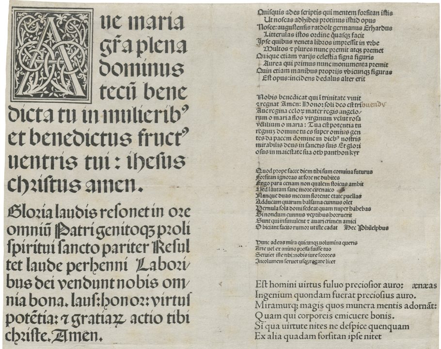
Top half of Erhard Ratdolt’s 1486 type specimen. Bayerische Staatsbibliothek München, Einbl. VIII,6§2, urn:nbn:de:bvb:12-bsb00095388-4. Click to enlarge.
Rainmann
1495
Even in the last years of the 15th century,[21] Augsburg already had an independent typefoundry. Johann Rainmann (Rynmann), originally a goldsmith, was widely known as a typefounder. It is even reported that, in Venice, Aldus Manutius (1494–1515) obtained typefaces from him.[22] Although perhaps Rainmann only recut the Aldine types so that he could sell castings of them.[23] In 1497, he began an extensive career as a publisher.[24] During the first quarter of the 16th century, he was the most important publisher of books in Germany.
Steiner (Silicus)
1522, 1548
The book printer Heinrich Steiner, who had lived in Augsburg since 1522, also worked as a typefounder. “Due to his natural (i.e., illegitimate) birth, he was not admitted to membership in any guild.”[25] He was immensely entrepreneurial but fell into difficulties. After he died in 1548, his creditors disposed of the estate. Not only did Christian Egenolff of Frankfurt am Main acquire the woodcuts from the artists who worked for Steiner (Burgkmair and Schäuffelin), but also the foundry’s punches and matrices.
Stenglin – Berg – Göde
1693
In 1693, Jeremias Stenglin had a typefoundry in Augsburg, from which a price list survives. It lists six typefaces in 78 sizes and shows that the names of the type sizes still in use today were already common practice at that time.[26] From the price list, it should be mentioned, for example, that 100 pounds of Garmond-sized Fraktur and roman cost 37 guilders. The Cicero size cost 33 guilders.
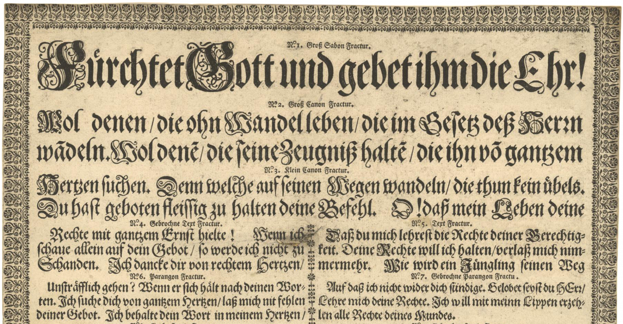
Top half of the 1708 Fraktur specimen from Jeremias Stenglin’s typefoundry. Since Stenglin had died in 1696, this was produced by Hermann Berg. Digitized by the Universitätsbibliothek J.C. Senckenberg Frankfurt am Main [2016]: urn:nbn:de:hebis:30:2-250836. At least two sizes of the Fraktur types on this specimen remained in use until the 20th century. According to Walter Wilkes, those made their way to Karl Tauchnitz (1761–1834) in his Leipzig foundry, which was active between 1800 and 1865. The W. Drugulin foundry, also in Leipzig, acquired them with its purchase of the Tauchnitz foundry in 1868. Thereafter it sold them as part of the Drugulin-Fraktur. When D. Stempel AG purchased W. Drugulin’s foundry after the First World War, it sold those products as the Tauchnitz-Fraktur. That, I believe, was later re-released as Luthersche Fraktur. See »Die Buchdruckschriften des 19. Jahrhunderts und ihre historischen Vorbilder« in Die Buchkultur im 19. Jahrhundert, Bd. 2/2 (Hamburg: Maximilian-Gesellschaft, 2019), pp. 399–576, here p. 441.
1696
The other known type specimens from the Stenglin foundry are a 1699 folio sheet with borders[27] and a 1708 blackletter specimen in the same format.[28] The latter has the following footer: “Specimen and print of the noblest and most beautiful typefaces / which were brought together with great effort and diligence for the special benefit of all authors / printers / booksellers and publishers / from which everyone can see / that which would be useful to him in his printing shop / and with what types he may have his work produced. However, some of the above types / many of them also have the same name / and yet are not the same (therefore I have decided that it would be good to put a number next to a typeface, so that the information is better for the lover / so that no mistakes will occur when ordering the same. Manufactured by Jeremias Stenglin / typefounder in Augsburg / in the year of Christ 1708.”
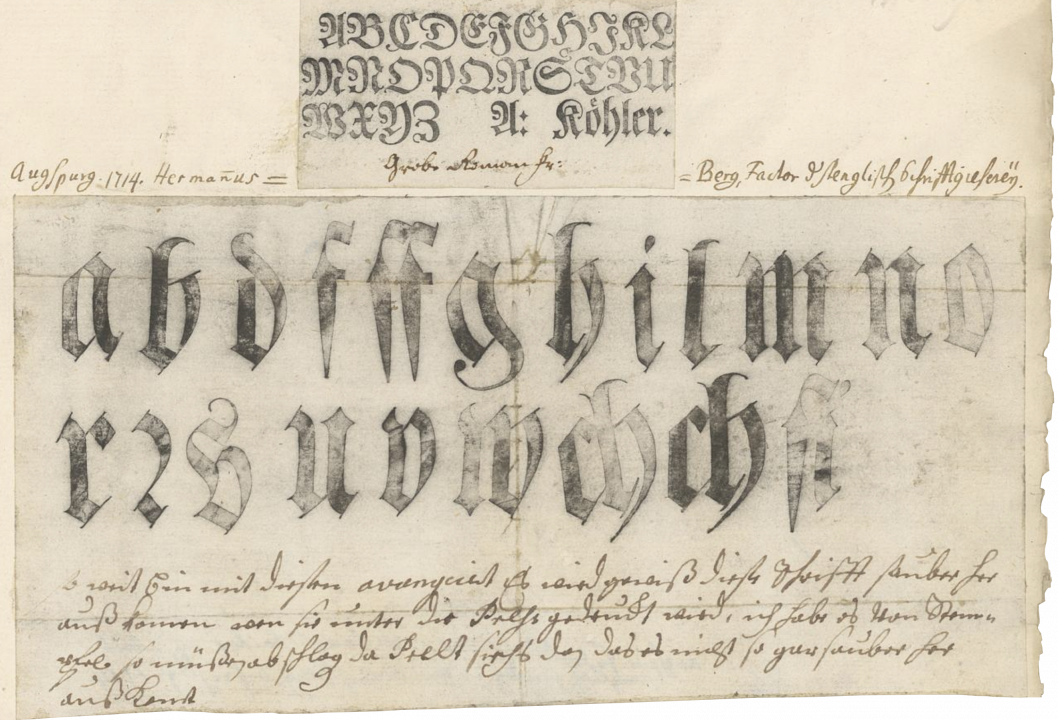
Collage of what appears to be smoke proofs from two sizes of Fraktur type from the Jeremias Stenglin foundry in Augsburg, run by Hermann Berg. The smaller type at the top seems to be majuscules from the Nuremberg typefounder Andreas Köhler. According to its caption, it is for the Grobe Roman size. Perhaps it is a series of more “subdued” majuscules than the ones shown in Köhler’s 1717 specimen. Digitized by the Universitätsbibliothek J.C. Senckenberg Frankfurt am Main [2016]: urn:nbn:de:hebis:30:2-422993.
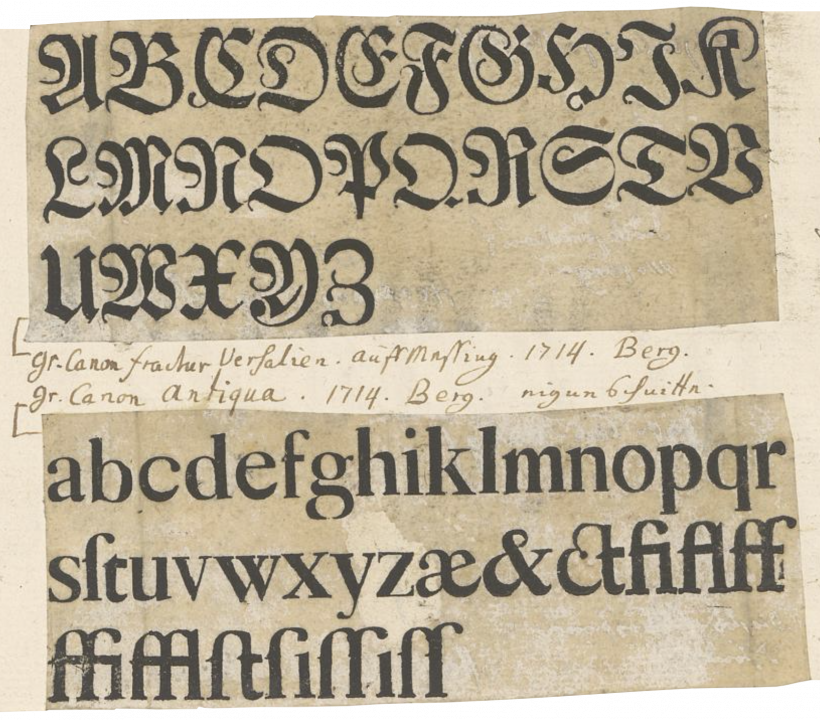
Two more types samples from the same collaged sheet excerpted above. Here, we see two other fragments from the Jeremias Stenglin foundry in Augsburg, run by Hermann Berg. The upper sample shows Grobe Canon size Fraktur caps. These were cut from brass in 1714 but I don’t know if Berg did that himself or acquired them from another founder. The The Grobe Canon roman lowercase, according to the caption, was cut in Berg’s foundry. Digitized by the Universitätsbibliothek J.C. Senckenberg Frankfurt am Main [2016]: urn:nbn:de:hebis:30:2-422993.
1730
Stenglin died in 1696, and the foundry was run under his name by the foreman Hermann Berg, who later became the owner.[29]
1742
After Berg’s death on 21 May 1730, his widow married the Braunschweig-born typefounder Johann David Rudolf Göde. In 1742, Göde published a Fraktur and roman specimen in poster format. Nothing further is known about the foundry.[30]
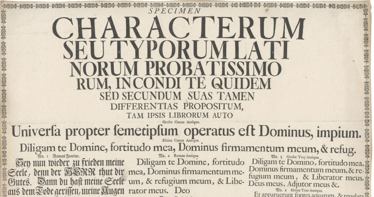
Top half of the 1742 Göde specimen that Bauer mentioned above. Digitized by the Universitätsbibliothek J.C. Senckenberg Frankfurt am Main [2016]: urn:nbn:de:hebis:30:2-421900.
Zinck – Schämaneck
1764
Born in 1737 in Kemberg (Province of Saxony),[31] the type foundry and type cutter Christian Gottlob Zinck, a son of the Wittenberg typefounder,[32] set up a foundry at Augsburg in 1764. He died in 1778.[33]
1779
His successor was the typefounder Johann Nikolaus Schämaneck, who bought Zinck’s foundry in 1779 and his house in 1783, but about whom nothing else is known.[34]
Schoch
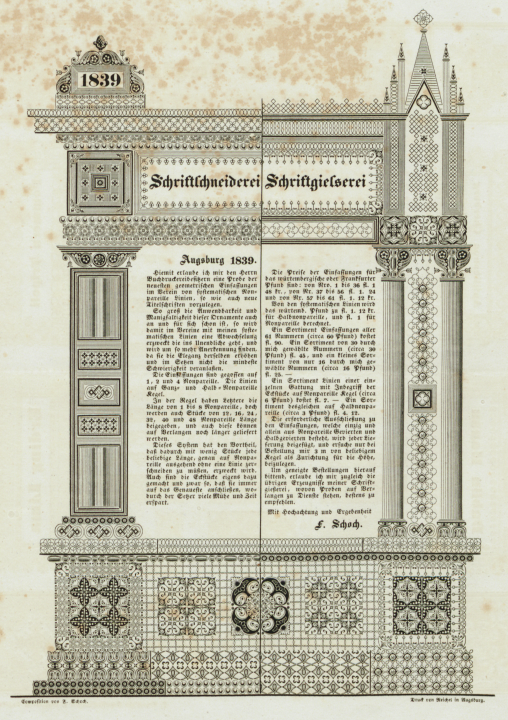
Ornamental “façade” from the front of a four-page brochure advertising products from the Friedrich Schoch typefoundry in Augsburg. Schoch composed the design from his ornaments himself. The specimen was printed at the Reichel printing house, also in Augsburg. Click to enlarge. Image: Allard Pierson, University of Amsterdam, KVB LPP 89.
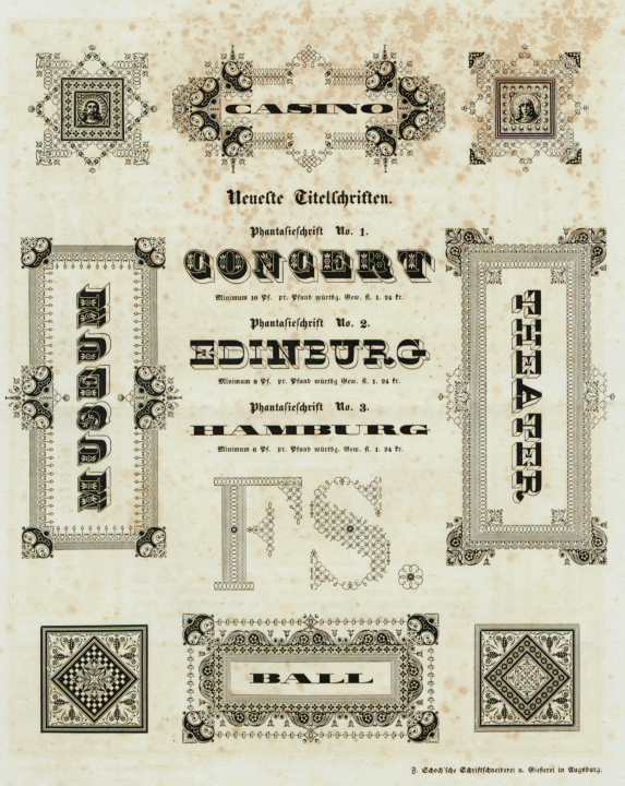
Lovely intricate “fantasy” types for titling use, from Friedrich Schoch’s Augsburg typefoundry. Printed by the Reichel printing house in 1839. The typefaces shown here may have been cut by Schoch himself. All of them are in the prevailing styles for titling faces found in Europe and the United States during the 1830s. Click to enlarge. Image: Allard Pierson, University of Amsterdam, KVB LPP 89.
1838, 1840
The Friedrich Schoch punchcuttery and typefoundry existed at Augsburg in 1838.[35] Specimens of typefaces and borders are first known from 1839.[36] A specimen of the “new characters, invented, cut, cast and printed by Fr. Schoch in Augsburg” appeared in 1840. In the headlines, the typefaces are called “Schochisch,” they show very simplified textura types and are reminiscent of the Neudeutsch typefaces created since 1900.[37] In addition to the “upright” Schochisch there is also “slanted” variant.[38] These were later cast by J. D. Trennert in Altona[39] and F. A. Brockhaus in Leipzig[40] – blackletter specimens from 1843 note that strikes in the best-quality copper are available.
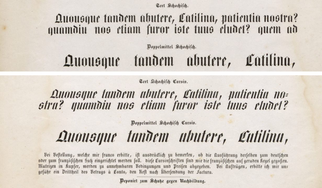
Above is a digital collage showing the largest sizes of the Schochisch and Schochisch Cursiv, which I made from a double-page specimen for the types. The Augsburg typefounder Friedrich Schoch designed and cut them between 1839 and 1842. Although their design was radical for the time, his specimen’s design is uninspired. Its texts simply repeat the beginning of Marcus Tullius Cicero’s first Catilinarian oration, from 63 B.C. By 1842, typefounders’ use of this text was already an old hat. From a design perspective, I think it is safe to argue that it was laudable for Schoch to focus on such a novel product’s development. However, doing so may have bankrupted his business. RIP. Click to enlarge. Images: Allard Pierson, University of Amsterdam, KVB LPP 89.
1847
Friedrich Schoch, engraver in Augsburg, offered steel punches and justified matrices for typefaces, symbols and borders “at any price” in 1847.[41]
1860
In July 1860, Rosina Schoch in Augsburg offered punches and matrices from the Schoch typefoundry for sale.[42] Punches were offered for 6–24 kronen, matrices for 4–12 kronen each. Among the punches, “Schoch’s novel typefaces” are also offered. This is how the foundry must have come to an end.
Herre – Adam – Sirch
1838
The Herre typefoundry, which existed in Augsburg at the beginning of the 18th century, was owned by a typefounder with the last name of Adam in 1838.[43] In 1854, there was a J. Sirch typefoundry in Augsburg.[44]
Kirchmayer
1907
The Kirchmayer typefoundry existed in Augsburg until 1907.[45] Josef Thoma in Munich acquired some of the machines and typefaces from the bankrupt foundry in use alongside those in his foundry.[46]
Notes
- Friedrich Bauer’s Chronik der deutschen Schriftgießereien – an early work, printed 14 years before Chronik der Schriftgießereien in Deutschland und den deutschsprachigen Nachbarländer – did not include as many entries for Augsburg. His information in the latter book must have been heavily influenced by Gustav Mori’s Das Schriftgiesser-Gewerbe in Süddeutschland und den angrenzenden Ländern (Stuttgart: Bauer & Co. and Felix Krais, 1924), pp. 3–13.
- Bauer’s assertion that Augsburg’s early printers had worked in other areas of the book trades before learning the activities associated with printing – punchcutting, typefounding, page composition, printing, etc. – is based on faulty interpretations of historical evidence. Some of them had indeed worked in other book trades, but I do not think that as many were scribes as he claimed. However, the first generation of printers did include men who were scribes. Even Peter Schöffer the elder, who printed in Mainz, is said to have been a scribe in Paris beforehand.
- The types used by the individuals Bauer mentions were not all cut by them. Many printers cast their types from matrices acquired elsewhere.
- The Ulm printer Johann Zainer may have been Günter Zainer’s brother. Both learnt printing from Johannes Mentelin in Strasbourg. Since Chronik der Schriftgießerien does not include a section for Ulm, Bauer did not mention Johann Zainer in the book at all. For information on him, see Claire Bolton’s The fifteenth-century printing practices of Johann Zainer, Ulm, 1473–1478 (Oxford: Oxford Bibliographical Society and London: Printing Historical Society, 2016). However, from 1493, Johann Zainer was a typefounder in Augsburg; see Peter Amelung, Der Frühdruck im deutschen Südwesten (Stuttgart: Württembergische Landesbibliothek, 1979), p. 32.
- This is GW 04739, Pseudo-Bonaventura’s Meditationes vitae Christi. The Bayerische Staatsbibliothek’s copy has been digitized well. The typeface is Type 1:117G.
- On the Deutsche Biographie, K. Steiff gives the date of Zainer’s death as 1 October 1478. Mori’s book (see note 1) had the 13 April date.
- It seems to me that many sources from Bauer’s time state this, but that recent ones do not. In his 1924 article, “Günther Zainer, Augsburgs Erster Drucker,” Albert Schramm notes that Zainer was listed in Augsburg’s tax rolls as a scribe, and only as a printer from 1474. He suggests that before 1474, there simply had not been a separate term for printers.
- According to the Typenrepertorium der Wiegendrucke, Schlüssler only printed with Zainer’s type.
- We can say we with certainly that Bämler was a scribe; see Victor von Klemperer, »Johann Bämler, der Augsburger Drucker als Rubrikator« and »Der Augsburger Drucker Johann Bämler als Rubrikator« in Gutenberg-Jahbuch 1927 and 1928 (Mainz: Verlag der Gutenberg-Gesellschaft), pp. 50–52 [1927] and 105–106 [1928]
- Bauer probably meant GW M28283, digitized e.g., by the Staatsbibliothek zu Berlin.
- This is GW 08445, digitized by the Bayerische Staatsbibliothek.
- In an e-mail Riccardo Olocco sent me on 23 August 2023, he questioned Bauer’s suggestion that Bämler was responsible for the Schwabacher style. “It seems that the first printer to use bastarda type after the 1454 indulgence,” Olocco notes, “was Arnold ter Hoernen in Cologne around 1470. According to the TW, Bämler was the second. He started using bastardas in 1472 and was indeed one of the very first printers to employ this style of type regularly for a long time. The vast majority of his work was printed in bastarda.” In 20th-century German classification systems for blackletter typefaces, a bastarda style called Schwabacher is always one of the main categories. Other bastardas are rarely mentioned, as they played little role in German typography after the sixteenth century. Internationally speaking, bastarda should probably be a category designation, within which Schwabacher is simply an instance. And Fraktur could arguably be seen as another instance – instead of its own category, as is common in German schemes.
- Olocco also reminded me that Anton Sorg “used several styles of type along his career.” He added that he was “not sure the first type, 103G, is rotunda. I would rather name it gotico-antiqua, due to the lack of gothic treatment on most of the letters and notably to the shape of g (8).”
- These included counterfeit editions of the Nuremberg Chronicle! Hans Schönsperger the Elder died in 1521.
- The Bayerische Staatsbibliothek has digitized Theuerdank’s fist edition, from 1517.
- The second Theuerdank edition was printed at Augsburg in 1519 but the colophon bears the name of Johann Schönsperger’s father. Here is a link to the complete volume.
- The type used in the Theuerdank was designed by Vinzenz Rockner, an imperial secretary. Mori writes that Schönsperger cut it; see Mori p. 4 (note 1 above).
- In his later years, Ratdolt prepared an autobiographical manuscript. Ignaz Schwarz published the text in 1924, and his article can be read online. Thanks go to John D. Boardley, who brought that to my attention many years ago.
- The Bayerische Staatsbibliothek in Munich has the only surviving copy of Ratdolt’s specimen sheet in its collection. They have also digitized it.
- For extensive details about the fourteen types and the woodcut initial used on Ratdolt’s specimen, see Riccardo Oloco, Ratdolt’s Index characterum the earliest known type specimen. Poem Pamphlet 3 (Frankfurt am Main: Poem, 2020).
- Olocco pointed out that Bauer’s early history summary left out several printers, including Johann Forschauer, Johann Wiener, Ludwig Hohenwang, etc. The Typenrepertorium der Wiegendrucke has a list of printers active in Augsburg during the 15th century, with 27 names.
- I think this is entirely bogus. On the Deutsche Biographie, K. Steiff’s entry for Rynmann mentions that the colophon for Theodoricus Rysicheus’s Oration in praise of St. Hugh [Theodorici Rysichei Germani in laudem sancti Hyvonis oratio (Augsburg: Johannes Otmar, 1502)] includes the following statement: “Impressit ex Johannes Rymannus Augustensis: Characterum Venetorum opifex et ingeniosus et exercitatus in Augusta vindelicprum.” The “Venetian” types are a rotunda. No Aldine roman or italic types may be found in the book.
- Likewise, this does not seem to be the case.
- Here, Bauer’s text seems much more accurate. Rynmann may have been the first publisher to sell books he did not print himself.
- Bauer presented this sentence as a quote. However, he did not provide a source.
- For the name and price of each typeface, see Mori p. 9 (see note 1 above).
- This specimen has been digitized by the Frankfurt University Library.
- The same library has also digitized this specimen. Mori p. 10 (see note 1 above) states that seven of its types came from the Luther foundry in Frankfurt. Those were the Gebrochen Text Fractur, Text Fractur, Tertia Schwabacher, Gebrochne Mittel Fractur, ein ander Garmond Schwabacher, Petit Schwabacher, and other other type. Five more items came from Konstantin Hartwig in Nuremberg: the Gabor Fractur, “the initials from” the Text Fractur, the Grob Tertia Fractur, and the Gebrochne Cicero Fractur.
- The Gustav Mori Collection at the Frankfurt University Library has a sheet with four specimen fragments from the Stenglin foundry at Berg’s time. That has also been digitized.
- The Frankfurt University Library digitized this specimen, too. According to Mori p. 10 (see note 1 above), this also includes typefaces from the Luther foundry in Frankfurt.
- Today, Kemberg is in Saxony-Anhalt. When Gustav Mori and Friedrich Bauer were compiling their historical works, it was part of the Prussian Province of Saxony, which had been formed after the Napoleonic Wars.
- Christian Gottlob Zinck’s father was one of my favorite 18th century punchcutters. While his work did not have the quality of e.g., Caslon, Bodoni, Fleischman, Fournier le jeune, or Rosart, etc., his output was prolific. Although he had a foundry of his own, his types were sold by many others, including Breitkopf’s family in Leipzig. As Zinck the elder worked in Wittenberg, it will take some time before I arrive at him in this project.
- Nikolaus Weichselbaumer’s Deutsche Schriftproben der Handpressenzeit – eine vorläufige Liste lists additional Augsburg foundries not mentioned in Bauer’s account. These include Johann Baptist Rößl’s, from which two specimens have been digitized (1789, 1793), Julius Wilhelm Hamm, and Johann Friedrich Blank.
- Mori p. 11 (see note 1 above) states that Schämaneck was from Jena, but Herbert Koch did not mention him in Die Jenaer Schriftgiesser seit dem Jahre 1557 (Mainz: Verlag der Gutenberg-Gesellschaft, 1956).
- In the August 1839 issue of Journal für Buchdruckerkunst, Friedrich Schoch ran the following notice: “The undersigned hereby announces that to expand his foundry, he is offering to exchange the matrices of his that he has the punches for, for other matrices in the typographic field. For this purpose, he requests that postage-free specimens be sent to him.”
- Some of these specimens been digitized, including one sheet with four Fraktur sizes, another with four more Fraktur sizes, and a third with four roman sizes and their respective italics. They each accompanied issues of Journal für Buchdruckerkunst in 1839. A small specimen of Schoch types ran in the June 1840 issue of the Journal, but that only displayed two shaded Fraktur and roman titling fonts.
- Bauer is referring to the Neudeutsch typeface designed by Otto Hupp for Genzsch & Heyse as well as the Neudeutsch designed and cut by Georg Schiller at the Reichsdruckerei. The latter typeface was distributed by J. John Söhne in Hamburg and C. F. Ruhl in Leipzig.
- Petra Rüth started a digitization of the Schochische Kursiv, which you can see on her website.
- In his 1925 book, Ursprung und Geschichte der Schriftgießerei J. D. Trennert & Sohn in Altona 1634–1925, Friedrich Bauer wrote that “Trennert had both [the upright and slanted Schoch types] in all available sizes. […] It shows Trennert’s progressive spirit that he championed this typeface and had all the accents for the Nordic languages cut for it, even Icelandic.” [pp. 30–31]
- A specimen sheet from F. A. Brockhaus in Leipzig including the Schochische Cursiv accompanied the January 1843 issue of Journal für Buchdruckerkunst. Schoch’s type designing didn’t end with the Schochisch and Schochische Cursiv types. Mori pp. 12–13 (see note 1 above) relates that Schoch created a similar all-caps face in 1845 – actually before October 1844 – as well as a Neu-Fraktur without descenders, a Neu-Schochisch, Demi-Schochisch, Prim-Schochisch, Sekund-Schochisch, and some sort of cryptographic system with its own typeface.
- This statement does not sound quite right. Schoch ran three notices in the Journal during 1847. In the first, he lists specific prices for ten sizes of Walbaum Fraktur matrices, eight of roman and italic matrices, as well as ornamental types, border elements, calendar symbols, etc. The second and third are identical. There, Schoch mentions that his matrices were available at low prices and that he would provide exact costs and specimens by mail. In 1848, Schoch seems to have disappeared and was sought after by the courts.
- Her price list took up a whole right-hand column in the 21 Juli 1860 issue of Journal für Buchdruckerkunst. Friedrich Schoch himself may have already died in 1854.
- If Bauer’s book had footnotes, one like this might have appeared: See “Adressen der Schriftgießereien in den Ländern deutscher Zunge” in Johann Heinrich Meyer (ed.), Journal für Buchdruckerkunst, Schriftgießerei und die verwandten Fächer, vol. 5, no. 4 (April 1838). Braunschweig: Meyer, 1838.
- Joseph Sirch was also a punchcutter. He died on 5 May 1860 and was buried four days later. Theresia Sirch, his widow, then put his foundry up for sale. She was not Joseph Sirch’s first wife. After he became a widower, they married on 2 Juli 1855.
- Bauer misspelled this foundry’s name. It should be: Kirchmeyer.
- Since Josef Thoma died in 1890, Bauer must mean the “Josef Thoma” typefoundry run by his widow Berta Thoma and their son Emil Thoma.
