Although Germany had dozens of typefoundries in the early 20th century, none were based in the Lower Rhine region. Once the Düsseldorf branch of Bauer & Co. was closed in 1899, area printers would have had to order their types from more distant parts of the country: from Berlin, Hamburg, Leipzig, the Rhine-Main area, or Stuttgart, for instance. Still, the Lower Rhine was not entirely left out of the type-making story at that time. For decades, a large brass-type foundry operated in Krefeld. Conventional metal-type is too soft to emboss onto book covers. That is where manufacturers like Otto Kaestner came into play. One of his company’s specimens inspired a new lettering zine.
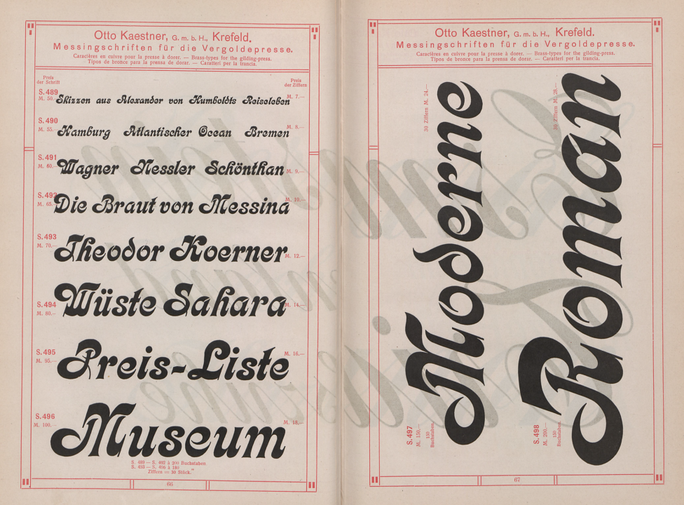
Pages from a circa 1910 Otto Kaestner GmbH catalog showing brass-type versions of Kalligraphia, a typeface created at Gustav Reinhold’s typefoundry in Berlin. By the time the Otto Kaestner GmbH printed this catalog, Kalligraphia was an H. Berthold AG typeface, as Hermann Berthold’s company had long since absorbed Reinhold’s. Kaestner’s specimen does not attribute the design to anyone – neither Reinhold nor to whichever draftsman or punchcutter might have had originally drawn it. Photo: Staatsbibliothek zu Berlin, Preußischer Kulturbesitz.
We have a lettering zine about Otto Kaestner that you can order
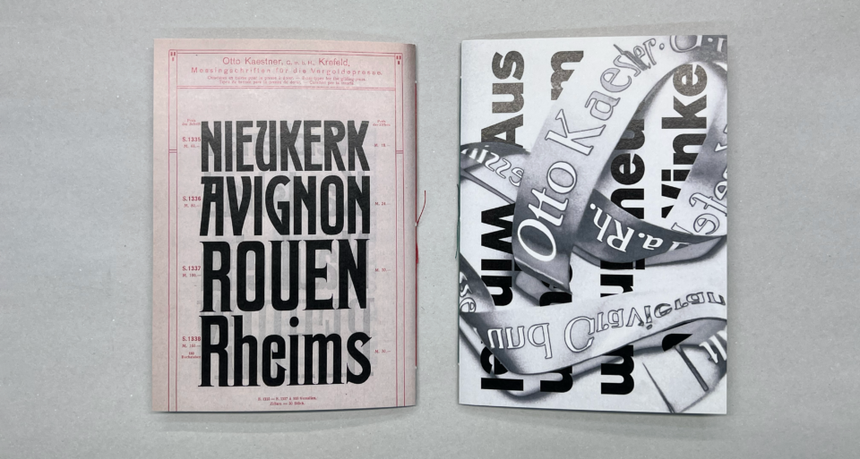
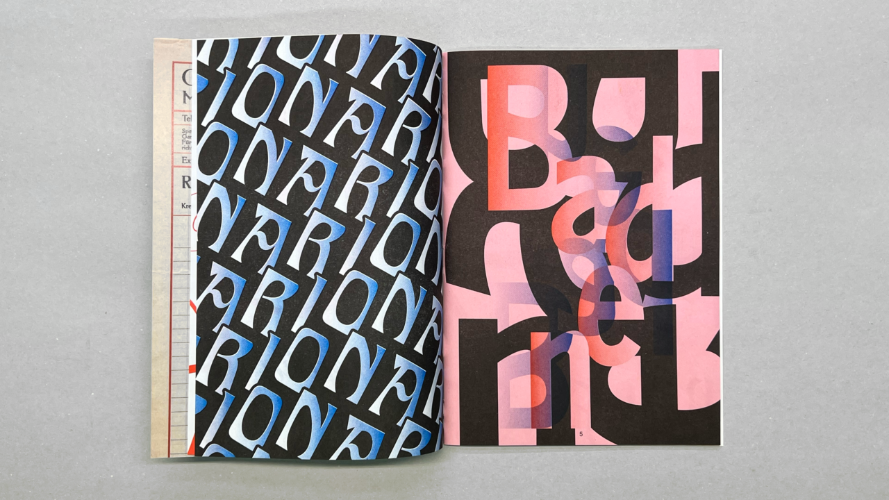
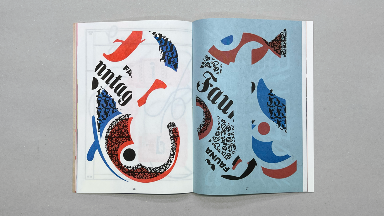
Before leaving Berlin for Krefeld in 2020, I had a catalog from the Staatsbibliothek zu Berlin digitized. This was printed for the Otto Kaester GmbH around 1910. During the 2021/22 winter semester, students in one of my courses drew vectorized copies of lettering from the pages of this catalog. Each student then interpreted one of those words in their own way in a layout. We then prepared a 48-page lettering zine on our department’s color laser and RISO printers. I hope the exercise will lead to further projects investigating the Otto Kaestner brass typefoundry and the Lower Rhine’s letter-making past. If you want to learn more about Otto Kaestner’s engraving firm and Germany’s brass-type makers, I’ve begun a new research project on the topic, and you can read my introductory post about it.
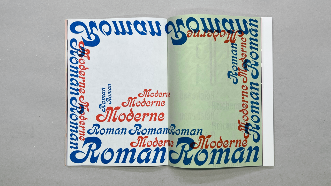
Currently, we have blue, red, yellow, and black ink for our RISO printer. All four colors were used in the lettering zine. Pages are also printed on a few different kinds of paper, including a pink, blue, and green sheet. The zine is 17 × 21 cm when closed. It has a hand-stitched binding. (Thank you, Steffi!)
Eleven students contributed lettering pieces to the zine, which we’ve named Aus einer anderen Blickwinkel [from another perspective]. We produced the zine in an edition of 100 copies, of which about 40 copies are for sale through the designkrefeld edition shop. Copies cost €18, plus shipping. The shop is in German only. If you’d like to order from abroad, I’d be glad to help you with the process! Send me an e-mail or DM me on Twitter or Instagram.
More pictures of the lettering zine
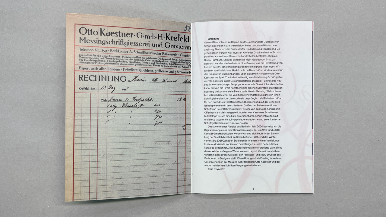
I reproduced part of a 1910 invoice from the Otto Kaestner GmbH on the inside front cover of the lettering zine. To read more about that piece of Kaestner ephemera or the Gebr. Klingspor, Berthold, and Central Type Foundry typefaces it uses head over to Fonts in Use.
As far as we know, this is the first publication of any kind to touch on Otto Kaestner’s company since 1986. While a Kaestner specimen only served as a superficial starting point for the lettering appearing in this zine, I think that calling attention to that starting point is still important.
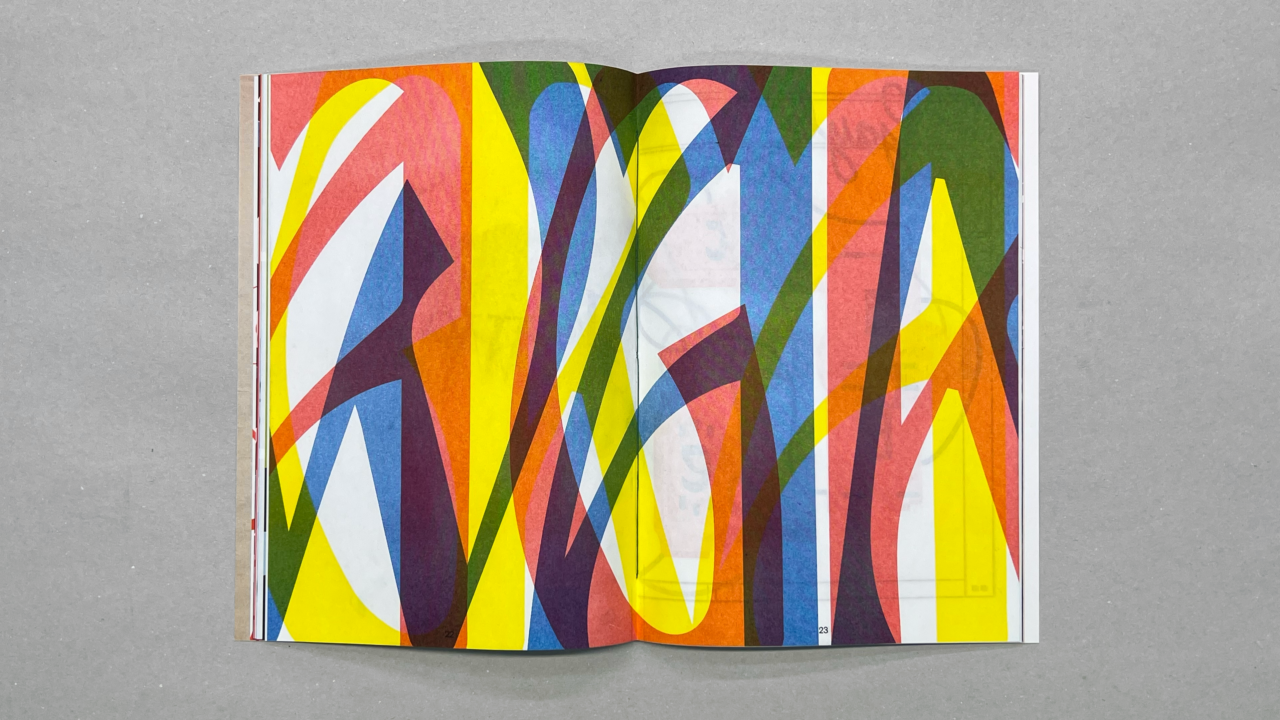
On the page, RISO ink retains a certain amount of transparency. That allowed us to mix additional colors in the prints by only overlapping elements overtop one another.
Summary
Aus einem anderen Blinkwinkel: A mostly RISO-printed zine. Original lettering inspired by brass type specimens in a circa 1910 catalog from the Otto Kaestner GmbH in Krefeld.
48 pages, 17 × 21 cm. German language (but the zine includes hardly any text).
Available exclusively from the designkrefeld edition shop for €18, plus shipping.