On January 10th, 2019, I successfully defended my doctoral dissertation at the Hochschule für Bildende Künste in Braunschweig. Since it will be about another year until I publish my dissertation – in one still-undecided form or another – I have decided to post an English translation of my defence presentation here. That was about 25-minutes-long, so this isn’t a short blog post. It may take a bit of time to read through. Nevertheless, it has much more information about my dissertation than an abstract would, for any of you who are interested.
My dissertation’s title is Schriftkünstler: A historiographic examination of the relationship between handcraft and art regarding the design and making of printers’ type in Germany between 1871 and 1914. The presentation at the root of this post was prepared for an audience who had already read my dissertation, so it has a few statements that might seem too much like broad sweeps, but which I substantiated in that document. To give readers of this post with some background in those areas, I have added several footnotes to the text below. I also prepared a handout with some extra text and imagery that didn’t fit into my presentation. I’ve published its contents here in a separate post.
Prologue
Movable metal-type has been cast in Germany since Gutenberg’s time. Since at least the late sixteenth century, there have been typefoundries here operating independently of printing offices. In the nineteenth and twentieth centuries, those firms belonged to several cities’ large-scale operations.[1]
After the Second World War, printing gradually uncoupled itself from letterpress tech. Today, there is only one German typefoundry in operation.[2] Housed inside a museum,[3] it fulfils orders for printers from all over the world. New typefaces are no longer developed as fonts of metal type, but as small files. Installed on our computers, these fonts store the letterforms that we use to read and write all the texts on our screens.
By the time I came to work at the HBK Braunschweig in 2011, I had already been involved in graphic design for several years. As a student, I had spent a few semesters at the HfG Offenbach, which is where I first came into contact with the historical collections in the neighbouring Klingspor Museum. Afterwards, I worked for seven years at Linotype, which was a company with a rich tradition dating back into the nineteenth century. For a time, I even had a key to the company archive in the basement.
My dissertation is a history of the people who – from my perspective – were responsible for establishing type design as a professional activity in Germany. There were both artists and craftsmen among them. In this post, I will explain the differences between those groups, within the context of type-making in Imperial Germany.
Eckmann as a lens for my examination
To date, the Eckmann typeface has been a common thread binding much of my previous experience together. It was developed in Offenbach, and Otto Eckmann’s original drawing for the typeface is part of the Klingspor Museum’s collections. Due to the number of authors who have positively discussed Eckmann since its publication, it may be considered the most well-received typeface produced in Germany during the period I investigate.
Since its release, Eckmann has been regarded as a clear artistic and economic success. It has been continuously sold for the past 119 years. Thanks to a series of acquisitions made over the last century, Eckmann was part of the portfolio of the approximately 1,000 typeface families that Linotype distributed when I started working there. The typeface is far from the only thing I wrote about, but for this post, it is a good example because of the clearly-defined artistic and craft personalities involved in its creation.
When I began my research, I assumed that the type designers active around the year 1900 were creatively brilliant. Over time, my assessment of their achievements has changed. In my dissertation, I try to draw attention to individuals involved in the production of typefaces during Germany’s industrial era who were rarely mentioned or acknowledged.
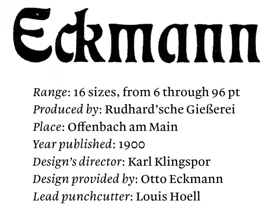
Going forward, I propose that everyone involved in the development of a typeface’s design should be credited.[4] In this case of Eckmann, this would mean that at least three people should always be credited: Karl Klingspor, Otto Eckmann, and Louis Hoell. In the pre-industrial period, which in German typefounding was up until about 1850, the responsibility for the appearance of new typefaces lay entirely in the hands of craftsmen.[5] After industrialisation, design tasks would be split between craftsmen and artists. This division may be difficult for practicing type designers today to grasp fully since common digital tools allow for everything to be undertaken by the same person again.
The bulk of what the term “typography” refers to is the conscious arrangement of text. Between any group of three typographers, one is likely to find at least six different definitions of what typography actually means. Nevertheless, several authors see it as encompassing both the design of letterforms themselves, as well as the arrangement of text. Perhaps this is analogues to how “building” – in its essence – can include both architecture and the manufacture of building materials.
In my dissertation, I do not concern myself with typography in its entirety, but rather with the production of letters. Moreover, I do not even examine the entire foundry type-making process. Instead, I only focus on its beginning steps: the design activity. I believe that the boundaries I have drawn around my specific area of research are justified, because technical-historical explanations of matrix fabrication and typecasting have already been written, but a history of type design in Germany has not.[6]
My narrow focus means that I do not write anything about how the typefaces produced during the period I investigate were used. It was intended that most of those typefaces would be used by people other than those who designed them.[7] Additionally, there are examples of typefaces, especially from the time between 1900 and 1914, which seemingly were only ever seldom purchased – if even ever at all. Both the creative decisions that a typographer or compositor would make about the use of these typefaces, as well as the dynamics of success in the marketplace, are themes that I view as being too dissimilar to the design processes that I write about.
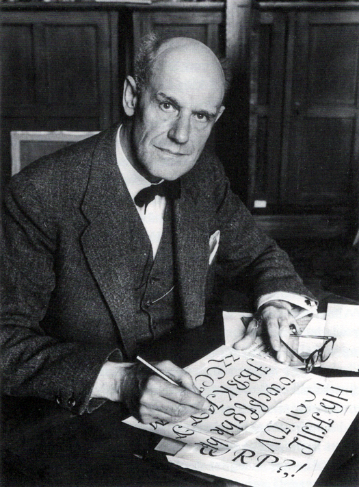
Portrait of Walter Tiemann (1876–1951). I don’t know the name of the photographer, or the date it was taken, but the portrait is definitely from after 1914, and may even be from the 1930s. I include it here because Tiemann began designing typefaces in the early 1900s, and because I am not aware of any photograph from the period before 1914 that shows a typeface designer together with a drawing of a typeface. In other words: this is a stand-in. It will have to do. Reproduced from Hans Adolf Halbey’s Karl Klingspor: Leben und Werk. Verein der Freunde des Klingspor-Museums, Offenbach am Main 1991, p. 51.
Let’s take a look at a new working group created in the industrial age: the Schriftkünstler, a German-language term for the type designers active during this period.[8] Who belongs to the group of Schriftkünstler and who does not? Walter Tiemann – a classically trained painter who later worked as a book designer and academy professor, and who also prepared several designs for typefaces that were published by the Klingspor foundry – is a clear-cut example of a Schriftkünstler. In my dissertation, I presented a classification system of the type designers active during the late nineteenth and early twentieth centuries, but this may not have been clear enough. A Schriftkünstler was someone who prepared a design as a drawing on paper. He or she did not produce the industrially manufactured master forms for the casting of the movable metal type himself or herself.[9]
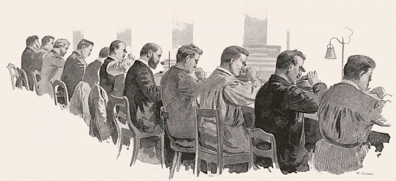
Illustration by E. Limmer showing eleven punchcutters at work in Schelter & Giesecke’s engraving department. Reproduced from Fünfundsiebzig Jahre des Hauses J.G. Schelter & Giesecke in Leipzig. Schelter & Giesecke, Leipzig 1894, p. 24.
No craftsman could become a Schriftkünstler,[10] and no “artist” could become one of the craftsmen employed within the punch and matrix-making processes.[11] The term Schriftkünstler includes the word »Künstler« in its name, which means artist, and there was not yet a term in German to describe a designer separate from the artist model, the way that the term “designer” already did so in English. Some Schriftkünstler would have liked to become craftsmen – or at least, they would have liked to be seen within the printing community as craftsmen instead of artists.[12] Artists were generally held in higher social regard than industrial craftsmen. Despite the desires some of those artists might have had, they had become part of the artistic strata within Imperial German society, and they remained artists. Even those who experimented with manual punchcutting themselves would not have acquired the knowledge that trained punchcutters and engravers had learned in their apprenticeships and later work experiences.
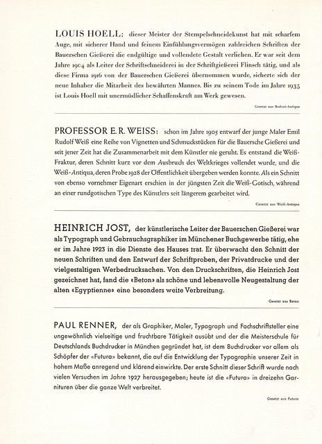
The reverse side of an undated Bauer’sche Gießerei advertisement sheet (about A4 in size). Printed after 1935; probably in 1937.
Before industrialisation, there were no Schriftkünstler*innen. Drawing can only be definitively identified as a specific step within the process of making typefaces beginning in the second half of the nineteenth century. In the pre-industrial era, it was still possible – and sometimes even common – for type-making craftsmen to become recognised, and treated a bit like brilliant artists (at least within the printing industry).[13] After industrialisation and even into the 1960s, German punchcutters were typically only celebrated within the printing industry after they died. Just like on the Bauer foundry advertising sheet shown above.
The punchcutter Louis Hoell ran the Bauer’s engraving department from 1916 until his death in 1935. You might remember Hoell from earlier in this article: around 1900, he cut Eckmann for the Rudhard foundry. On the sheet shown above, he is listed together with three of Bauer’s type designers – who themselves would have still been alive when the sheet was printed. Weiß and Renner, for example, worked as freelancers for Bauer. Jost was the company’s artistic director. Weiß, Jost and Renner are each described in typefaces that have always been attributed to them, while Hoell’s text is composed in Bauer’s Bodoni-Antiqua, a revival of Giambattista Bodoni’s typefaces. You might know this design by its later name, Bauer Bodoni. The “design” of Bauer’s Bodoni-Antiqua is not usually attributed to Hoell, although he is often acknowledged as having cut its punches. I recommend the following attribution scheme for the typeface:
- Name: Bodoni-Antiqua (later referred to as “Bauer Bodoni,” even in Germany)
- Range: 15 sizes, from 6 through 84 pt
- Produced by: Bauer’sche Gießerei
- Location: Frankfurt am Main
- Registration date with the Verein deutscher Schriftgießereien: 30 September 1924
- Based on: Types from Giambattista Bodoni (1740–1813)
- Foundry owner: Georg Hartmann
- Design possibly provided by: An uncredited employee at Bauer
- Lead punchcutter: Louis Hoell
- Other possible punchcutters: Employees in Bauer’s engraving department
What is not explicitly stated on that Bauer sheet is that Hoell would have actually been responsible for the production of the punches or matrices for all four of typefaces shown. According to John Lane, Hoell cut the pilot size of Weiß’s Weiß-Antiqua typeface, as soft-metal patrices.[14] The remaining sizes – whether cut by hand or engraved with a pantographic cutter – would presumably have been made by Hoell directly, or under his supervision.
On the bright side, at least Hoell was celebrated eventually. Other companies active within the broader type-making industry during the 1920s and 30s – such as D. Stempel AG or British Monotype – would have simply written the text on a sheet like this about Giambattista Bodoni, rather than about an interpretive designer or craftsman.[15]
After digitisation, industrial craft-work completely disappeared from type making. Now there are no more craftsmen to be celebrated or ignored.[16] The artist – or the designer, to switch to today’s terminology – performs all designing and making tasks herself. Or at least, she should be able to do everything herself.
Alltagsgeschichte
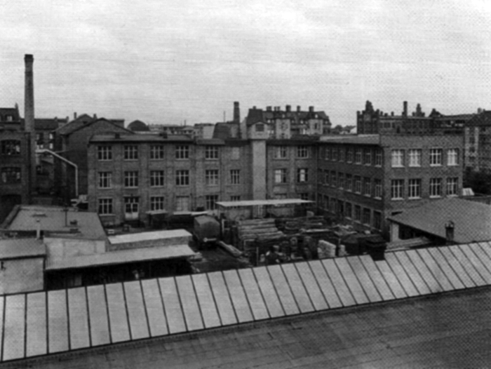
Photograph of the Klingspor foundry’s premises at Ludwigstraße 140/142, Offenbach am Main, in 1954. The foundry buildings had been rebuilt after the bombing damage inflicted to them during the Second World War. The Klingspor family acquired the Offenbach-based Rudhard typefoundry in 1892, and they moved it onto this located in 1897. The business remained there until the foundry closed in the mid-1950s. Reproduced from Halbey’s Karl Klingspor, p. 16.
The way that I went about my historical research is most similar to the methods used in Alltagsgeschichte, or the history of everyday life. This was a movement that briefly became popular in West Germany during the 1980s. It is one of the principles of Alltagsgeschichte to investigate one’s own profession: literally, one should excavate the ground where they stand.[17] I have allowed myself some liberties with the Alltagsgeschichte methods. In particular, my research is not focused on one particular place – I did not exclusively write about Berlin-based companies, for instance. I was not only interested in so-called “little people,” either. The Schriftkünstler and the typefoundry directors were not part of working-class society, and were not “little.”
As a labour group within the typefounding industry, punchcutters received comparatively low wages. During the period of time I investigated, they enjoyed virtually no professional recognition within the greater printing industry, let alone from society at large. Nevertheless, they are predecessors of the individuals working as type designers today, like the more renowned Schriftkünstler. I developed a lot of sympathy for punchcutters during my research.
I found myself willing to give the punchcutters a lot of room in my text. My sympathy for these professional colleagues also means that a more accurate description of the creative roles within typeface creation is important to me. I had to speculate a lot about their work situations because not many sources documented those specifically. My hypothesis is that the Schriftkünstler were actually responsible for much less of the finished typeface products than the foundries implied. Typefoundries to improve their image with their customer base by associating themselves with well-known artistic personalities. In retrospect, however, I find it unjust when the contributions of punchcutters are not sufficiently publicised. I hope to get something moving so that future researchers – as well as graphic and type designers – have a better understanding of their achievements.
What were the sources I used for my research? Printed type specimens were important. Produced by type foundries for advertising purposes, these are a kind of grey literature. Their lifespan was often short. Some of them are very rare today. The various printing trade journals are more common, and almost all monographs and exhibition catalogs on typographic themes from Germany’s imperial era have survived as well. Although available in comparatively fewer numbers, the drawings of the participating artists – as well as the correspondence between those artists and typefoundry owners – were also important sources for my research, too.
Sources
The biggest problem I encountered is that not enough of that latter kind of primary sources have survived (drawings and correspondence). For the typefoundries that closed before the Second World War, it seems to me that there was no push to find places like a city or state archive – or a museum or library – where business records could be stored for posterity. Fortunately, this situation is different for the West German companies that closed after 1945. Nevertheless, almost all of those companies were affected by Allied bombing during the Second World War. In the resulting fires, much of the files containing drawings and correspondence was lost. The same is true for the foundry’s matrices: paper burns, bronze melts.
How did I go about my research? First, I compiled a chronicle of the collaboration between German typefoundries and external artists during the 1870s, ’80s, and ’90s. For the time after 1900, such work was not necessary: lists were already available. While I was creating my chronicle, I looked for both designer attributions and punchcutter attributions, too. In the years between 1870 and 1900, information regarding which artists or craftsmen contributed to a typeface’s design was rarely printed by the foundries in their type specimens. If such attributions were published at all, then they were more likely to appear in printing trade journals, or later publications made by those typefoundries, in historical-overview sections.
The development of the Eckmann typeface is the best-documented case from this period, but even it has source varieties that are missing. For example, I would wish that sources had survived that would have documented steps between the time when Otto Eckmann completed the drawing for his typeface that is now part of the Klingspor Museum’s collections and when the finished types were first cast. These could be smoke proofs that Hoell might have made while he was cutting its punches, or perhaps additional drawings from Eckmann that clarified his design idea, which he might have made while sitting together with Hoell – something we know happened during the production of this typeface. Or these could include additional correspondence between Eckmannn and Karl Klingspor, or between Klingspor and Hoell.
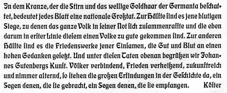
The Eckmann typeface, cast by the Rudhard typefoundry in 1900. The foundry renamed itself “Gebr. Klingspor” in 1906. Image reproduced from Julius Rodenberg’s In der Schmiede der Schrift: Karl Klingspor und sein Werk. Buchmeister Verlag, Berlin 1940, p. 44
The most significant of Hoell’s improvements to Eckmann’s design was to flatten the tops of the lowercase letters so that they were no longer pointy. Generally, he made all the letters more rectangular, too. This enabled them to better combine to form good word images and lines of text, which would not have been as effective with the letterforms as Eckmann drew them. To quote Matthew Carter, a type designer working today, a typeface design aims to offer “a beautiful group of letters, not a group of beautiful letters.”
In the 1990s, Dagmar Welle proposed that parts of the design that could not be attributed to Otto Eckmann must have come from Karl Klingspor,[18] who at that time would have still been somewhat inexperienced in his new “creative director”-like role within the foundry. I find it much more likely that the specific changes made to Eckmann were decisions made by Hoell, while he reacted to Klingspor’s directives. In 1900, Hoell would have already had as much as 25 years of experience in typographic punchcutting. Ultimately, Eckmann’s creation must have worked out as well as it did because Karl Klingspor was capable enough to find a way to implement his idea of a typeface in the style of Otto Eckmann’s book illustration work within his company, using the resources available in the foundry industry. He found in Louis Hoell the craftsman who had the creative ability to transform a non-specialist design into a successful product.
Neither Welle nor I can prove our hypotheses definitively. Instead, like any historians, we justify our assumptions based on surviving sources, as well as on our personal experiences. There are gaps in the record, and you try to fill them. To do this, I built on the knowledge that I acquired from my study of source material, as well as my experiences within today’s type design profession. In English, one speaks of an “educated guess,” and history writing is only possible with the aid of a little imagination.
Since Eckmann was published, the printing trade press has called typefaces like it Künstlerschriften, or “artistic writings.” Nevertheless, the artists behind those typefaces’ designs were not capable of performing all the necessary work for their final realisation. Perhaps from now on, we should refer to these typefaces as Partnerschaftsschriften, or “partnership typefaces.” That would be a more accurate description.

Thanks to Ulrike Stoltz and her bookbinder in Darmstadt, I have the original steel punches for one size each of these two typefaces from the Benjamin Krebs Nachfolger foundry in Frankfurt. Above, a specimen of the 28 pt size of Renata-Kursiv I is reproduced.
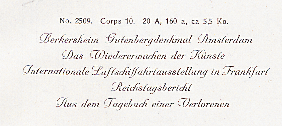
Also from Benjamin Krebs Nachfolger, this specimen shows the 10 pt size of Pompadour. Especially when it comes to this small size of Pompadour, even a layperson should be able to see that these punches were cut by craftsmen who had mastered their craft. The details are exquisite. This is not a kind of manual labour that I can reproduce myself, and it is not likely to be something that I will still be able to learn in my lifetime.
For us today, the punchcutters active in Imperial Germany are predominantly anonymous. Cases like Eckmann – where some reports written retrospectively mentioned Hoell by name – are rare. Both of the typefaces reproduced above are products that were developed entirely within the Benjamin Krebs Nachfolger foundry in Frankfurt … at least, according to the few mentions from the time that were made about these typefaces.
How my research fits into field today
Chart listing the type specimen catalogues of typefoundries carrying types in the Midolline design. That design was first cast into type by the foundry inside of Eduard Haenel’s printing house in Berlin. Haenel then offered to sell duplicate matrices of the typeface’s eight sizes to other foundries. The kind of typeface distribution illustrated by this chart was typical for many designs during the nineteenth century.
My findings bring new forth insights that other researchers may be able to build upon in the future. For example, in my dissertation, I used the Midolline designs as examples of the general distribution that typefaces underwent in nineteenth-century typefounding. Similar reconstructions for the distributions of many other type designs could be made for this period; however, there are no other published examples for nineteenth-century foundry type designs. The national and international distribution of products on the sales side (not just the user side) shows how intertwined the typefounding industries of various countries must have been.
That typefoundry owners liked to pick up products from other companies during that time is an indication that product originality must not have held the same importance during the nineteenth century in the twentieth and twenty-first. When a foundry ceased to sell duplicate matrices to other firms, this can be seen as an indication that an internal strategy had changed, in terms of their appreciation of originality and exclusivity.
Within the typography research disciplines, my results predominantly contribute to the histories of various typefoundries. Recently, much more has been published about the histories of the companies active in manufacturing items for a successive technology: mechanical typesetting. For those firms, denser and better-preserved source materials are available. Researchers who focus on the typesetting-machine manufacturing companies will be able to find entry points in my work, through which they may find a more in-depth glimpse at typefounding history, and then identify cross-references between the industries.
Another typographic research discipline examines the processes by which Western companies produced typefaces for foreign writing systems. Individual German typefoundries active during the Imperial era – such as C.F. Rühl or Ferd. Theinhardt – had specialisations in that kind of development. Today, this area of work makes up a considerable part of font development. Much historical research is being undertaken in this area now. So far, investigations in the development of the so-called “non-Latin” typefaces have primarily focused on products made by the mechanical-typesetting equipment manufacturers.
My results compliment Julia Meer’s recently published Neuer Blick auf die Neue Typographie, which investigates the spread of New Typography through the German printing industry during the 1920s and ’30s.[19] According to Meer, trained compositors working within the printing industry took up the working methods of the “New Typography” on their own initiative. She does not see them having stood in the way of the avant-garde artists, as the traditional historiography of the New Typography has so far implied. By redirecting the focus away from well-known artists and towards the average the industry practitioner, she allows for a clearer, more diverse picture of developments within the history of design to be presented. This is the same goal that I have for discussions of the Künstlerschriften.
A central thesis of my dissertation is that, while the Schriftkünstler may have been necessary partners as typefoundries produced the so-called Künstlerschriften, they do not deserve to receive sole credit for the completed typefaces. Going forward, we should view the craftsmen who also worked on those typefaces as co-designers, because of the creative nature of their contributions.
The experiences of individual workers within typefoundries reflect larger developments from greater processes of industrialisation. Researchers from the cultural studies will now be able to adopt the typefounding industry more easily into their area of focus, and perhaps integrate it into future investigations of the social structures of Germany’s imperial period. The division of labour within the typefoundries’ product development may also be of interest to researchers from both the history of technology and the social sciences; hopefully also for researchers in the media studies. My work may also appeal to those researching the materiality of books and other printed media, as the production of typefaces should be an inherent part of any discussions about the materiality of text.
In my work, I have mainly relied on published sources, rather than on unpublished documents intended for corporate consumption, such as correspondence and internal memoranda, as so much of this has not been preserved. German museum collections of punches and matrices house industrial products that were mostly released or recreated after the Second World War; however, these have not all yet been fully catalogued, and may well still contain artefacts that originated from the period I investigated. Much research in this direction is still needed. Although such artefacts are not likely to contribute to a deeper understanding of the collaboration between typefoundry workers, artists, and craftsmen, they will certainly clarify our picture of the punchcutting and matrix-making working methods used within various typefoundries. Together with an exploration of printers’ union archives that may have been preserved, one may be able to assemble a clearer image regarding punchcutters’ training, working conditions, mobility, and payment.
Footnotes
- In German: Großbetrieben.
- This is the Schriftgießerei Rainer Gerstenberg in Darmstadt.
- The Haus für Industriekultur, part of the Hessisches Landesmuseum Darmstadt.
- See also TypeTogether’s excellent post on this topic in the industry today: Crediting in type design.
- There were occasional exceptions, of course. The biggest exception must bei the romain du roi, designed in France at the end of the seventeenth century. While I can think of exceptions in other countries as well, I am not aware of any such similar instances from German-speaking Europe.
- For example, there is a history of type design in the Netherlands: Jan Middendorp’s book Dutch Type.
- For type designers like Friedrich Wilhelm Kleukens, F.H. Ernst Schneidler, or Walter Tiemann – who each designed at least one typeface that was primarily intended for use on their own private presses – the situation is naturally somewhat different.
- Around the year 1900, neither the terms Gestalter nor Designer were common in the German language.
- From the time period up to 1914 in Germany, I am only aware of one woman having delivered a design to a German typefoundry that was produced as a typeface: this was Hildegard Henning’s Belladonna, published Julius Klinkhardt at Leipzig in 1912. For more information on the women active in type design through the 1950s, see Indra Kupferschmid’s article on the subject at Alphabettes.org.
- Although I am not going to go into detail about it here, I must point out that I am aware of Tages-Antiqua, a typeface whose design is sometimes attributed to Louis Hoell. The typeface was developed at the Flinsch typefoundry, where Hoell became the head of the company’s punchcutting and engraving department in 1904. However, I am not at all sure where the attribution of the design to Hoell comes from. In 1938, Gerrit Willem Ovink described it as being from Hoell, but it is not clear to me if Ovink was implying that Hoell had “designed” the typeface, or just produced it. The PDF on the Klingspor Museum website about Hoell clearly attributes the design of Tages-Antiqua to Hoell, but it does not give a source for this, and none of the three reference publications it provides for Hoell mention a Tages-Antiqua design attribution either. I suspect that no explicit attributions of Hoell as the typeface’s author were made during Hoell’s lifetime. For example, he is not mentioned in the first notice published in the press about the typeface’s release, which ran in 1915 in Archiv für Buchgewerbe. There, the typeface was described as a Flinsch foundry Hausschnitt. As the head of Flinsch’s engraving department, Hoell would have been directly or indirectly responsible for all the foundry’s Hausschnitte. Yet, this does not necessarily mean that he designed any of them. All typefaces not attributed to a non-craftsman artist were naturally designed by someone. Often, that someone must have been the same person who cut the typeface’s punches. For centuries, punchcutters were designers and craftsmen at the same time. This only changed in the period I am researching. Nevertheless, it was a gradual change, which unfolded over decades, and not on a day in e.g., 1881 or 1899, etc. Flinsch published a type specimen brochure for Tages-Antiqua, but it does include any information about the typeface’s design, or attributions to Hoell or any other people. The Bauer’sche Gießerei – who acquired Flinsch in 1916 – published a type specimen brochure for Tages-Antiqua as well, in 1922. This also does not mention any designers or craftsmen either. Like the Flinsch specimen, it simply showed the various sizes and styles of the typeface family in different settings. See Deutscher Buchgewerbeverein: Archiv für Buchgewerbe. Vol. 52, no. 7–8. Verlag des Deutschen Buchgewerbevereins, Leipzig 1915, p. 266. See also Schriftgießerei Flinsch (ed.): Tages-Antiqua – Eine neue Antiqua für alle Drucksachen. Schriftgießerei Flinsch, Frankfurt am Main. Undated (circa 1915). Bound into a larger volume of Flinsch brochures at the Berlin Kunstbibliothek, catalogue number H 1195 m mtl-4. See also Bauer’sche Gießerei (ed.): Tages-Antiqua. Bauer’sche Gießerei, Frankfurt am Main. Undated, but published in 1922. Staatsbibliothek zu Berlin catalogue number 8 An1214/30. See also Gerrit Willem Ovink: Legibility, Atmosphere-Value and Forms of Printing Types. A.W. Sijthoff, Leiden 1938, p. 219 and 244.
- During the 1920s and 1930s, at least two type designers in German-speaking Europe did take up punchcutting: Rudolf Koch and Victor Hammer. Rudolf Koch also ensured that his son Paul Koch was trained – at least to some extent – at the Klingspor foundry in punchcutting and typecasting. Paul Koch would eventually cut punches both for his own designs, and for others – including for letters by his father and Hammer. Nevertheless, none of these men ever worked as “proper” punchcutting and engraving employees within the German typefoundry system. They were artists who were eager to understand manual processes, and who – at least in Paul Koch and Victor Hammer’s cases – became quite skilled at being able to put certain ideas into form in steel.
- Particularly Rudolf Koch and Otto Hupp longed to be viewed as craftsmen, rather than artists.
- Historical individuals like John Baskerville or Giambattista Bodoni were likely celebrated within the societies of their times just as much for their printing as for their press’ typefaces, if not more so.
- See John A. Lane: “Twentieth-Century Punchcutters.” In John Randle (ed.): Matrix 11. The Whittington Press, Cheltenham 1991. Pages 7–23, here page 12. Heinrich Bachmair’s obituary for Louis Hoell implied that Hoell cut all of Weiß-Antiqua; see Heinrich Bachmair: »Der Stempelschneider Louis Hoell«. In: Aloys Ruppel (ed.): Gutenberg-Jahrbuch 1936. Verlag der Gutenberg-Gesellschaft, Mainz 1936. Pages 205–207, here page 205.
- Indeed, this is what Bauer had done for their 1926 type specimen brochure introducing the typeface. Entitled »Bodoni Schriften«, a portrait of Giambattista Bodoni is reproduced on its the frontispiece. The brochure’s introduction – a text often written by the type designer at this time – is by Heinrich Jost, a designer who worked for Bauer and later became its artistic director. His text is a three-page biography of Bodoni, not a description of the new typeface’s design. Louis Hoell is not mentioned anywhere in this brochure; see Bauer’sche Gießerei: Bodoni Schriften. Bauer’sche Gießerei, Frankfurt am Main 1926. The copy of this brochure I examined is located in the Raralesesaal at the Staatsbibliothek zu Berlin, with the call number RLS Gk 5408.
- I am over-simplifying this for effect. In today’s “type industry,” there is also often a division between those who design, and those whose labor helps ensure that the finished font is an effective product. Sometimes, those latter individuals are called “font engineers.” Yet, I do not see the division of labor in today’s digital environment between type designers and font engineers as being similar to the differences between Schriftkünstler and punchcutters in Imperial Germany. The main differences between those examples from the last centuries and practitioners today is that the punchcutters came from a lower class background than the Schriftkünstler, and had different levels of formal education and professional training. Today, individuals employed as type designers and font engineers alike often have exactly the same educational background: a master’s degree in type design (or equivalent postgraduate training in type design) from one of a growing number of design education institutions.
- See Sven Lindqvist: Grabe wo du stehst: Handbuch zur Erforschung der eigenen Geschichte. Dietz, Bonn 1989. Originally published in Sweden under the title Gräv där du står (1979).
- See Dagmar Welle: Deutsche Schriftgießereien und die künstlerischen Schriften zwischen 1900 und 1930. Roderer, Regensburg 1997, p. 88–90.
- See Julia Meer: Neuer Blick auf die Neue Typographie. Transcript Verlag, Bielefeld 2015.