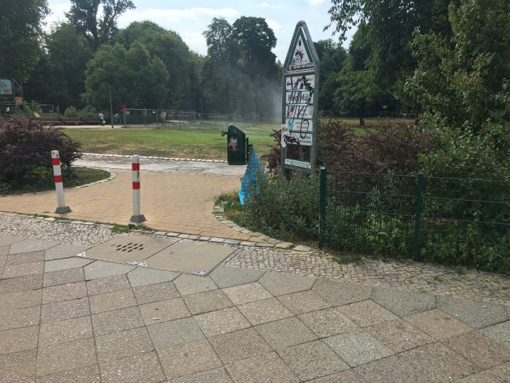
Northwest entrance to the Heinrich Lassen Park in Berlin-Schöneberg. There used to be buildings here. Between 1896 and 1918, one of them – at Belziger Straße 61 – housed the Gronau typefoundry. The printing-office and typefounding facilities Eduard Haenel established in the 1840s were about two-and-a-half kilometers to the north of here.
Today, almost nothing remains of the Haenel/Gronau typefoundry. It ceased operations 100 years ago, after it was purchased by Gebr. Klingspor in Offenbach am Main. Haenel/Gronau, which had been in business for about 88 years, has now not existed for longer than it had ever been around. While researching for my dissertation in 2017, it was by reading Haenel/Gronau type specimens that I first began to feel like I understood several aspects of how the nineteenth-century typefounding industry in German-speaking Europe operated. The foundry was a significant player in the Berlin, Prussian, and German typefoundry networks, and I’ve developed a particular interest for the firm’s history. This is a long post, with slightly more than 3,400 words.
Brief history of the foundry
Several authors use “Haenel/Gronau” as shorthand to describe a foundry that went through two names in its history. It was created in 1830 by Eduard Haenel (1804–1856), inside of the pre-existing Haenel printing house in Magdeburg. In 1852, Haenel’s Berlin operation was sold to Karl David. Karl Wilhelm Gronau purchased it in 1864. Gronau had been with Haenel for some time, having begun a typesetting apprenticeship in 1827 at the printing office in Magdeburg.[1] He restyled the company after himself, changing its name to Wilhelm Gronaus Buchdruckerei und Schriftgießerei. Also in 1864, Hans Alexander Jürst became a part-owner of the business.[2] Gronau died in 1887, but according to Friedrich Bauer, his widow Agnes remained a part owner of the firm after his death.[3] In 1905, the printing operations split off from the typefoundry entirely. They operated under the name Gebhardt & Landt GmbH, while the foundry continued to be named after Wilhelm Gronau. Agnes Gronau left the typefoundry in 1909, perhaps selling her share to Jürst, who died himself in 1914. According to a notice in the Deutsche Reichsanzeiger, the seat of the Wilhelm Gronau foundry moved from Schönberg to Offenbach on 22 January, 1915, thanks to its new owners: Karl and Wilhelm Klingspor. Friedrich Bauer’s Chronik der Schriftgießereien – cited in [3] above – gives 1918 as the sale’s year. Perhaps that was only when casting in Schönberg stopped permanently.
The Haenel printing house’s roots went back to 1731. It was founded in Magdeburg – where it was a court establishment (Hofbuchdruckerei) – by Nicolaus Günther. Magdeburg is a city about 130 kilometres to the west of Berlin. The printing house came into the Haenel family in 1798, when it was purchased by Eduard’s father, Christian Jacob Haenel.[4] The firm managed to successfully operate for 99 years without a typefoundry, but after Eduard and his brother Albert Theodor Haenel inherited the operation, Eduard set up a typefounding devision. Pierre Pané-Farré’s recent essay on some of the Haenel foundry’s poster typefaces from the 1830s and 1840s includes fascinating information about Eduard’s training abroad during the 1820s, in England and France.[5] In 1835, Eduard set up a dependency in Berlin, which printed Prussian exchequer bills (Kassenanweisungen).[6] Following an 1838 fire on the business’s Magdeburg premises, Eduard moved the typefoundry to Berlin, along with at least some of the family’s other printing operations. His brother Albert Theodor, and Albert Theodor’s descents, kept the Magdeburg printing office running until 1945.[7]
Haenel’s was one of at least six German-speaking typefoundries to participate in the 1851 Great Exhibition at the Crystal Palace in London (the first World’s Fair). Aside from Haenel, the Berlin-based Decker printing house and typefoundry also made the trip. Gustav Schelter’s Leipzig foundry was there – he was independent of the larger J.G. Schelter & Giesecke operation, who did not participate – and Friedrich Dresler from Frankfurt am Main also attended. Johann Christian Bauer, who had recently returned to Frankfurt after living and working in Britain for several years, may have been at the fair as well: Frankfurt’s Benjamin Krebs foundry produced a specimen of his types for the event.[8] The Austrian Court and State Printing House was among the fair’s exhibitors, too. Although the Haenel/Gronau foundry was still in business six decades later, it did not participate in the German typefoundry exhibitions at the 1914 Internationale Ausstellung für Buchgewerbe und Graphik in Leipzig (the Bugra).
Berlin geography
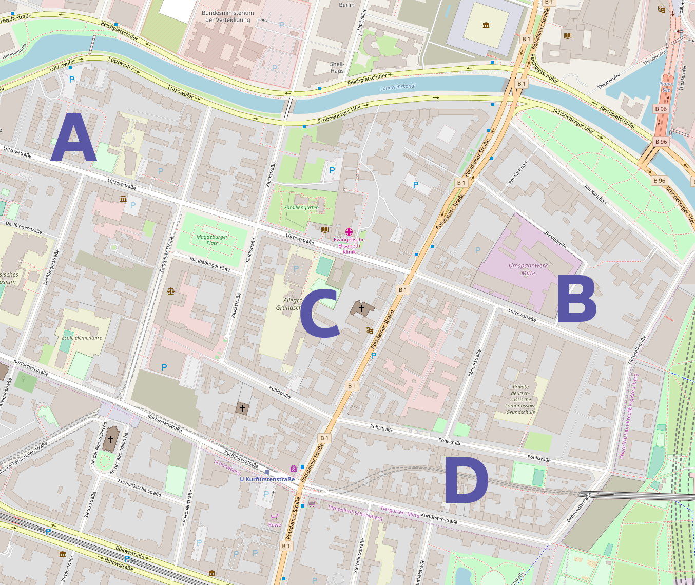
The above map shows part of Berlin’s Tiergarten district as it exists today (click to enlarge). The letters A and B mark the possible locations used by the Haenel/Gronau printing and typefounding operation between 1849 and 1896. These were at Lützowstraße 44 (formerly Lützowerwegstraße 44) and Lützowstraße 9. The letter C marks the rear building at Potsdamer Straße 98A, the home of Erik Spiekermann’s p98a gallery. D is Kurfürstenstraße 14, the West Berlin location occupied by the Johannes Wagner Schriftgießerei und Messinglinienfabrik from the late 1940s or early 1950s through the early 1970s; I wrote about Wagner’s firm elsewhere in this series. © OpenStreetMap contributors.
I have not yet found every address that Eduard Haenel’s printing office and typefoundry occupied in Berlin. According to Friedrich Bauer, their first location was at “Lützowerwegstraße 44, later Lützowstraße 9 [my translation].”[9] 1840s issues of Berlin’s address books suggest the business may initially been in the Potsdamer Straße – that bisects Lützowstraße, as is illustrated on the above map. Under Gronau at the latest, the firm certainly did end up at Lützowstraße 9. Lützowstraße, and the neighbourhood surrounding it, were not part of Berlin until 1861. After the city’s expansion in that year, the area was part of the Schöneberger Vorstadt. Today, Lützowstraße is in the Tiergarten district, and indeed Lützowstraße 9 is only around the corner (450 meters away) from p98a. No nineteenth-century structures remain at Lützowstraße 9 or 44.
Update 1: Pierre Pané-Farré sent me a list of Haenel’s Berlin addresses from the years 1837 through 1853, which I quote in full below (Potsdamer Chausee – mentioned in the second, third, and fourth addresses – was renamed Potsdamer Straße in 1841):
- 1837 Halleschen Thore
- 1837 Potsdamer Ch. 42c
- 1838 Potsdamer Ch. 42b & 42c
- 1841 Potsdamer Ch. 42b & 44d, Brüderstr. 12
- 1843 Potsdamer Str. 118 [today: Potsdamer Str. 65], Spittelbrücke 2
- 1847 —, Sparwaldsbrücke 16
- 1849 —, Lützowerwegstr. 44cc
- 1853 Lützowerwegstr. 44d[10]
Update 2: In 2022, I was informed that the eight addresses listed above all describe the same location. In other words, while the address changed, the company did not move around the neighborhood. Eduard Haenel’s printing house was behind his villa. Both the Villa Haenel and the printing house were built by the renowned Berlin architect Eduard Knoblauch.
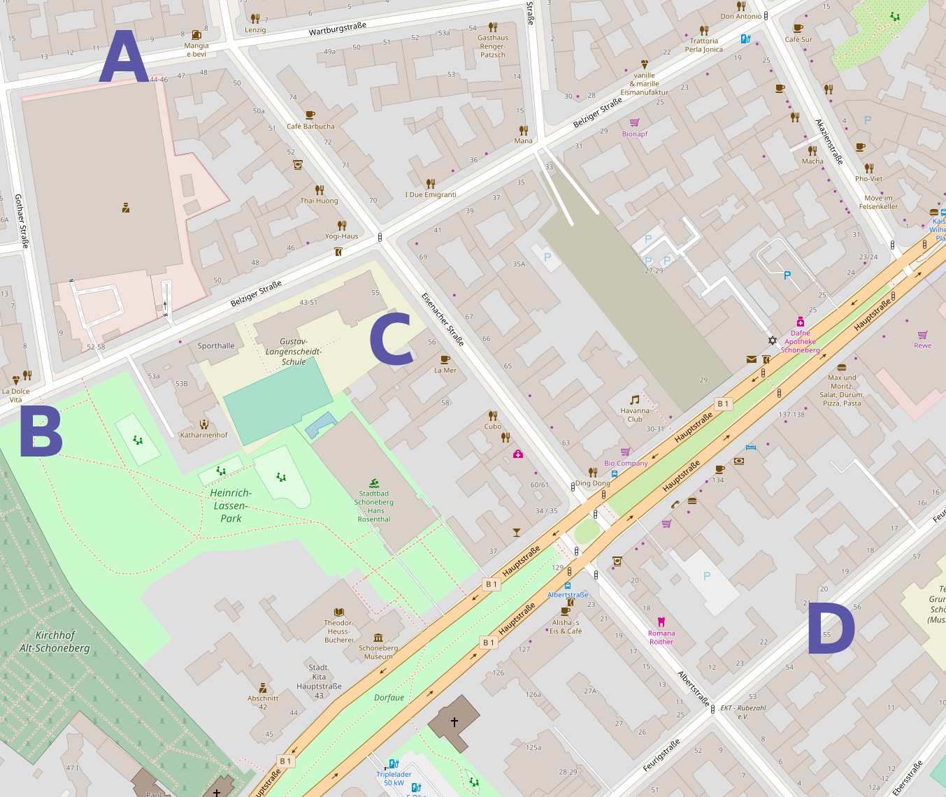
Map showing the locations of four Schöneberg type businesses past and present (click to enlarge). A is for Alphabet Type, B marks Gronau’s 1896–1918 location, C is for LucasFonts, and D marks Feurigstraße 55. For a time, the Ferd. Theinhardt foundry was located at Feurigstraße 55b; it was their final location. The Theinhardt foundry’s buildings are the subject of a later post in this series. © OpenStreetMap contributors.
In 1896, the Gronau printing office and typefoundry moved 3.1 kilometers south, to Belziger Straße 61; this is around the corner, or about 300 meters away, from both LucasFonts’s office at Eisenacher Straße 56 and Alphabet Type at Warburgstraße 10. The building that Gronau would have used at Belziger Straße 61in Berlin-Schöneberg no longer stands. It was destroyed during or after the Second World War, and no structures have been rebuilt in its place. Today, the land is part of the small Heinrich Lassen Park. Although Schöneberg is now part of Berlin, the city’s borders only expanded to include it 1920, after the Gronau foundry had already closed. For at least some of the c.22 years during which Grounau operated from Schöneberg, it was not the area’s only typefoundry: during the last few years of its operations, the Ferd. Theinhardt foundry was in Schöneberg, too. Ferdinand Theinhardt sold his foundry and retired long before that point, but he is addressed below in this post, as he had been a punchcutter for Haenel for a few years in the 1840s.
Type specimen
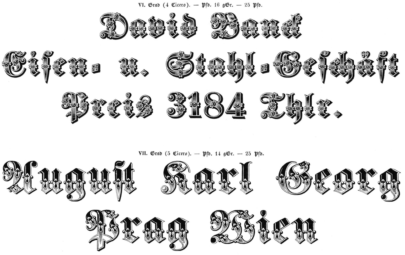
Ornamentierte (›musirte‹) Fraktur, from Atlas zur Geschichte der Schrift. The authors of that volume reproduced these two type sizes – 4 Cicero and 5 Cicero, or about 48 and 60 Didot points – from an 1844 Haenel specimen.[11]
Type specimen are often the longest-surviving creations a foundry makes. While Eduard Haenel’s typefoundry did not produce bound specimen catalogues per se, they did regularly print type specimen sheets, which have later been bound together. The printing of numbered, single-sheet type specimens was a common practice at many mid-nineteenth-century German-speaking foundries. The sheets would be bundled as supplements to e.g., the Journal für Buchdruckerkunst, Schriftgießerei und verwandte Fächer, a publication established by Johann Heinrich Meyer (1812–1863), which began its run at Braunschweig in 1834. A number of bound volumes of specific ranges of Haenel specimen sheets exist in various collections, and I will name just two examples here: First, the Ghent university library has two Haenel volumes. These have been digitised by Google and are available here and here.[12]
Second, Wilhelm Gronau continued printing single-sheet specimens, after taking over the Haenel foundry. In 1879, the firm bound 651 separate Haenel and Gronau specimen sheets into one large volume. This covered the time between the 1830s and the late 1870s. Today, the volume is part of the Berlin Kunstbibliothek’s collection. I suspect that it was specially bound for sale or donation from Gronau to the Kunstbibliothek’s predecessor, the library of the school of the Berlin Kunstgewerbemuseum (that school itself is a forerunner of today’s Berlin University of the Arts). The volume’s title page stated it contained a complete record of everything the foundry had produced since 1830. In early 2017, when I first viewed this item, it was still in its original binding, but was falling apart. The librarians and restoration staff decided to re-bind the sheets. Now, the sheets have been divided among three shorter volumes, of approximately 200 sheets each.[13]
In addition to continuing Haenel’s specimen-sheet run for several years, the Gronau foundry also produced bound type specimen catalogues, where all pages were printed and bound at once. Perhaps their most common catalogue was published in 1891, about four years after Wilhelm Gronau’s death.[14] This catalogue cannot be particularly rare, as I am aware of several surviving copies in Berlin alone. It contains many typefaces that originally debuted at the company during Eduard Haenel’s lifetime.
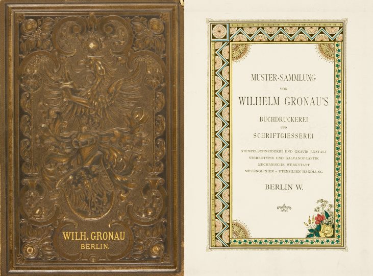
Front cover and title page of the Wilhelm Gronau foundry’s 1891 type specimen catalogue, from Type: A Visual History of Typefaces and Graphic Styles.[15] Although it is difficult to see clearly, the design of the font cover makes use of the printers’ coat of arms, the top half of which features a left-facing griffin holding two ink balls (click to enlarge).
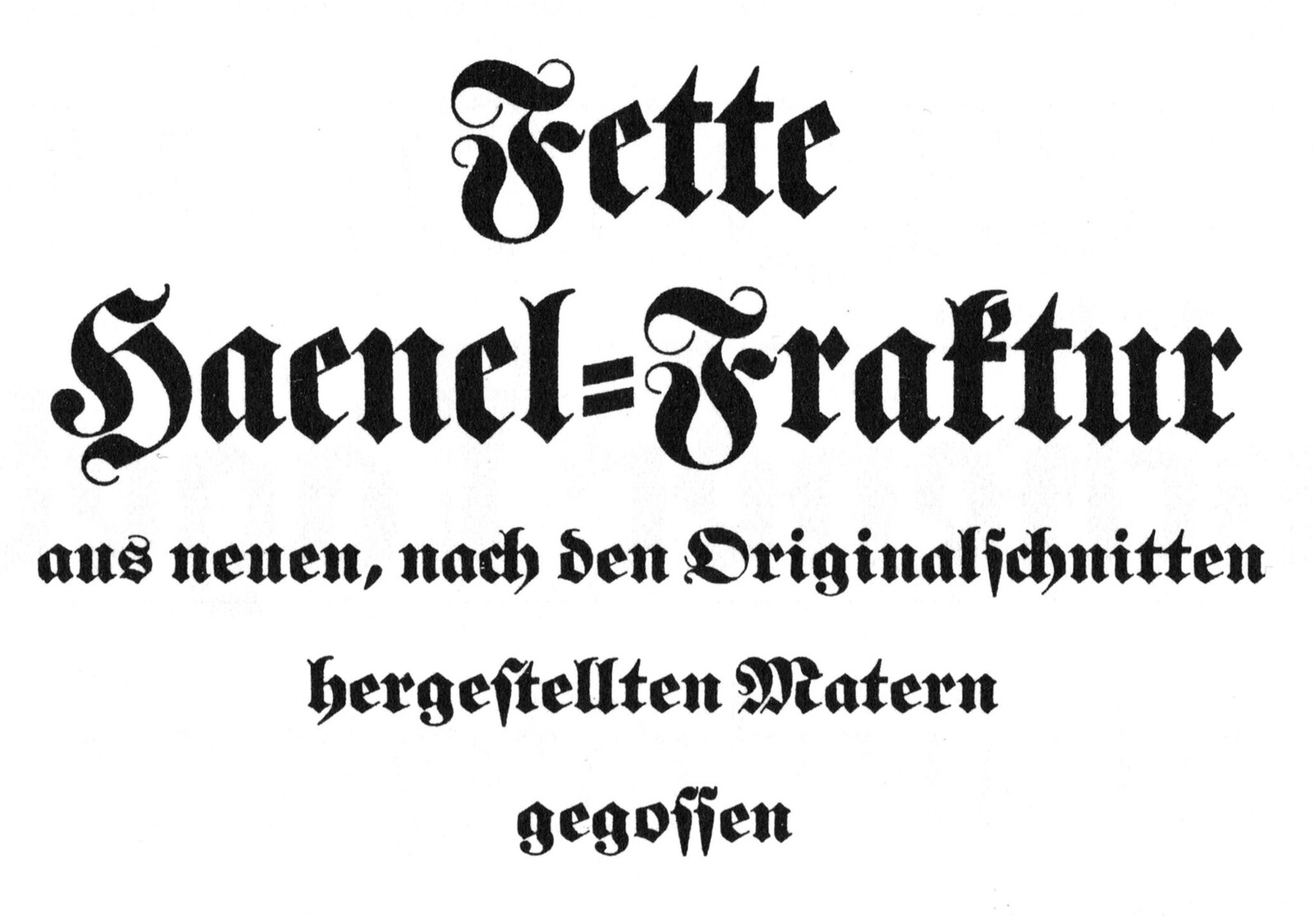
And typefaces? A foundry’s typefaces are often picked up by competitors, or firms that acquire them. For a time, the Gebr. Klingspor typefoundry of Offenbach am main sold a typeface named the Fette Haenel-Fraktur. Although this was neither designed nor cut by Eduard Haenel himself, it was based on Fraktur types that Haenel’s foundry had sold. In fact, it was Gebr. Klingspor that converted some of Haenel’s fette Fraktur sizes into a “family.” The term “Fette Fraktur” just means Heavy Fraktur; during the mid-nineteenth century, almost every German-speaking foundry carried a fette Fraktur from one source or another. I even have a database of cataloged specimens of those different fette Fraktur types available. The concept of a typeface family had not quite developed during Haenel’s own life time. Haenel’s fette Fraktur sizes came from at least two – if not three – different hands.
Klingspor’s Fette Haenel-Fraktur
The first “author” of the types was E. Krumwiede, a Berlin-based punchcutter and typefounder. He was in partnership with a man named G.F. Schneggenweide. Together – at least for a time – they were in business, performing engineering and typefounding as Schneggenweide & Krumwiede. The small sizes of another Haenel face, their fette Antiqua, are attributed to Krumwiede’s hands; presumably he cut them first, between 1830 and 1834. In 1833–34, Schneggenweide & Krumwiede cut a fette Fraktur in several sizes ranging from Nonpareille through grobe Kanon (approximately 6–42 Didot points) for the typefoundry of J.D. Trennert & Sohn Altona. In 1834, Haenel purchased matrices for seven sizes of this range, Petit through Text (8–20 pt). Then in 1834–35, Haenel bought four larger fette Fraktur sizes from Justus Erich Walbaum in Weimar: these were Doppelmittel through Kleine Missal in size (28–48 pt).[17] In Klingspor’s specimen brochure for the family, they wrote that “the ‘Fette Haenel-Fraktur’ is one of those fine, old punchcutter works [from the heyday of early nineteenth-century craftsmanship, cut by keen punchcutters and showing a high level of sensitivity to form]. It was cast from new matrices made after the old punches and matrices of the Haenel foundry. These originals – first published in 1835 – were partially cut by Walbaum and are in our possession.”[18]
Punchcutters at the foundry
I have only found the names of two punchcutters who worked directly at Haenel. Each was there prior to starting their own independent businesses. These punchcutters were Heinrich Ehlert, and the more well-known Ferdinand Theinhardt (1820–1906). Friedrich Bauer briefly mentioned Ehlert’s work at Haenel by writing that “[the foundry] commissioned the cutting of many good typefaces, especially in the Textura and Kanzlei styles, as well as some idiosyncratic display faces. Haenel was very successful with these typefaces, and they were cut for the most part by Heinrich Ehlert, who set up his own business in 1858.”[19] As Bauer also mentioned, Ehlert went on to run his own Berlin punchcuttery and typefoundry until 1862, before becoming a freelancer.[20] Ehlert was presumably still alive and cutting punches more than a decade and a half after that: in 1879, he was granted a patent in the United States for the design of a series of ornaments. It is not clear from the text of the patent if he had moved to the United States, or if the design was only being distributed on his behalf by the James Conner’s Sons typefoundry of New York. He is mentioned in the patent’s text as “Heinrich Ehlert, of Berlin, Prussia.”[21]
Ferdinand Theinhardt is one of few punchcutters to have written an autobiography, and from this, we know that he worked at Haenel’s twice in the 1840s, during his 30s.[22] He established his own typefoundry in 1849. After that point, according to Bauer, Theinhardt cut types for the Preußische Staatsdruckerei, as well as for the Egyptologist Karl Richard Lepsius and other academic clients at the Königliche Akademie der Wissenschaften.[23] As I will explain in more detail in an article I am currently preparing for a printed publication, Theinhardt never cut any types with the designs that would later became known as Akzidenz-Grotesk or Royal-Grotesk. This is despite what Günter Gerhard Lange explained on a few occasions in/after 1998. Since I am saving my powder for later debates, I won’t go too deeply into Theinhardt’s career here. It should suffice for me to say here that I believe he was one of the most significant punchcutters of the trade in nineteenth-century Prussia, and that I view him as the most prolific of the punchcutters associated with the Haenel foundry, despite his not having played a role in the development of sans serif typography.
Closing remarks
The nineteenth-century Danish-born Leipzig printer and printing historian Carl Berendt Lorck (1814–1905) had very nice things to say about Haenel’s foundry in his 1882–83 Handbuch der Geschichte der Druckkunst. In a summary of German-speaking type foundries that operated between about 1830 and 1880, he mentioned Haenel’s firm before Walbaum’s, or any others. According to Lorck, “the typefoundry developed more slowly in Germany than in England and France. The upturn in their productions’ purer taste dates to the [eighteen] thirties, and no one equaled Eduard Haenel’s influence in this direction. He introduced the most recent and beautiful French and English romans, and he commissioned the cutting of punches for upright Greek, chancery, heavy and bold, gothic and other ornamental and display types, or acquired the best matrices for these from abroad. In jobbing printing, Haenel lead a complete revolution. Excellent works of printing came forth from his Magdeburg office – and, after a fire in 1838, from his Berlin institute. He was the first to introduce compound plate printing in Germany, which he called Congreve printing. With his guilloche and underprint plates – and especially with his lace patterns – he won over the German audience. It was hardly conceivable at that time for envelopes or bills of sale to be produced that did not make use of guilloches and colored printing. Already by 1837, his number ornaments exceeded 2,813. The struggle with lithography was courageously taken up by letterpress printers. Many of the latter threw themselves zealously into jobbing printing, and other typefounders followed Haenel’s example. It was a time of quick and merry creations, of the good, the half-good, and the tasteless, of the practical and impractical together.”[24]
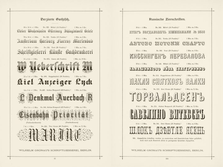
Two pages from Gronau’s 1891 type specimen catalogue, from Type: A Visual History of Typefaces and Graphic Styles.[25] (click to enlarge)
Karl Klingspor had nothing nice to say about Haenel’s advertising, at least during the early years of the foundry’s existence. He lamented that “such a distinguished foundry as Haenel’s was not afraid to bluntly state in a specimen from 1831 that ‘Incidentally, I am also able supply any border elements from other foundries, as long as I am provided with a few sorts in good condition.’”[26]
Sources cited
- Karl Faulmann: Illustrirte Geschichte der Buchdruckerkunst – mit besonderer Berücksichtigung ihrer technischen Entwicklung bis zur Gegenwart. Vienna/Pest/Leipzig: Hartleben (1882), p. 568
- Hans Reichardt: »Haenel – Gronau«. PDF file, http://www.klingspor-museum.de/KlingsporKuenstler/Schriftgiessereien/HaenelGronau/HaenelGronau.pdf [link]
- Friedrich Bauer: Chronik der Schriftgießereien in Deutschland und den deutschsprachigen Nachbarländern. Bearbeitet von Friedrich Bauer, Offenbach am Main 1928. Mit Ergänzungen und Nachträgen von Hans Reichardt. PDF file. Frankfurt am Main: Hans Reichardt (2011), p. 24 [link]
- Guido Heinrich: »Hänel (Haenel), Eduard Gustav«. In Anon (ed.): Universität Magdeburg, http://www.uni-magdeburg.de/mbl/Biografien/1232.htm/ (2 February 2005) [link].
- Pierre Pané-Farré, “Affichen-Schriften.” In Stephan Müller, Pierre Pané-Farré, and Reymund Schröder (ed.), Forgotten Shapes, https://forgotten-shapes.com/affichen-schriften?article=affichen-schriften/ (June 2018) [link]. See also Pierre Pan-Farré: “What came after black and red? The development of chromaticity in letter-press posters by the German-speaking print industry from 1827 to 1865.” In Julia Blume, Pierre Pané-Farré, and Fred Smeijers’s (ed.) Vom Buch auf die Straße. Große Schrift im öffentlichen Raum. Journal der HGB #3. Leipzig: Hochschule für Grafik und Buchkunst (2014), p. 211–226, here p. 217–220
- F. Bauer, p. 109
- G. Heinrich (no page numbers)
- Exhibition of the Works of Industry of AllNations, 1851 (ed.): Reports of the Juries on the Subjects in the Thirty Classes into which the Exhibition was Divided. London: William Clowes & Sons (1852), p. 878–879, 902–903, and 986. See also Konrad Friedrich: Werden und Wachsen einer deutschen Schriftgießerei – Zum 100jährigen Bestehen der Bauer’schen Schriftgießerei. Frankfurt am Main: Bauer’sche Gießerei (1937), p. 21–23
- F. Bauer, p. 24
- Tweet from Pierre Pané-Farré (26 June 2018) [link]. For information on the 1930s-era renumbering of the buildings along Potsdamer Straße, see Sibylle Nägele and Joy Markert: Die Potsdamer Straße – Geschichte, Mythen und Metamorphosen. Second edition. Berlin: Metropol (2011), p. 453–456. First edition published 2006
- Gewerbelehrerstudium Graphisches Gewerbe (ed.): Atlas zur Geschichte der Schrift. Band 2. Von Gutenberg bis Ende des 19. Jahrhunderts. Darmstadt: Technische Hochschule (1986), p. 286
- See Eduard Haenel (ed.): Schriftgiesserei, Schriftschneiderei und Graviranstalt. Berlin: Schriftgießerei, Schriftschneiderei und Graviranstalt von Eduard Haenel in Berlin. Undated [link]. See also Eduard Haenel (ed.): Neue Polytypen der Schriftgiesserei und Gravir-Anstalt. Berlin: Schriftgießerei, Schriftschneiderei und Graviranstalt von Eduard Haenel in Berlin. Undated [link].
- Wilhelm Gronau (ed.): Wilhelm Gronau’s Buchdruckerei und Schriftgiesserei Berlin. Berlin: Gronau. Undated, c.1879. At the Berlin Kunstbibliothek, this has recently been rebound into a three-volume set, with the call numbers H 1209 mtl-1, H 1209 mtl-2, and H 1209 mtl-3
- Wilhelm Gronau (ed.): Muster-Sammlung von Wilhelm Gronau’s Buchdruckerei und Schriftgießerei, Stempelschneiderei und Gravir-Anstalt, Stereotypie und Galvanoplastik, mechanische Werkstatt, Messinglinien, Utensilien-Handlung. Berlin: Gronau. Undated, c.1891
- Cees W. de Jong (ed.): Type – A Visual History of Typefaces and Graphic Styles. With texts by Jan Tholenaar, Alston W. Purvis, and Cees W. de Jong. Volume 1. Cologne: Taschen (2010), p. 268
- Philipp Bertheau (ed.): Buchdruckschriften im 20. Jahrhundert – Atlas zur Geschichte der Schrift, ausgewählt und kommentiert von Philipp Bertheau unter Mitarbeit von Eva Hanebutt-Benz und Hans Reichardt. Darmstadt: Technische Hochschule (1995), p. 355
- See Schriftgießerei Gebr. Klingspor (ed.): Fette Haenel-Fraktur – aus neuen, nach den Originalschnitten hergestellten Matern gegossen. Offenbach am Main: Gebr. Klingspor. Undated, c.1933. See also P. Bertheau, p. 355, 588, and 592, as well as F. Bauer, p. 24
- »Die ›Fette Haenel-Fraktur‹ ist eines dieser guten, alten Stempelschneiderwerke [der Blütezeit der Handwerkskunst des beginnenden 19. Jahrhunderts entstandenen Schriften, die von fühlenden Stempelschneidern geschnitten, und eine hohe Stufe des Formempfindens zeigen]. Sie wurde aus neuen, nach den alten Stempeln und Matern der Haenelschen Gießerei hergestellten Matern gegossen. Diese Originale – zuerst im Jahre 1835 veröffentlicht – sind zum Teil von Walbaum geschnitten und befinden sich in unserem Besitz.« See Gebr. Klingspor, p. 3
- »[Haenel] ließ auch selbst viele gute Schriften, besonders in gotischem und Kanzleicharakter, und manche eigene Zierschrift schneiden. Haenel hatte mit diesen Schriften, die zum größten Teil von Heinrich Ehlert, der sich 1858 selbständig machte, geschnitten waren, einen großen Erfolg.« See F. Bauer, p. 24
- F. Bauer, p. 30
- Heinrich Ehrlert: “Design for a font of printing-types.” In Google, Inc. (ed.): Google Patents, https:// patents.google.com/patent/USD11424S/en. US design patent issued on 23 September 1879 [link]
- See Ferdinand Theinhardt: Erinnerungsblätter aus meinem Leben. Berlin: H. Berthold AG (1920). This was the text’s second edition; the first was published elsewhere, in 1899
- F. Bauer, p. 25
- »Langsamer als in England und Frankreich entwickelte sich die Schriftgiesserei in Deutschland. Erst aus den dreissiger Jahren datiert der eigentliche Aufschwung des reineren Geschmacks in den Produktionen derselben und an Einfluss in dieser Richtung kam niemand Eduard Hänel gleich. Er führte die neuesten und schönsten franzosischen und englischen Antiquaschriften ein, liess die geradestehende griechische, Kanzlei, fette und halbfette, gothische und andere Zier- und Auszeichnungsschriften schneiden oder erwarb aus dem Auslande die besten Matern zu denselben. Im Accidenzdruck brachte Hänel eine vollständige Umwälzung hervor und aus seiner Magdeburger Offizin, und nach dem Brande derselben im Jahre 1838 aus seinem Berliner Institut gingen vorzügliche Druckarbeiten hervor. Er war der erste, der den Compound-Druck, den er Congreve-Druck nannte, nach Deutschland brachte. Mit seinen Guillochen- und Unterdruckplatten, namentlich seinen Spitzenmustern enthusiasmierte er das deutsche Publikum. Fast kein Umschlag, ja kaum ein Rechnungsformular konnte damals ohne Guillochen und Buntdruck hergestellt werden. Bereits 1837 hatten seine Zierstücke die Zahl von 2813 erreicht. Der Kampf mit der Lithographie ward damals mutig von den Buchdruckern aufgenommen. Viele der letzteren warfen sich mit Eifer auf das Accidenzfach und andere Schriftgiesser folgten dem Beispiel Hänels. Es war eine Zeit des rasten, lustigsten Schaffens, vom Guten, Halbguten und Geschmacklosen, vom Praktischen und Unpraktischen unter einander.« See Carl Berendt Lorck: Handbuch der Geschichte der Buchdruckerkunst. Volume II. Leipzig: Verlag von J.J. Weber (1883), p. 281–282. The first volume was published in 1882. A single-volume facsimile edition, with an afterword from Walter Bergner, was published in Leipzig by the Zentralantiquariat der DDR in 1988
- C. de Jong, p. 268 and 271
- »… eine so angesehene Schriftgießerei wie die Hänel’sche scheute sich nicht, in der Schriftprobe von 1831 offen zu sagen: ›Übrigens liefere ich auch jede Einfassung aus anderen Gießereien, wenn mir von solchen einige scharfe Stücke eingesandt werden.‹« See Karl Klingspor: Über Schönheit von Schrift und Druck – Erfassungen aus fünfzigjähriger Arbeit. Frankfurt am Main: Georg Kurt Schauer (1949), p. 77
