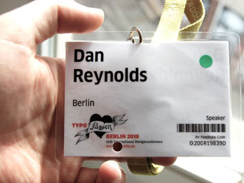
Over the weekend, about 1,500 designers came together in Berlin’s Haus der Kulturen der Welt for the 15th annual TYPO Berlin. Sold-out again this year, Europe’s largest graphic design conference was an assured hit even before doors opened on Thursday. Astoundingly, at least for me, this year was my seventh TYPO in a row. I have attended every instance since 2004; first as a student at the HfG Offenbach, and later as a helper at the Linotype trade fair stand. Many of the faces I saw seven years ago were attendees this year, too; I even ran into one of the designers I drove to my first TYPO with.
At the end of the day, however, 2010 was different from all of my previous TYPOs. This was the first time that I attended as a conference speaker. As Slanted has already covered in their article about my talk, joining the ranks of TYPO Berlin’s speakers had been a personal goal of mine for years. So I can’t thank FontShop and the conference’s organizers enough for allowing me to achieve this. I cannot find the right words for it, but this is a personal and profession milestone for me, any way I look at it.
Since preparing for presentations isn’t part of my day job, and because several designers organized great side activities in the evenings before and during the conference, I haven’t had a proper night’s sleep in about a week. However, the events of the past few days are still quite fresh in my mind, even if my head is still a little dizzy. So, here is my report of actives at TYPO Berlin 2010: Passion.
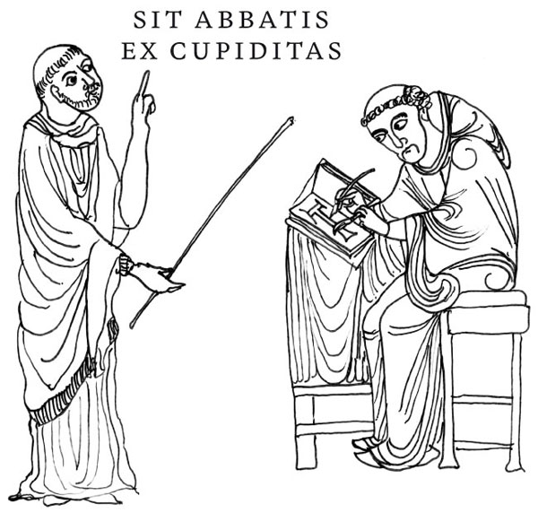
He is the abbot from Greece. Every monastery has its abbot, doesn’t it? This was my favorite presentation slide. It seems to capture much of what I remember life in Reading to have been like. Although, it has been awhile since I left…
The Passion of the young, non-Latin type designer
Since my reason for being at the conference this year was this presentation, I am writing about it first, even though it took place on the third and final day of the conference. My paper explained my experiences designing for the Devanagari script. This took place mostly as a student in Reading, but I have done a little at Linotype since then, too.
I don’t think that there is anything particularly special about my own methods; I work in a manner that designers have been using for decades. However, I do believe that I belong to a rather passionate generation. With the tools that we have available, we are able to work quickly, and test effectively. More than discussing multi-script typefaces, or even multi-script typeface design itself, I wanted to present on the passion that I feel for multi-script typefaces; a passion shared by many designers in my peer group. My talk was about typeface designers themselves, more than any other single topic.
Without going into too much of the content, I included work from four other Reading graduates in my slides. I think that looking at their example drives home my argument. Before presenting their work, I mentioned Fiona Ross’s influence in our education; I certainly wouldn’t have taken the same design path that I’ve chosen without her example, for instance. Perhaps we will see Fiona one day at a TYPO Berlin? I ended my talk with a few words on web fonts, which I think are as big a jump for type design as the transition from metal type to phototype was, or the change from photo to digital typesetting.
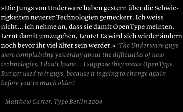
Since I have been living in Germany so long, I decided to present in German, instead of English. Although TYPO Berlin is quite an international event, I assume that the vast majority of attendees are either native German-speakers, or speak German as a second language. Although I’m not a German citizen, I’ve lived in the country for a number of the years. I’m a German designer—I think that this is clear—and deep inside, I just have the feeling that speaking in German at TYPO Berlin is the right thing to do. In the conference’s speaker room, Erik Spiekermann told me that this was the right decision. Although if he had heard my grammatical mistakes on stage, he might have changed his mind!
The decision to speak in German, right as it might have been, psyched the hell out of me way more than I expected. Combined with the nervousness of speaking at my absolute-favorite design event (in my new home city), I was an emotional wreck for the entire length of the conference. Several people have since asked me how my presentation went… I really don’t have an answer, since I wasn’t able to see it myself. No matter how it went down, I couldn’t help but have a bad feeling about it, and was rather depressed after the talk was over. But this feeling is normal, right?
To the gamut of friends who helped me prepare, I owe sincere thanks. Below is my list, which includes designers who provided me with material or other vital information:
- Jo De Baerdemaker
- David Březina
- Rob Keller
- Indra Kupferschmid
- Mathieu Réguer
- Dan Rhatigan
- Yvonne Schüttler
- Eben Sorkin
On June 21, 2010, I’ll be presenting “version 2.0” of this lecture at the first Type Talks conference in Brno. It will be bigger, better, in English, and with more confidence. I’ll also be subbing in an additional French type designer for one of the designers I presented in Berlin. So even if you were at TYPO Berlin, this is going to be worth a second viewing. Think of it at my “director’s cut.” I’m pleased to have the chance to reprise my talk, both because I think that the desire to improve things is an integral part of the design process, as well as because it gives more people a chance to hear these ideas. I had tough competition in Berlin, as I shared a time slot with Piet Schreuders. What a star! With choices like that, it means a lot to me that anyone came to hear my talk at all. A few hours after my talk had ended, I logged onto Twitter, and from my feed I could see that even many of the people that I follow seem to have chosen to attend Piet’s lecture. What can you do?
The best talks of the year (at least, from my rather subjective viewpoint)
While I did not attend nearly as many lectures at this year’s conference as I would have liked, there were a couple of great presentations that I was really happy to catch. The strongest talk that I had the pleasure to sit in one was Ivo Gabrowitsch’s “Goodbye Tristesse! Hello Web Fonts!” In the time alloted, Ivo summed up the entire history of font embedding online, as well as presenting the Web FontFont solution, as well as the other options available to web designers today. Yanone’s multimedia “Arabic for Beginners” was the best presentation on any single non-Latin script that I have ever seen at a design conference. Explaining both Arabic as a writing system as well as the design of his upcoming Latin/Arabic FF Amman typeface, Yanone dominated the stage with his excellent presence, which included something of a costume. Last but not least, Rob Keller’s “I ♥ India (& Why You Should Too)” covered everything you need to know about the past, present, and future of Indic type design, with a series of brilliant slides, as well as brilliant text (and display) typefaces.
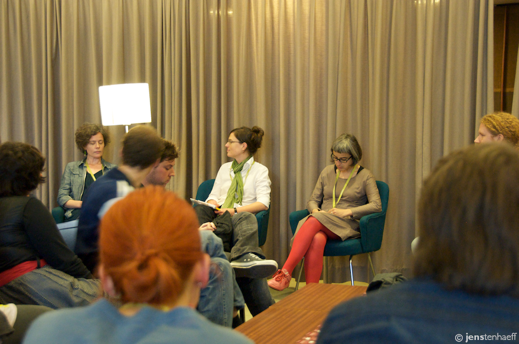
Photo: Jens Tanhaeff. The KABK and UoR panel discussion. From left to right: Veronika Burian MATD03, moderator Indra Kupferschmid, Laura Meseguer T]M04, and Dan Reynolds MATD08. Christoph Dunst T]M06.
KABK and Reading
On Friday afternoon, there was a brief panel discussion with two graduates each from the type]media program at KABK in The Hague and MATD at the University of Reading. This was held in English, and was quite a low-key affair, taking place in the swag TYPO Nest room. The panelists sat on upholstered chairs, and the attendees on large modernist sofas. The moderator, Indra Kupferschmid, led the four of us in a pleasant discussion for about an hour. We each talked about a few personal experiences, and related what expectations—if any—we had respectively had about the courses we attended. There were very few questions from the audience, most of whom already seemed quite familiar with both of the graduate programs.
Social media
It is with deep regret that, as was not the case in several of the previous years, I spent no time this year tweeting, facebooking, or blogging. I hope that the breadth and depth of this post makes up for a little of that. Here are a number of great links from this year’s TYPO Berlin coverage:
- The TYPO Berlin 2010 flickr group
- TYPO Berlin blog
- TYPO Berlin video blog
- Tweets with the tag “#typo10”
- Jürgen Siebert on tv.berlin’s Frühcafé
- Erik Spiekermann on the RBB Abendschau
- Slanted covers the conference
- Slanted on Jonathan Barnbrook
- Slanted on Erwin K. Bauer
- Slanted on Veronika Burian
- Slanted on David Carson
- Slaned on Candy Chang
- Slanted on Jan Chipchase
- Slanted on Fons Hickmann
- Slanted on Eike König
- Slanted on Alessio Leonardi
- Slanted on Yves Peters
- Slanted on Joachim Sauter
- Slanted on Carlos Segura
- Slanted on Julian Smith
Other things that must be mentioned
There were two unofficially organized parties this year. The first, on the night before the conference, was in the newly opened studio of Carrois Type Design and Adam Twardoch. This large beautiful space was formally a painter’s workshop, but you would not know it from the excellent renovation. During the party, we also had access to the building’s roof terrace. Although the night a rather foggy and the weather chilled, this offered an inviting view of Berlin’s Friedrichshain district. On Thursday night, Slanted hosted a heavy metal party to celebrate the release of their Blackletter-themed issue. Located in an underground bar in Mitte, this was the perfect occasion for me to untie my long, curly hair and get in-touch with my metal-loving self. Although I only stayed for about an hour, I though that this party had a great concept.
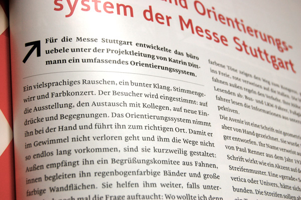
During the conference, Ralf Herrmann gave me a fresh copy of the second issue of TypoJournal. Ralf was in Berlin to present a paper on “Speed Reading—Traffic Sign Fonts,” which I was very disappointed to miss. The new issue of TypoJournal—which was on sale at the conference book store but is not yet available for online ordering—is devoted to wayfinding and legibility. Ralf had asked me to write a short article about my Malabar typeface, so when he handed me my author’s copy, I thumbed through it quickly to get to the end of the issue and see how my article looked. In my rush, he had to point out to me that the text throughout the entire issue was set in Malabar! Large headlines are set in the navigation typeface that was part of Ralf’s Diplomarbeit at the Bauhaus University in Weimar. His decision to use Malabar was quite a surprise, and honestly, one of the nicest surprises I have ever had as a designer. I cannot express my gratitude enough. More images and details about Malabar in TypoJournal will have to be covered in a future TypeOff. post.
The Typejockeys appeared in full-force again this year. A conference sponsor, all three members of the young, dynamic design studio made their way to Berlin from Vienna. The newest Typejockeys typeface—Aniuk from Thomas Gabriel—was officially launched via a fold-up poster/brochure that every attendee received in their conference bags. The Typejockeys brought a new t-shirt for me with them, too. Friends who complain that I only ever seem to wear the Typejockeys t-shirt that Michael Hochleitner gave me at TYPO Berlin last year are going to be in for a double dose of disappointment, I fear.
This year was the second year in a row that I spent the Sunday after the conference ended recuperating in the sun in Berlin’s Mauer Park. This is a nice tradition, and one of many things that I am already looking forward to during Typo Berlin 2011.
