Now that 2010 has begun, I can’t help but reminisce about the past 12 months. 2009 was good, personally and professionally … but can I measure it somehow? Was 2009 awesome, or am I just trying to convince myself of something? How does it all stack up to 2008?
Bedrooms and traveling
- 2008: Nine months in Reading, then three months working at Linotype in Bad Homburg. During these three months, I began commuting between Offenbach (near Bad Homburg) and Berlin.
- 2009: Twelve months of working at Linotype, including ten months commuting between Offenbach and Berlin, with stops in Darmstadt, too—where I taught from March–July and October–December. Since November, I’ve been living in Berlin full-time, with just one trip per week to Bad Homburg and Darmstadt.
- Winner: 2009. The MATD program kicked ass, but living in Berlin trumps living in Reading. Although, I spent more total hours in Reading during 2008 than I spent in Berlin during 2009.
Letter drawing
- 2008: About eight months of full-time typeface design (including ca. seven months of this at Reading).
- 2009: Just three months of close-to-full-time typeface design, scattered on various projects throughout the year.
- Winner: Well, it should be 2008. But 2009’s projects were interesting …
Now a good four seasons back, 2008 was certainly a good “year in type” for me. I spent nine months of it as an MATD student at the University of Reading. After I returned to Germany, I finished up the Latin weights of Martel/Malabar, before releasing them in 2009. On the professional side, January 2009 brought changes: the new year saw my move from Linotype’s old Product Marketing department into the font development group—allowing me to build fonts, rather than to classify and write about them. In 2009, I also started teaching type design at the Hochschule Darmstadt.
Personally, 2009 was more difficult. Through October 2009, I divided my week between two quite distant areas. I had a series of sub-optimal living arrangements in Offenbach, where I spent two or three nights per week, which was just no fun at all. But since November, things have been looking up, as I’ve been living full-time in Berlin.
Extra-curricular activities, large
- 2008: I attended two big conferences (TYPO-Berlin and ATypI St. Petersburg).
- 2009: I attended two big conferences (TYPO-Berlin and Typecon). Plus, I went to RoboThon, which might be considered a “big” conference now, too.
- Winner: 2009, since I was a speaker at TypeCon, not just an attendee. I might have had more fun at 2008’s conferences, though.
2010 looks like it is going to a good “big conference” year already, since I’m already on the speaker list for TYPO-Berlin (first time!). Plus, I can’t imagine how ATypI Dublin could suck.
Extra-curricular activities, small
- 2008: Not very many Typostammtische attended.
- 2009: A whole lot of Typostammtische attended! Including Typostammtische in Berlin, Cologne, Offenbach, and Saarbrücken.
- Winner: 2009, hands down!
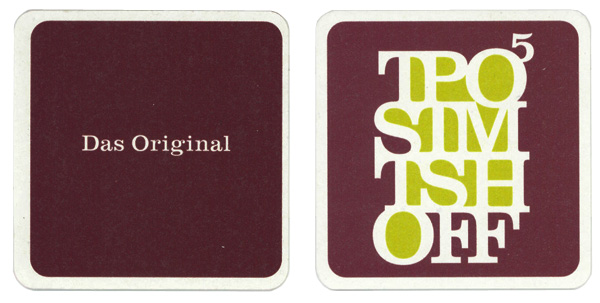
The Saarbrücken Typostammtisch was new this year, and I think that I attended three of them (already, my memory is getting hazy…). The original Typostammtisch, in Offenbach, celebrated its fifth-anniversary in 2009. How sweet is that?
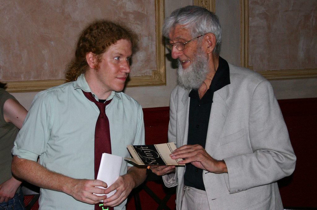
Photo: Florian Hardwig; lots more Berlin Typostammtisch images are on Flickr. At the August 2009 Berlin TST, with Karl-Heinz Lange; he’s about to sign my first edition copy of his book, Schrift: schreiben, zeichnen, konstruieren, schneiden, malen. Last summer, Karl-Heinz Lange celebrated his 80th birthday. He was a significant letterer and type designer in the former German Democratic Republic, and is still active. While the talk at this TST was billed as his last-ever lecture, I hope very much that this is a promise that he will break. For more information on him, as well as on his work, read the fantastic interview at PingMag.
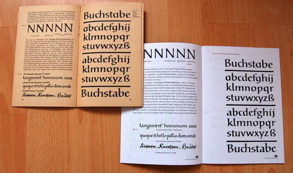
Above, the first edition of Karl-Heinz Lange’s Schrift: Schreiben, Zechen, Malen, Konstruieren, Schneiden. Leipzig: VEB A. Seemann, Buch- und Kunstverlag (1965). Below, a recent reprint in primetype’s brochure Schriftmuster: Karl-Heinz Lange Collection. Edition primetype. The original is printed on what Lange called, “real GDR paper!” The book is slowly disintegrating. Primetype’s reprint in on a much brighter page, with a glossy surface. The primetype edition has also been reset in one of Lange’s own typefaces, whereas the original used a more stock selection. When the first was published, I don’t think that any of Lange’s typeface designs had yet been released.
Two additional Berlin Typostammtische stand out in my 2009 memories … namely, the first and the last meetings. In January, Berlin TST organizer Ivo Gabrowitsch staged a Pecha Kucha round. Nine guests, including myself, gave short presentations. We were each limited to 20 slides. Ivo’s computer would automatically switch slides every 20 seconds, giving us a total of around six minutes to entertainingly cover our themes. The last Berlin TST of the year was one that I almost missed… I took a fast train from Hamburg just to make it on time. For this evening, Jan Middendorp and Florian Hardwig organized a TypoQuiz. Luck put me in an unbeatable team, together with Ivo, Klaus Rähm, and Burckhart Seifert. We advanced to the final round, where I had to go on stage for a one-on-one showdown with our rival team’s champion, Jens Kutilek! Jens put up a good fight, keeping me in a cold sweat the whole time. Only luck kept my score up in the end, allowing me to win 5–4.
Extra-curricular activities, vacations
- 2008: Zero.
- 2009: Three very short ones (to Denmark, France, and the US).
- Winner: There is no winner! Not until I take a real vacation … whenever that’ll happen.
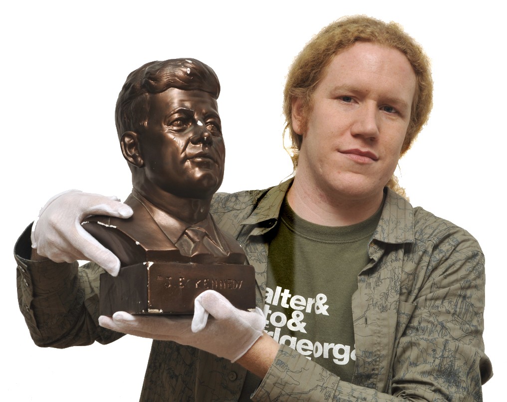
In December, I turned 30. In the months leading up to my birthday, I suffered a severe quarter-life crisis. As the day itself rolled around, normality set back in again, and I came to terms with my calendar. As a birthday gift, Indra Kupferschmid, Rob Keller, and Sonja Keller adopted a bust of of John F. Kennedy at Berlin’s Museum der Dinge in my name. We are both Berliners now. Note both that the JFK bust has lettering on it, and that my Museum der Dinge white gloves are a bit unsized.
I guess that 2009 tops 2008, at least according to the five unscientific metrics used above. Here are some of my type highlights from 2009 …
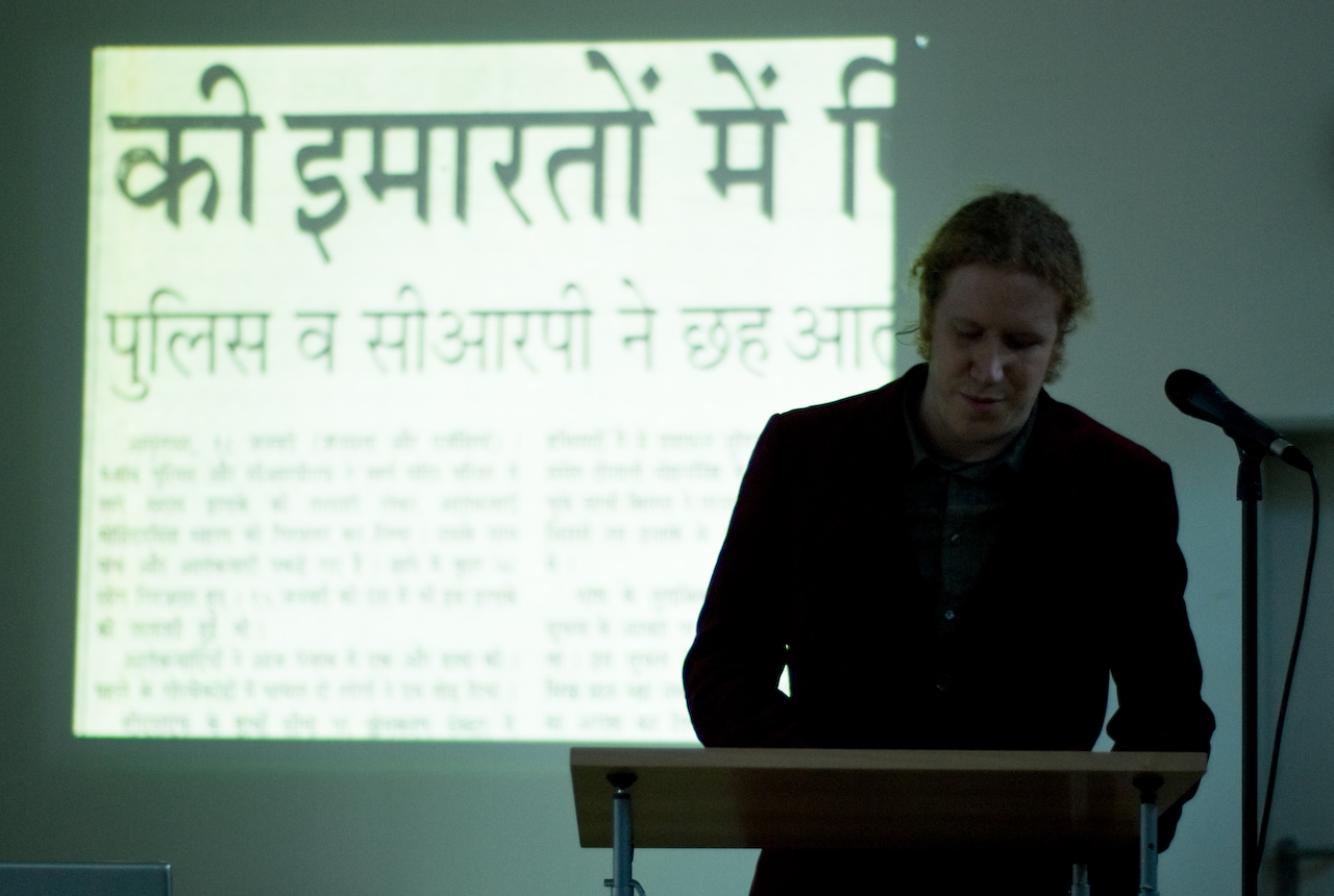
Photo: Yvonne Schüttler, Flickr. From 5 Uhr T at the AVA Frankfurt. The slide shows an image of a 1987 newspaper set in Linotype Devanagari.
Presentations
During 2009, I spoke publicly about my work several times. The first was in February, at the AVA Frankfurt. This was part of their 5 Uhr T lecture series, which also included an excellent lecture by Ralf de Jong (Lars Harmsen’s lecture may have been awesome, too, but I was not able to attend). In March and April, I visited Paris twice. First for a workshop with Franck Jalleau and Jean-Baptiste Levée at the École Estienne, and then later for Linotype’s Platinum Paris lecture evening at the Institut du Patrimoine. In July, I gave a brief talk about Indian newspaper typography at TypeCon in Atlanta. And I wrapped the year up with a lecture and workshop at HBKsaar, again on newspaper typography.
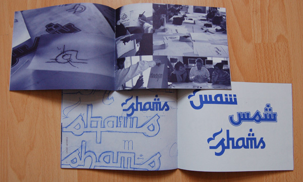
After our workshop at the École Estienne, Jean-Baptiste designed this small brochure, which was printed on the university’s presses. Quite an honor, this brochure displays a single day’s work more lavishly than any other presentation I’ve yet seen. JBL set the brochure with Linotype typefaces, but in a way I’d never seen them used before. Also, he selected excellent paper. The stock is a rather rough surface, not shiny or corporate at all.
Writing
On the whole, I’m sure that I wrote less in 2009 than I did in 2008, given all of the research I had to undertake in Reading. But I did put a few things together at the beginning of last year. The first was an article for Slanted #7, “Geometric type and where it comes from.” The whole issue was devoted to geometric typefaces and letters. I’m a bit surprised that I haven’t received any feedback to date on that text, since among other things, I implied that Ed Benguiat was a better designer than Herbert Bayer. Surely, there are people who think otherwise? 2009 also saw the relaunching of Stephen Coles’s Typographica, one of the last decade’s most significant typography websites. In their “Typefaces of 2008” feature, I wrote about Tom Grace’s Givry.
My favorite typeface releases
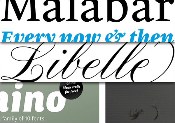
Aside from the release of my Malabar family, which I have written about often enough, I played a small role in bringing two other typefaces to market, and am quite proud of the little bit I was able to do. These are Libelle, from Jovica Veljovic, and Neue Swift, from Gerard Unger. Also at Linotype, November saw the launch of the ITC Chino microsite. While I had nothing to do with this typeface family or with its launch, I think that this microsite is well worth an other mention. As far as I am concerned, it is simply the most beautiful thing Linotype has ever put into electronic media. At least I got to share a building with the cool people who made it happen.
Awards
2009 was a year of significant personal recognition for me. It all got to be a bit silly. My Malabar received three awards: first, a Certificate of Excellence in Type Design from the Type Directors Club, then a Silver Award at the ED-Awards 2009 competition, and finally the Design Prize of the Federal Republic of Germany, in Gold. Malabar, as well as several of my earlier typeface designs (including some never-released ones … ) appeared in the Typodarium 2009 desk calendar. Since I burned up all of my ammunition with that, I only have one page in the 2010 Typodarium … Malabar Heavy Italic appears on December 4th.
In the Spring, TYPO published its yearly article on the MATD Reading typefaces, in issue 35. At the time, this was still only the second time that Malabar had been seen in offset print. I enjoyed the article, naturally; and as I’d been reading TYPO articles off-and-on for years, I finally became a magazine subscriber with issue 36. During the summer, a short online interview with me (in German) was published at ABCdarium.
Noteworthy peeps
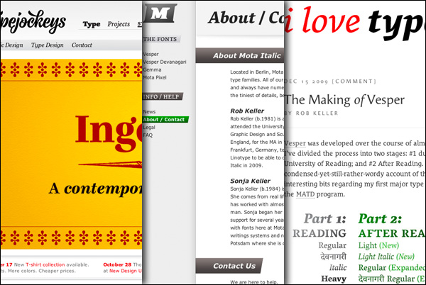
Two good friends made tremendous strides in 2009, establishing their own foundries. In fact, they did such a good job in presenting themselves that they put a lot of the big boys to shame! I’m writing, of course, about the Typejockeys and Mota Italic. But their awesomeness was not limited to these websites. The Typejockeys printed up an enviable flyer, which they distributed at TYPO-Berlin. I must admit that I am quite a fan of their t-shirts. Mota Italic’s webshop implements the most intuitive font licensing interface to date. And Rob Keller’s article, “The Making of Vesper” at I Love Typography is a successful example of how to market a new typeface family to a broad blog audience.
What would excite me above little else for 2010? More typefaces from Mota Italic, for starters. But I am also itching to see the successful launch of the upcoming French typefoundry B.A.T. (le Bureau des Affaires Typographiques).
Offline social networking
Another significant 2009 item was Indra Kupferschmid’s idea to start the Type Meet-Ups Calendar. This has made it easier than ever before to decided what to go to, where, and when. While I realize that not everyone buys a BahnCard 100 and zips around the country from one typographic thing to another, I certainly do recommend it! Since moving to Berlin, I’ve noticed another benefit of this … namely, that people come here all the time! I don’t think this happens to designers everywhere. Hence the whole, “which city is the world’s capital of type?” discussion that cropped up on Twitter in December…
Books
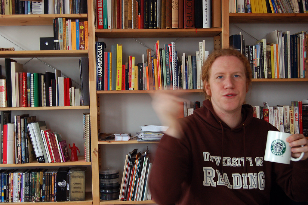
I hope my readers will forgive me, but I don’t really buy many typeface licenses (in 2009, I only licensed FF Trixie HD and Axel). Instead, I buy a lot of books. Mostly, these books are about typefaces. In November, after I moved into my new apartment, I was finally reunited with all of the possessions that I had stored elsewhere in Germany over the past two and a half years. This meant that my “library” could be restored! Since packing everything up in Wiesbaden in mid-2007, I had acquired quite a few more type volumes. But the bookshelves in my new digs gave me reason enough to close out the year by adding lots of new titles.
My most noteworthy acquisitions of 2009 were:
- Naik, Bapurao S., Typography of Devanagari, three-volume edition. Bombay: Directorate of Languages (1971). This is a must-have for any Devanagari typeface designer. Unfortunately, it is very difficult to find. Kudos to David Brezina, who gave me the heads up on the sale!
- Middendorp, Jan and Erik Spiekermann, Made with FontFont. Amsterdam: BIS Publishers (2006), and Bartlett, Edward E. and William Dana Orcutt, The Manual of Linotype Typography. Norwood, Mass.: Plimpton Press (1923). I bought both of these books in August. I finally got the great MwFF due to a most-excellent sale that I read about on FontBlog. TMoLT is quite easy to get. Interestingly, the two books have very much in common. Sure, they were printed 80-years apart, but they have similar sizes, they’re both multi-color, and they were both created by foundries to show off how well their products work, as well as function of how well proper typography can look.
- On a visit to Linotype, Monotype’s Dan Rhatigan brought over a copy of Banham, Rob and Fiona Ross (ed.), Non-Latin Typefaces at St Bride Library, London and Department of Typography & Graphic Communication, University of Reading. London: St Bride Library (2008). Here’s a link for readers who want to purchase their own copies: St Bride Library Bookstore.
- In Indra Kupferschmid’s library, I saw the Dutch-language, original edition of Gerard Unger’s Terwijl je leest (Amsterdam: De Buitenkant [1997]). I’ve had a copy of the new English-language version of While You’re Reading since before I left for Reading (New York: Mark Batty Publisher [2007]. But the original is so infinitely better designed … I couldn’t believe it. I cannot read Dutch, but shortly after buying this, I also got a copy of the new Letterfontein, also in Dutch (Pohlen Joep, Letterfontein: over drukletters. Roermond: Uitgeverij Fontana [2009]). So maybe I should start learning…
- Morison, Stanley (ed.), The Fleuron, number five. London: Cambridge University Press (1926), and Meynell, Francis and Herbert Simon, Fleuron Anthology. London: Ernest Ben Limited (1973). I started my Fleuron collection with these two books. Number five is my favorite of the set, and the anthology contains many of the journal’s best articles. Reading these got me on a Stanley Morison kick that later led me to buy Politics and Script (Oxford University Press [2000]).
2010? Now what will that be like? Since I ended my list with books by Mr Morison, I’ll leave you with my favorite 2009 quote from Typophile … Victor Curran citing Fine Print quoting Paul Rand on Stanley Morison:
I once had the pleasure of meeting him at the Garrick Club in London. He was sort of like the Pope. He sat there in a black suit with a little white collar, just like a priest. I decided, this is too much. I started to drink and I haven’t the faintest idea what he was talking about for about two hours.
Now there’s a New Year’s resolution if I’ve ever seen one. Happy 2010!
