Rob and Sonja Keller like to do things differently. For years, Rob Keller’s personal blog, youshouldliketypetoo, has followed the beat of its own drummer. The layout, color scheme, and navigation system do not look like those of a standard weblog, whether one thinks of the online typorati landscape or not. The Kellers’ first joint publication, TypeNews.net, also has its own look and quirks; I don’t see any stylistic resemblance to other popular type information sites, like iLT, TypeDaily, Typographica, or Typophile. Now the Keller duo has officially entered the type business with its own site: Mota Italic. This is not some light WordPress blog + selling via MyFonts operation; the Kellers built the Mota Italic site from the ground up. The shop offers its own means of displaying fonts, and (much better than that, in my opinion) its own e-commerce system! Mota Italic’s buy page is one of the most ingenious solutions for selecting, comparing, and purchasing font licenses that I have ever seen.

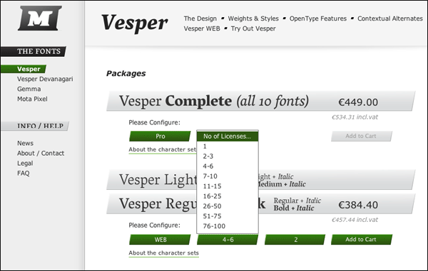
The Mota Italic shopping cart lets you intuitively select and compare various sort of licenses, as well as the number of users for the fonts. For web licensing, there is also a field for the number of URLs.
Mota Italic kindly sent me a press release with oodles of information about their site. Usually, I hate to republish these sorts of things, because so many people out there in type land think that blogs like mine are just additional channels by which they can speak to potential customers. But, well… how can I put this? The launch is Mota Italic is just more newsworthy than most of the mail I get.
So, without further ado, here is some o-tone Mota Italic text:
We are pleased to announce the opening of the new typefoundry Mota Italic.
Founded by Rob and Sonja Keller, Mota Italic is based in Berlin, Germany. The foundry strives to provide beautiful, feature-rich typefaces with wide language and OpenType feature support. Mota Italic is committed to producing fonts for a variety of scripts and writing systems always using the latest font tools and techniques.
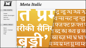
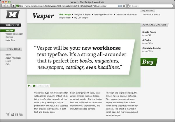
The first major release, Vesper, is a contemporary serif family in 10 styles. There are 5 weights, light through heavy, and all have matching italics. Great for setting large amounts of text at small sizes, Vesper is comfortable to read while still being distinctive and interesting at large sizes. Vesper supports over 88 Latin-based languages and also the Devanagari script – including specific stylistic alternates for the Hindi, Marathi, and Nepall languages. The fonts contain many sophisticated and useful OpenType features such as small and petite caps, case forms, superiors and inferiors, fractions, and more. As an added bonus, there are over 100 contextual alternates to subtly shift and smooth out text. These delicate improvements help improve legibility and reading comfort by making the individual words and letters easier to identify. The rhythm of the text is becomes smoother by closing in large gaps and avoiding unsightly dark sports from serif clashings.
Also available is the free family Mota Pixel. This two weight family, with Regular and Bold, is a significantly larger-than-average pixel font. Optimized for use at 20px, it is legible and fun to use. Just as with Vesper, there is wide language support and a whole host of extra OpenType features. Mota Pixel contains small caps, petite caps, and unicase alphabets – all with full linguistic support. It is covered by the SIL Open Font License and therefor is extremely open and flexible in what you can do with it. Among many other things, feel free to use Mota Pixel on your website with CSS’s @font-face declaration! There are many possibilities to play and experiment with this free font family!
Mota Italic is committed to being customer-orientated and therefor we have some rather special license agreement terms and WEB Fonts policies – extremely unique for the current state of the type industry. Our standard license has many flexible points to it, including: installing the fonts on your primary computer and also a laptop for out-of-office use, you can make modifications to the fonts for personal use, and you can re-download the fonts as often as you need through your account at motaitalic.com.
Our (commercial) fonts come in three varieties: Pro, Basic, and WEB. Pro is the full character set and always contains many advanced OpenType features. The Basic character set follows our wide language support policy and also supports the same languages as in the Pros. Basic however does not include all the extra OpenType typographic goodies. Mota Italic’s WEB Fonts are extremely unique packages. They are fonts have the Basic’s character set but are designed especially for web use and they have additional usage rights beyond those for the Pro and Basic fonts.
Mota Italic’s WEB Fonts are a whole package of several fonts together. Customers receive two sets of fonts: WEB Fonts for online use and also Basic fonts for offline use. The Basic fonts are covered by the regular license and are great for creating mock-ups, images, or any other marketing materials that go along with a website. The WEB Fonts are for a number of online implementations, such as: @font-face, sIFR, Cufón, Typeface.js, and Flash. They have been subsetted into multiple fonts for quicker download times depending on the required languge support. Lining and old-style numerals are provided and it is possible to specify which variety should display on your webpage! The WEB Fonts are currently .TTF files and will soon also ship with pre-made EOT and WOFF font files for added browser support. Early adopters will receive these as free updates – upgrades are always be included for free for all fonts.
More information about the products and services can be found at http://www.motaitalic.com.
Mota Italic must invariably be offering some introductory sale or other such thing. For all of their details to this sort of thing, the best thing to do is to start following them on Twitter @motaitalic.
