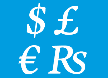
Over the last few days, discussion has begun about how a new Indian rupee currency symbol could be designed.
The operative word, of course, is new. The Indian rupee already has a symbol, U+208A. The symbol is some sort of combination of a capital R and a lowercase s. Granted, this already-existing symbol does bring a number of complicated issues to typeface designers, and anyone setting type. Many of the common international currency symbols (dollar, euro, pound sterling, yen, etc.) are often designed in typefaces so that they take up the same amount of space as an average figure’s width. Some typefaces offer multiple figure widths (tabular figures, proportional figures), and some of these typefaces also have matching multiple versions of each currency symbol. Trying to fit two letters, one of which is a capital, into the space of a single digit is tough.
India is on the search for a replacement. You can read more about that in this article on the BBC News website, or in this other article on the BBC News website. You can also hear a BBC reporter talk about the issue with Erik Spiekermann.
I think that, as difficult as is it, a replacement for the current rupee symbol is a good idea. Not just from my typeface designer point of view, but also because the current symbol is difficult to write.

Left, the current rupee symbol written with a separate R and s. Middle, the R and the botton of the s and one “movement,” the top of the s as a separate one. Right, the current rupee symbol with the tail of the R and the entire s as one movement of the hand.
In many typefaces, the R and the s in the current rupee currency symbol are ligated. This is a perplexing form to actually try to write with your hand. Do you write the tail of the R and the whole s together? If you do, is you s going to look like an s anymore? Compare the s on the very left with the s on the very right in the image above.
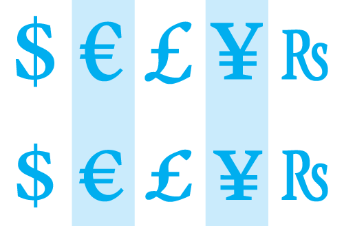
While I was as Reading, I designed a multi-script typeface named Martel. Martel had character sets for both the Latin and the Devanagari script. Since the brief of my typeface had to do with India, a rupee currency symbol was necessary. In the end, though, I drew four different rupees. In the image above, you can see the sacrifices that I made to get the R and the s to fit in the same space as the other currency figures in the tabular width option. Not only did I shrink the letters down, I also condensed them quite a bit.
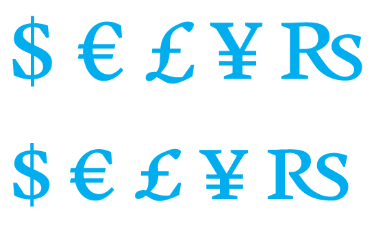
The same sacrifices needn’t be made for proportionally-spaced glyphs, as these can be as narrow or wide as need be.
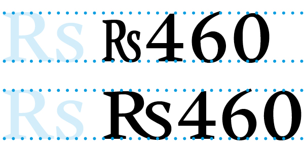
Above, Martel’s two lining figure options for the rupee. On the top is the tabular currency symbol together with three tabular figures. All glyphs on the bottom line are proportionally-spaced.
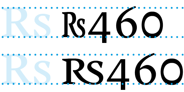
Above, Martel’s two oldstyle figrue figure options for the rupee. On the top is the tabular currency symbol together with three tabular figures. All glyphs on the bottom line are proportionally-spaced.
One gets the feeling that all of this has happend before, and that all this will happen again. A few years ago, type designers all around the world updated their old fonts to include the euro currency symbol. The EU’s powers that be had actually supplied them with a logo, not a spec. But designer did the right thing, as FontShop’s Jürgen Siebert reports in this classic article (Jürgen was also interviewed by the BBC in the first of the articles I link to above). I have heard for some time now that the Russians are looking for a rouble currency symbol, too. With both India and Russia end up with alternates of the latin capital R? Or will the Russians settle for something based on the P, and the Indians for some sort of cultural icon?
More about all of this in German on the FontBlog.