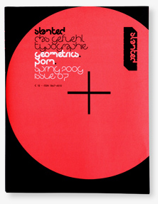
The newest issue of Slanted, the über-typography magazine from Karlsruhe, Germany, is now out. This is their seventh issue, and the first of 2009. Three more are planned to be released before Christmas, making this their year, hands down.
Slanted can better be described as a phenomenon, rather than any specific thing. Begun as a German language type blog (which is still running at slanted.de), the studio behind the brand also has their own type foundry and book projects. At some point, a print magazine spun off from all of this synergy, and I’ve been a semi-regular contributor to the printed Slanted since the early days.
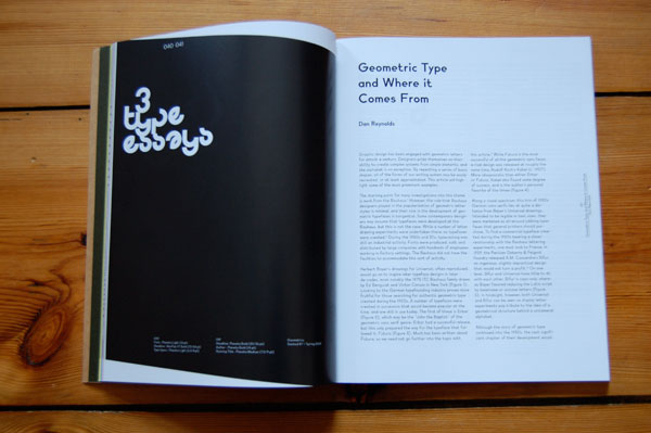
Issue seven has the theme “Geometrics.Porn.,” and I wrote an article about German geometric type and lettering from the 1920s, and its revival since the 1970s: “Geometric Type and Where it Comes From.”
Despite the popularity associated with it, geometric type doesn’t stem from the Bauhaus at all, despite the popularity a number of geometric lettering experiments experienced in later decades.
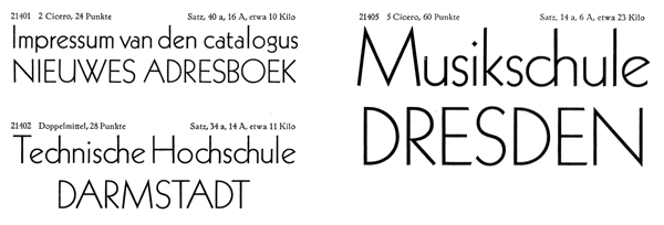
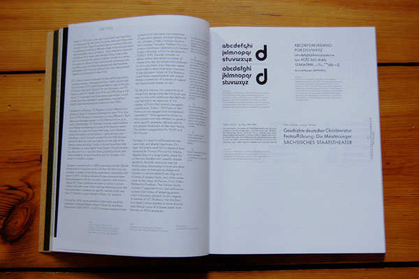
The article’s images include sample comparisons of several contemporary digital fonts, as well as scans from older specimen books, like this image from a 1930s Klinsgpor foundry booklet for the Kabel typeface.
Here’s the low-down on the issue itself
“Geometrics” deals with type and design that is based on basic geometric forms like square, circle and triangle.The first magazine section illuminates this topic by portraits, type essays and photo series. The categories Fontlabels, Fonts & Families, Fontnames Illustrated and Typolyrics present contemporary typefaces and designers. With contributions of Emil Kozak, Non-Format, Dan Reynolds, Florian Walzel, Ian Moore, Taro Hirano, Dirk Altenkirch and many more. The second magazine section offers interviews with Ed Benguiat, John Collins and Jan Middendorp, geometric works and projects (among others Hort, Benoit Lemoine, Labour, Mind Design) as well as the category Studienplatz that presents (final) work by students. The third magazine section connects the magazine with our weblog, www.slanted.de. Here you can find discussions regarding entries and archives of fonts, books and magazines that have been presented on the weblog. Furthermore the book/magazine shop’s do you read me?! and Soda show their current favorite publications.
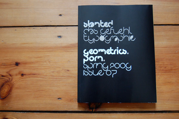
Slanted #7 comes with some novelties: Hubert Jocham, Typedesigner, is going to design an exclusive headline font for the next 4 issues that will deal with the particular topic – our readers can download it for free. NeoPop S7 is the first font released in this series. It decorates the cover of “Geometrics.” The cover itself is a folded poster that covers the binding. There will be a series of 4 posters until the end of the year, that forms a 4-word-sentence. PORN is the beginning—because we see a connection between the mostly fat, visually strong geometric material and the drive to show visual lust.
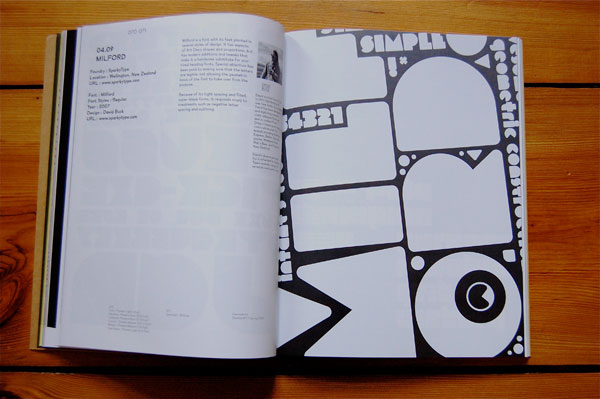
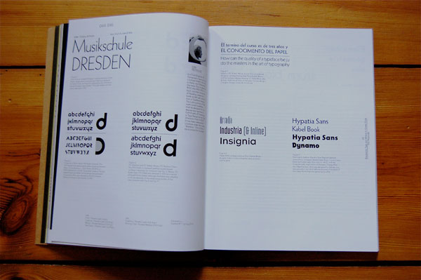
The issue includes a number of great type samples, like this one from SparkyType in New Zealand.
Facts
Slanted Magazine #7
“Geometrics.Porn.”
Spring 2009
196 pages
12 Euro
Available via
Paypal / national & international
Amazon.de
Stores
Subscriptions / national & international
Keep your eyes peeled. More issue will hit the market in June, September, and December 2009.