As I mentioned recently, I’m worn down by “best font of the year” lists. Since I crave recaps of another sort, I decided to write one of my own: behold the TypeOff. 2008 Year in Review! Of course, the following article represent my completely subjective view of the past year’s events. But, hey… what else would you expect?
The following are 12 events over this past year that have moved me to comment, on this site or elsewhere…
Number One
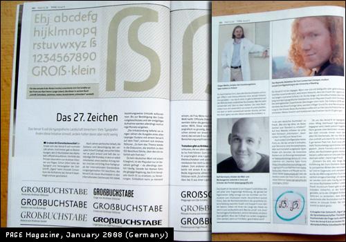
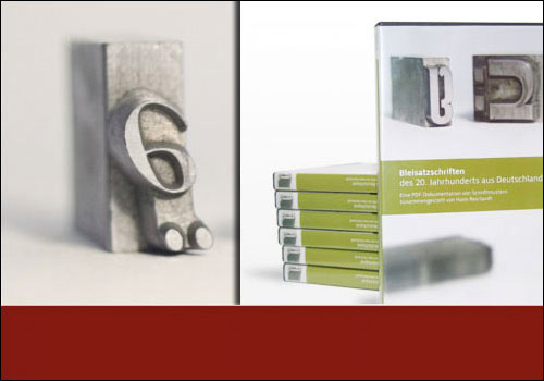
Unicode gives the uppercase-ß a code point. Deep sigh of sadness. What else do I have to say about the cap-ß? Read the TypeOff. POV from January 3, 2008. Or, get your hands on the January 2008 issue of the German design magazine PAGE, where the pros and cons of the letter are covered in depth (pictured above).
Number Two
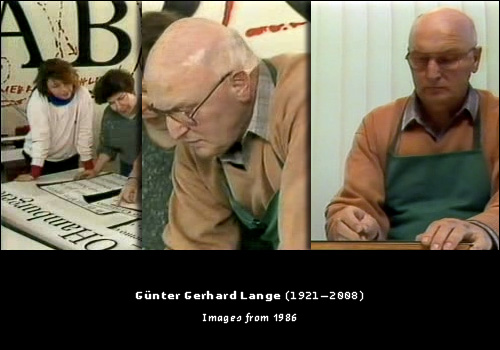
Toward the end of the year, Günter Gerhard Lange passed away. More from my archives, FontBlog, and FontFeed. Thanks to the Internet, it will be easier than ever to remember him for years to come. For instance, there are his appearances in the 1986 video (in German) on type production at Berthold (more…). Don’t forget his 1996 TYPO Berlin presentation—Die Inszenierung einer Botschaft in der Fläche—that may still be viewed online, too.
What was my favorite GGL quote? Definitely this:
Schrift ist nicht alles, denn Schrift ohne Anwendung ist wie eine Blume ohne Duft, ist wie eine ungekorkte Flasche und ein ungeküßtes Mädchen. – Günter Gerhard Lange (1996)
I translated that as, “type is not everything, because type without an application is like a flower without aroma, an uncorked bottle and a girl who has never been kissed.”
Number Three
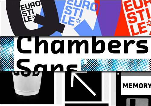
Many awesome new typefaces were released in 2008. Like I’ve said, I’m not a super big font list fan. But I did cover the release of three great families on TypeOff. this past year: Eurostile Next, FF Chambers Sans, and FF Utility. Have a look at them again!
Number Four
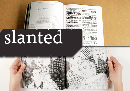
The German design powerhouse from Karlsruhe that keeps changing their company name published two new issues of Slanted (issue 5 and issue 6). Even better news: four more issues are to come in 2009.
Number Five
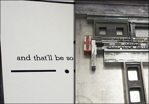
The Helvetica film? So 2007. 2008 saw the world’s first letterpress music video! Read the TypeOff. announcement here.
Number Six
Is it just me, or was 2007 filled with more conferences than 2008? No matter, the ’08 events delivered quite a bang for their buck. I was at TYPO-Berlin and the ATypI conference, my fifth time in a row about each. Maybe fatigue is setting in, because I did not write up any recollections about either of them. Other past conferences worth noting were TypeCon in Buffalo and a small type design exhibition/symposium in Offenbach’s Klingspor Museum. I didn’t make it to either of those, but word on the ground says that they were good. Another conference I missed out on was a meeting on Arabic type in the Netherlands. No matter; those talks are online for all too see.
Number Seven
In 2008, Hans Reichardt and spatium Magazin release brilliant DVD collections of scanned-in old type specimen and catalogs. Volume 1 is already sold out. Order Volume 2 while you still can.
Number Eight
As has come to be expected, brilliant typefaces continue to pour forth from KABK and Reading. See more of those great Reading examples at the new David Březina über-site.
Number Nine
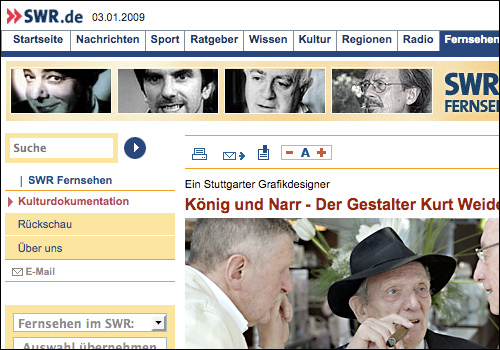
German television, which I normally cannot recommend, won a few more points with me in 2008. This was especially soothing after returning from my year in the UK, where they have such excellent programs. The light at the end of the tunnel is of course the Kurt Weidemann documentary that was aired. More information may be found on the website of the German SWR channel. The film includes memorable quotes along the lines of “I would only agree to design another typeface if I were sentenced to a five-year term in prison!”
Number Ten
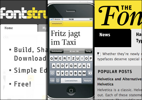
2008 may also be remembered as the year that FontShop just didn’t stop. First, they released FontStruct, a little web thing where you can make your own fonts with the help of simple tools. According to del.icio.us, I hear that this was the third most linked to website of 2008. In the whole world. I want to cry.
Later in the year, they released the significantly more cool FontShuffle (cause, you know, FontStruct isn’t an iPhone app). I commented on this great app here and here.
Not to be forgotten—and a great segway into my next point—is the FontFeed, an amalgamation of all the FontShop bloggers.
Number Eleven
Last year should be remembered most of all as the year when good type blogging got even better. The year began (and continues) with the indescribable, meteoric rise of ILoveTypography, which seems to have more readers than I even know how to imagine. But iLT doesn’t cover the whole typographic landscape. 2008 showed how well two heavyweights could blog as well, specifically James Mosley and Hoefler & Frere-Jones.
More personally blogging highlights of 2008 include:
Not to be forgotten is the the Ministry of Type, and Simon Daniels at Microsoft Typography, who seems to have been doing this the longest, making him the unsung hero of the Typorati.
Number Twelve
Although it came about before 2008, I’ll remember this past year as the year when Twitter took off and supplanted Facebook as the English-language type-talk medium of choice. Maybe the FontBlog will get the Germans over there by 2010, too? I don’t think that I’ve published my Twitter feed yet. Anyone who wants to follow me on Twitter may do that via http://www.twitter.com/typeoff
So, that’s it for 2008! It was quite a year. I’m looking forward to 2009. I think that the year will see great changes, both for me personally and for type generally. And I don’t mean “change” in the Obama-way (although some of that would be good for the world, too). But I’m young and optimistic enought to still think that any change is good change.
Good luck, everybody!
