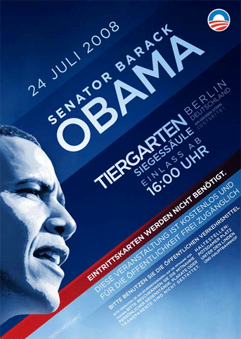
Barack Obama will be speaking in Berlin on Thursday, and a marvellous poster announcing the event is making the rounds. Actually, when I look at the poster’s design, I really don’t understand what the deal with the letterspacing is… “Senator Barack Obama” looks just fine. But “Tiergarten” is spaced way too tightly in comparison. What’s up with that? However, these inconsistencies do not bother me. Just as I’m willing to overlook a few inconsistencies in many a politician (don’t you have to if you want to be able to support anyone?), I’m OK with this poster. The heart of its design is in the right place. It’s direct, and the Gotham typeface looks great no matter what you do to it. Luck would have it that I’ll be in Berlin on Thursday, too. Would I miss Barack Obama’s only pre-election European appearance? No, I wouldn’t… no matter what the posters might look like.
Via FontBlog.