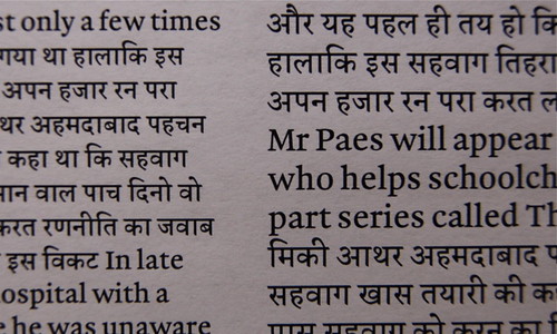
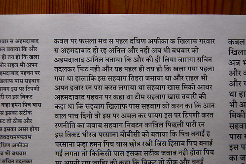
My practical brief in Reading calls for a typeface family with a Latin and Devanagari component. I’ve certainly spent more time to date on the Latin so far. I try to justify this to myself by remembering that my brief also calls for italic and bold companions for the Latin’s regular, while the Devanagari will not have other variants. However, the Devanagari component does require quite a hefty character set.
My typeface’s genre is an oldstyle one, sort of baroque-ish. When I started sketching for Gerard in November, I was looking at a lot of reproductions of texts printed with Van den Keere type. I don’t think that my letters look Van den Keere-y at all now, but I wanted them to sparkle in the same way. My capitals are a different animal altogether, I drew them to harmonize with the lowercase, but they aren’t really baroque at all, I think. Their proportions are not right for that. In the photo above, you can only see three of them; I’ll keep them hidden that way for the time being.
I also wanted to draw an oldstyle Latin because I like the diagonal stress axis that runs through its letterforms. Traditional calligraphic-style Devanagari faces also have diagonal stress, although the axis runs in the opposite direction. Still I figured that if I picked a “pen angle” for the Latin that was in a similar vein as the Devanagari, I’d be halfway along the route to creating some nice sort of familiarity.
After not working on my Devanagari for almost four weeks, I’ve spent most of the past two days immersed in it again. So far, the character set only contains about 40-odd glyphs, which I suspect is less than ten percent of what I’ll need; I still don’t have a defined standard to work from yet. Of the 40 or so glyphs, I can’t say that I’m happy with more than half of them yet. So I’m sure that my core glyphs will still go through a number of changes as the character set expands.
How many weeks do I have left? I think I’m still in double-digit territory…

