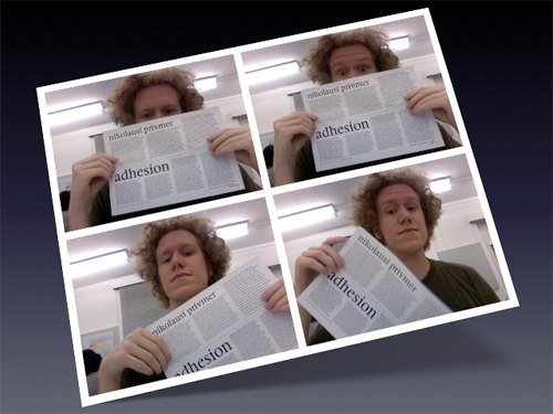
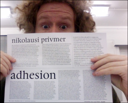
Outside, it is raining. But this is England, and mentioning this sort of weather is akin to saying that “the ice in the soda is cold.” No matter; inside, the typography is hot! This week marks the third visit that Gerard Unger has made to the department since we began in October. By now, we are all experimenting with possibilities of how our typefaces might actually look, or at least what form we think that the letters a d h e s i o n should take. Maybe. The process is certainly something you’ve heard of before. But my days tend to run along like this:
- First, I make a print out. Lots of text in various sizes. Short of like what you see in the picture above.
- I look at the letters, and mark some comments to myself.
- Someone else, preferably an instructor, looks at my text, and makes comments about what is terrible. Well, all of it is terrible, but some letters are less terrible than others.
- I make a few small changes.
- I print out another text document.
- I see that a few of my changes are slight improvements over the previous versions, but also that some have mutated other letters into monstrosities even more horrible than what I had before.
- I go back to the first step in this list, and repeat.
How are the thin strokes of my letters looking? I think they are coming along…they should be right by June. Maybe May. So far I’ve still just 15 lowercase characters. About 14 of them need a lot of work, I’d wager.
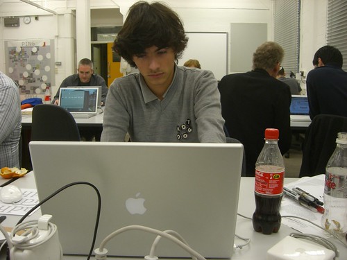
Mathieu Réguer, putting the “F” into French typeface design. Notice the bottles of Coca-Cola. These feed his productivity the way that electricity powers his MacBook Pro.
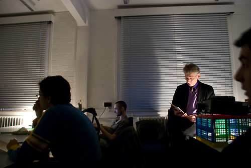
Gerard reads from his notes during a lecture on Dwiggins. Photo by Yvonne Schüttler.
On afternoons when he is here, Gerard often presents lectures on various stages in the history of typeface design. On Tuesday, he delved into W.A. Dwiggins’ work. The lecture was aided by a collection of various books designed by Dwiggins, most of which I believe are from Gerry’s collection.
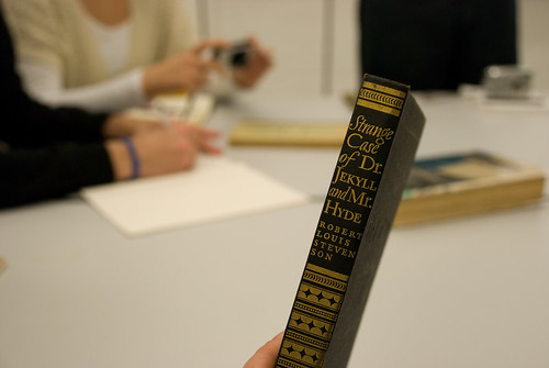
The Strange Case of Dr. Jekyll and Mr. Hyde, design by W.A. Dwiggins. Photo by Yvonne Schüttler.