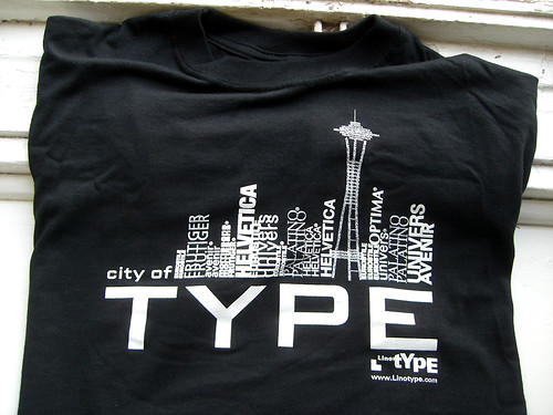
I wasn’t at TypeCon in Seattle this year, but at least my typeface was. Above is this year’s Linotype shirt for the conference, which I did not have a hand in making. The text “city of TYPE,” as well as some of the skyline elements, is set in Morris Sans. Hopefully, a few prominent Seattle landmarks are visible in the design. The letters however, are clearly more important, especially that big “TYPE” ;)

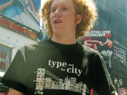
Photo from Times Square, 2005.
The Seattle design isn’t the first Linotype t-shirt with this sort of motif. There are also similar examples from New York and Dubai. Above is a photo of the NYC “type and the city” example, from TypeCon 2005.
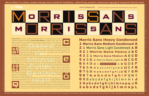
We also put three typefaces into this year’s SoTA Type Gallery, one of which was Morris Sans. I didn’t make the specimen shown above, but I quite like it!

