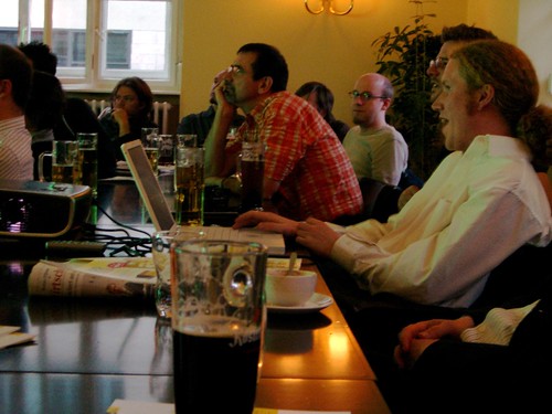
Berlin is large, alive, dirty, perhaps too big, often cold, rainy, or windy, and full of designers. All of which are reasons why I like the city so much. The Berlin Typostammtisch held in »Cum Laude« in Mitte last night was small, quiet, and formal, but also full of designers—some from far afield.
Ivo had invited me to speak at the event, which I enjoyed thoroughly. Anke and I sat in one of the corners next to Verena Gerlach. The attendance was so high that I wasn’t able to meet all of the people who attended, but there were several highlights for me none the less. Aside from a sad story that I got to hear from Karl-Heinz Lange, Alessio Leonardi instructed me in the proper Italian pronunciation of Eurostile (ae-oi-ro-steel-e?), and I discovered that I have one more reason to upgrade my computer (again).
My slides touched on the process I went through while designing Morris Sans. Some of them may be seen in miniature below. This talk was the first time that I’ve presented in German before a professional audience, more or less. I spoke a little quicker than I would have liked, but it was still a treat for me.
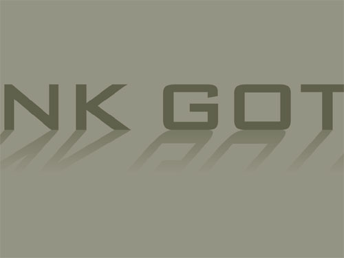
Bank Gothic. We all live in the shadow of this typeface.
She is everywhere I go, even when I’m on vacation. I never would have noticed her this much three years ago.
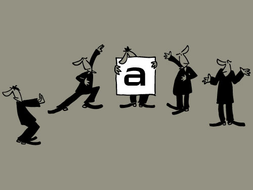
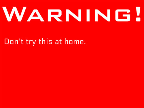
At the beginning of the project, I solicited input from four other people, and even toyed with democratic tactics, like voting. Five people sitting around one typeface: don’t try this at home.
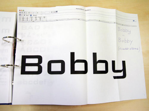
How does Bank Gothic look with a lowercase? Some were of the opinion that it would become a techno-style typeface. This idea was discarded after a single test.

No one in the audience seemed to find this very funny.
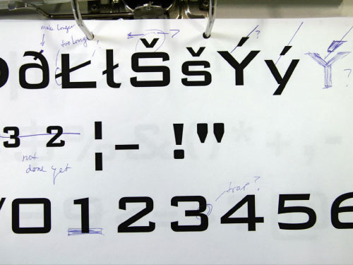
Even after I was passed my deadline, changes still needed to be made.
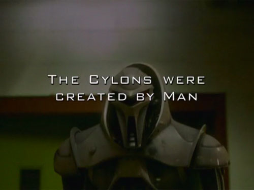
Bank Gothic, here staring on the hit sci-fi program Battlestar Galactica.