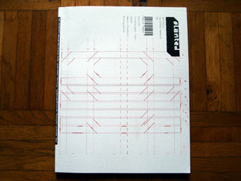
The newest edition of Slanted arrived in my mailbox this week! This is the fourth issue in what is turning out to be quite an important element of the German design scene. Slanted is the only German design magazine that is not dedicated to celebrating boring corporate studios and their portfolios, announcing who has become a professor at which institution, or just running through the list of big name brands who have recently won fabled advertising awards.
Instead, Slanted, whose slogan is »Das Gefühl Typografie« (typography with feeling), paints a lyrical, almost artistic vision of what a typo/graphic designer can see in their environment. Slanted is both a magazine and a weblog. More to the point, it is a weblog that has spawned a magazine. Both features are fixtures at conferences like TYPO Berlin, their principles are teaching at multiple institutions, and the studio that seems to have given birth to this all, MAGMA Brand Design GmbH & Co. KG, continues to produce unorthodox work… a perfect example of designers doing what they really want to do, and being successful at the same time.
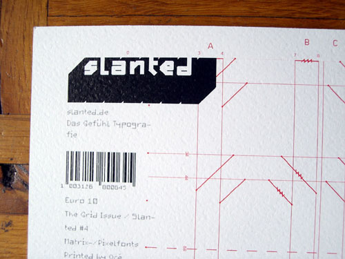
Slanted #4: The Grid Issue may be viewed and purchased at http://www.magma-ka.de/Order/Slanted_04. Further online discussion is going on here.
Hitting its stride, each issue of Slanted has been better than last. Having personally contributed articles to the last two issues (here and here), my contribution to this issue consisted of assisting the editorial team in selecting fonts that fit with the theme, and contacting the respective foundries. Nick Blume was my compatriot in this matter.
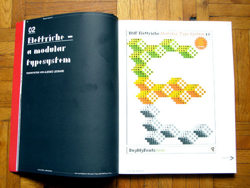
My favorite article in this issue has nothing to do with the foundries and typefaces that Nick and I contacted. But it takes the cake as far as fonts in the issue are concerned: Alessio Leonardi’s upcoming BMF Elettriche family. This grid-based system comprised literally hundreds of fonts. So much work! The URL that will eventually describe this project is just a placeholder, but more information about Alessio and his other typefaces may currently be found at BuyMyFonts.com.
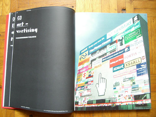
Another piece that grabbed my attention was a profile on the façade of the Sandberg Institute in Amsterdam. Its piecework nature feels like an analog version of the Million Dollar Homepage.
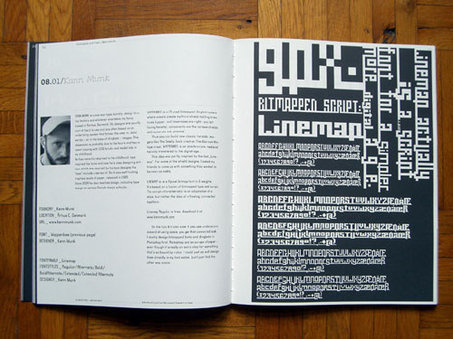
Kenn Munk was the first designer I contacted for this issue, simply because I love his Wappenbee dingbats system. It was the first thing that came to mind when I heard that we were looking for pixel and grid-based fonts.
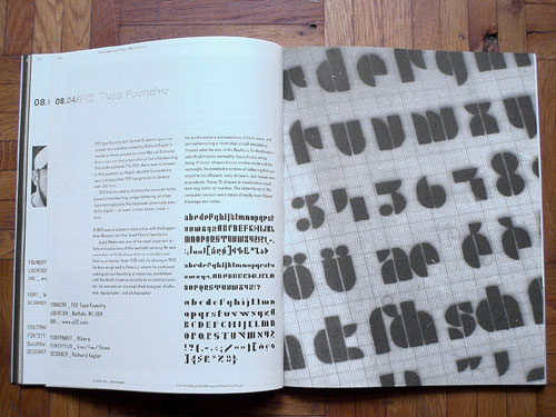
Richard Kegler from P22 was at TYPO Berlin last year, and I thought that it wood be good to bring more of his work to the German designer audience. I was really glad that he contributed fonts to this issue. Specifically, P22 Albers and P22 De Stijl were used.
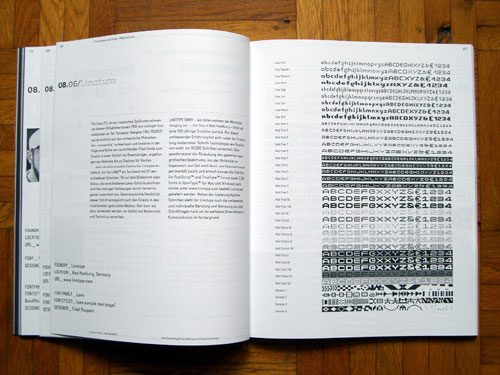
The closest selections from the Linotype library that fit the theme were the Lomo typefaces, designed by Fidel Peugeot for the Russian Lomo camera makers and their cult following. The Lomo family has 37 members.
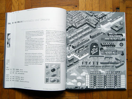
Although I didn’t contact Romibello or Yanone myself, the upcoming fonts of theirs that were presented in this issue were my favorites out of the bunch. I can’t wait until they release these!
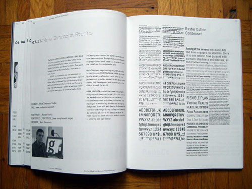
Mark Simonson is old school and new school at the same time. A master letterer, he was already designing pixel fonts in 1986 (in 1986, I was still just in the first grade!). Raster Gothic Condensed is one of those early creations that he brought up to contemporary professional standards in 2003.
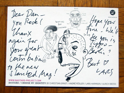
This image cannot be found in the magazine itself; it’s the back of a postcard that came to me along with the issue in the mail. Anyway, Lars (and everyone else) thanks so much for letting me be a part of Slanted again. I’m looking forward—as always—to TYPO Berlin!
The next issue of Slanted will be based on serif typefaces, and their revival of popularity in 2007 Germany—quite odd actually, since Germany is sans serif country (my theory is that they leapfrogged from Fraktur to Sans Serif without really every stopping over on serif texts themselves ;-) ). It is due to be released later in 2007.