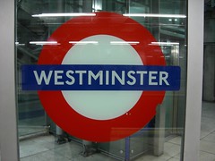
Anke and I were in London a few weeks ago. Since I’ll be moving to the UK next year, I went over to scout out a few things, and stayed over the weekend for my birthday. All in all, I just behaved normally—looking at type and trying to take some pictures. The city was beautiful, and despite a weather forecast that predicted rain for each day of our trip, most days were mostly dry, if a bit on the dark side. I only managed to get out in the sun for three hours a day… four hours tops.
Like any metropole, London has a wealth of typographic treasures. The city wears its history on its sleeve, and helps codify the language of British lettering to boot. Early 20th century lettering examples—damn good ones at that—have entrenched themselves, and are unescapable. Thankfully, they are also pleasing to view. This is all, of course, impossible to photograph within the span of a few years, much less inside a few days. But it was fun to try anyway. Below are some of my favorites…
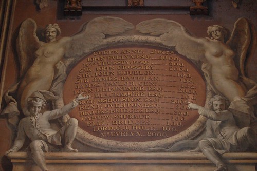
I liked Greenwich; it reminds me of the Naval Academy back home in Maryland. Instead of waiting to see the null meridian, I walked along the Thames and through the Old Royal Naval College. Its grand interiors are mostly trompe l’oeil cheaper to finish that way, I guess. The lettering switched between faux painted v-cut treatments and drop shadows. These each pre-date Photoshop filters by about 300 years.
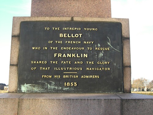
Block letters at Greenwich. Where there is a military institution, there will also always been monuments.
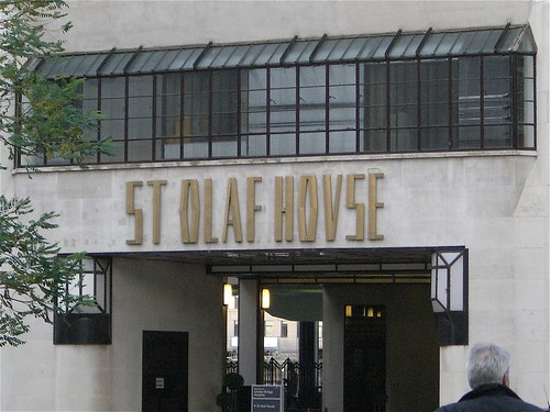
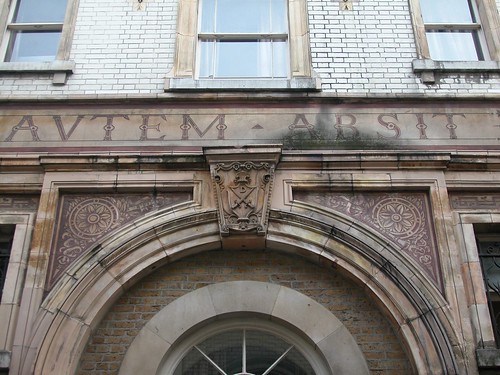
I spotted this facade near London Bridge, on the south side of the Thames. The building also had more lettering above several entranced, each in a different style.
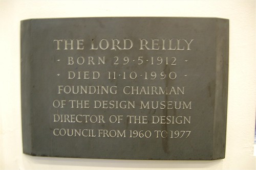
The kind of thing that I go for. Great Britain still maintains a lively stone carving tradition. I appreciate this tremendously. Carved stones are to be found everywhere, old as well as new. This was the case in New England, where I studied first, but much less so in Germany, where I studied second.
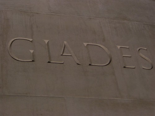
An L-A ligature. More stone carving, this time from the Memorial Gates outside Buckingham Palace. These date from 2002. That ligature is rather innovative, I think.
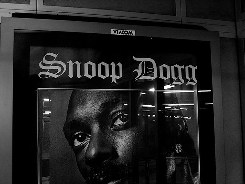
Many current recording artists have been using blackletter recently, either starting or reviving a trend. Snoop Dogg has used blackletter before. The last occurance was a bit more interesting than this straight Old English, but it is nice to see these types in contemporary use no matter what.
Signs
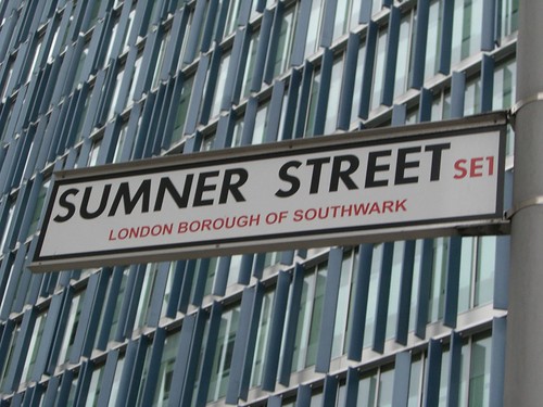
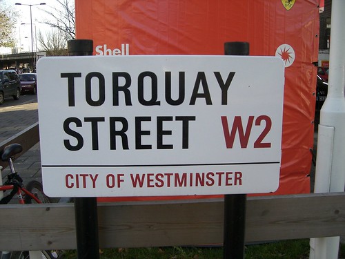
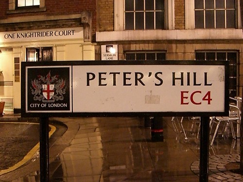
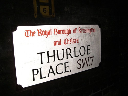
The London boroughs all seem to have their one style of street sign. This helps one navigate through the city on foot; you can always generally tell where you are just by the lettering style and composition.
