Last week, I was in Cologne (or Köln), and I felt the need to take a lot of pictures. I’ve been to Cologne about a dozen times over the past five years, but I rarely have found the time to photograph much of anything. Cologne has a rich history, going back two thousand years, and it has a lot of lettering as well. I just managed to hit the touristy things in the inner city this time around. There are plenty of newer things to take note of as well. Someday…
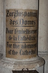
The image to the left is from one of the pillars in the cathedral transept. It is above a little box, in which you can donate money for the building’s upkeep. The text is in German, French, and English. The German is an odd painted textura variety, with lombardic capitals. I guess that the artisans assumed that foreign tourists wouldn’t be able to read blackletter; the lettering style that clothes the French and the English lines is interesting, but it doesn’t match the heavy oddity of the German. “All or nothing,” I would have said. Interestingly, the four lines of serif lettering use an alphabet that is even more condensed than the textura, a hand normally more condensed than typical old style.
More Photographs from the Cologne Cathedral
Begun in the middle ages, the Cologne cathedral wasn’t completed until the 19th century. But it is still one of the largest gothic buidlings in the world. Believed to hold the remains of the three kings, it has been a destination for pilgrims for over 800 years.
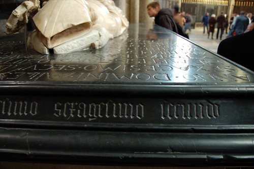
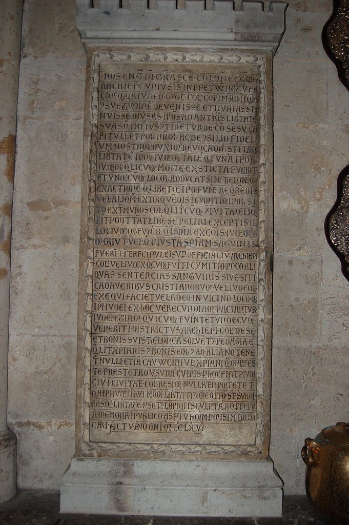
The choir ambulatory contains a number of tombs. The letters on this one were particulary attractive, both the textura on the side and the monumental roman on the top. This sarcophagus above is located just to the right of the Gero Cross.
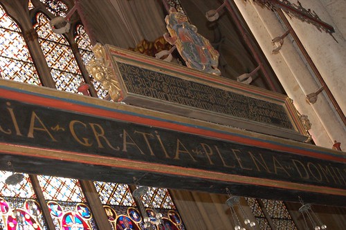
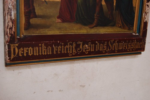
Painted screens above an abulatory chapel. Blackletter on top, monumental Roman capitals on the bottom.
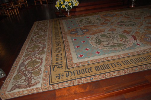
Schriftteppich, a type rug. Seeing this sort of thing reminds me of the wall-hangings that Rudolf Koch and the Offenbacher Werkstatt created. This has a much more conservative design, and actually functions as a rug on the floor, but there are similarities none the less.
Inside Groß St. Martin
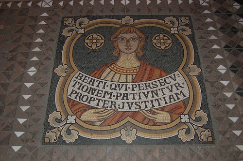
19th century mosaic floor imagery.
Stone-Carved Letters, Old & New
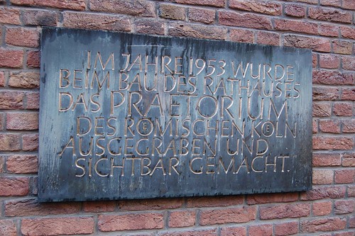
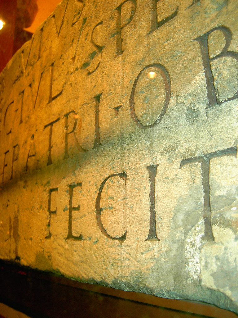
This decidly newer stone commemorates the discovery of more ancient Roman ruins in Cologne, this time underneath the new city hall, in 1953.
