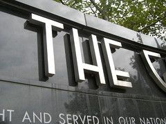
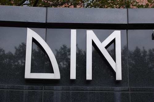
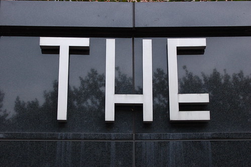
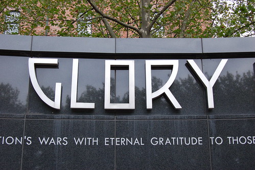
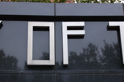
Memorial Stadium served as the principal venue for Major League Baseball and NFL Football in Baltimore for decades. Built as an expansion of previous stadiums on 33rd Street, Memorial Stadium was dedicated in 1950. Its most impressive external element was a large ornamental facade. Designed by L. P. Cook and Company Architects, the facade stated – in quite original and monumental Memorial Stadium Lettering – that the stadium was dedicated to soldiers who died in the two World Wars, and that “time will not dim the glory of their deeds.”
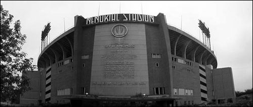
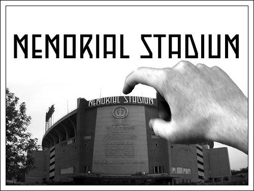
Photograph showing the now demolished Memorial Stadium, on 33rd Street in Baltimore.
After the Orioles moved to Oriole Park at Camden Yards in 1992, and the Baltimore Ravens moved to their new stadium in 1998, Memorial Stadium stood empty. In 2001–2, it was slowly demolished. The last element taken down was the facade, with its famous lettering.
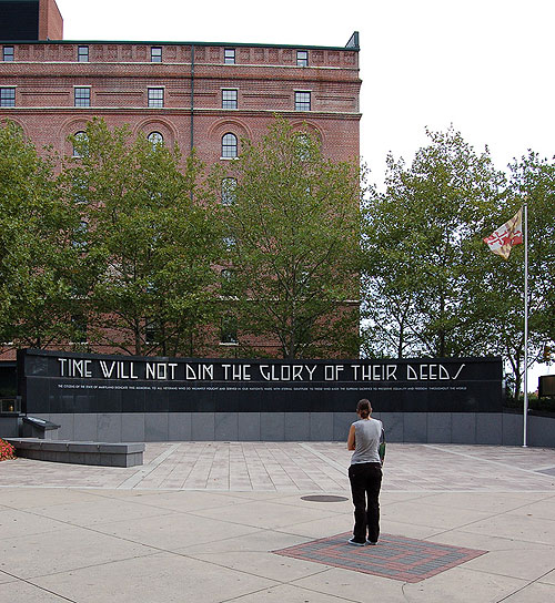
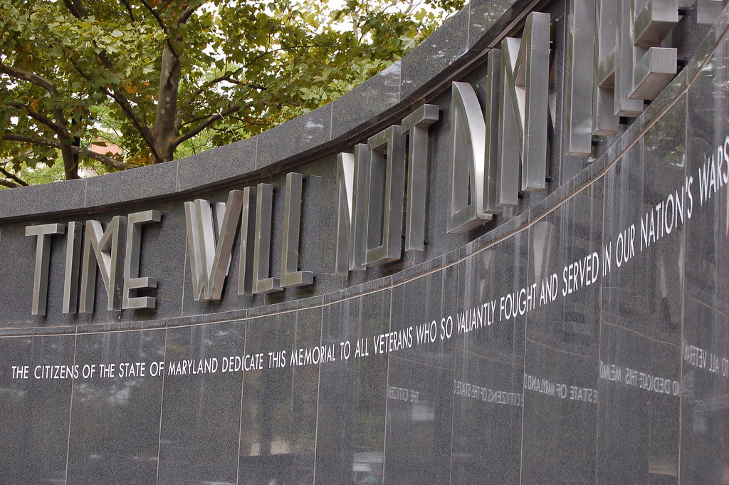
The new memorial at Camden Yards. The B&O Warehouse is in the background; the stadium (not visible) is to the left.
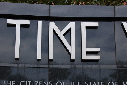
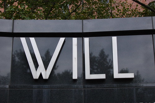
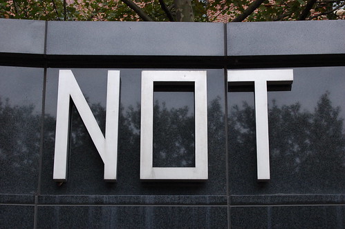
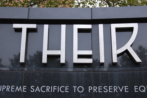
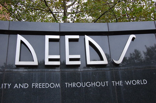
Later, a new, smaller memorial was constructed near Oriole Park at Camden Yards, sort of integrated along Eutaw Street adjacent to the parking lots. This black marble memorial was built to hold the letters of the last line of the lettering from Memorial Stadium’s facade—”time will not dim the glory of their deeds.” The new memorial is, however, no longer dedicated to those soldier from the two World Wars, but rather to all American wars. An urn with earth taken from all cemeteries in which US servicemen and women are buried was installed next to the black marble wall. This urn had been at Memorial Stadium as well.
These letters are beautiful. But they were made for an entirely different scale and setting. They do not feel at home here. To make matters worse, the “new” text, underneath the older metal letters, has been sandblasted into the marble, using some sort of geometric capitals. These do not match the original lettering at all, and one wonders why the client did not just commission a digital typeface in the style of the art deco pieces from 1954. In the grand scheme of things, this neither would have been too costly, nor too time consuming.
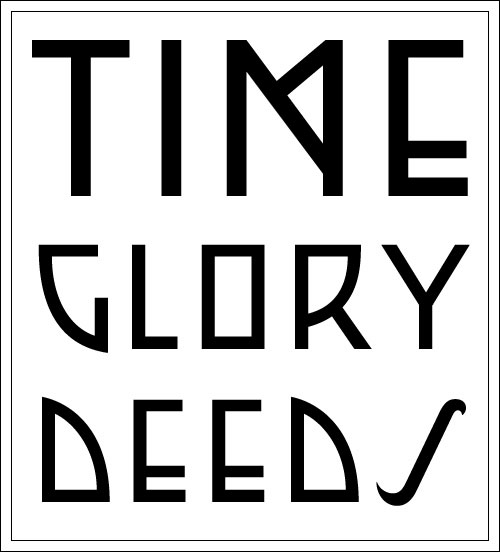
Quick digitization of several of the letters re-used on the new monument.
The letters from the last line of the original facade are of a wider, rounder style than the first line. Compare the quick digital redrawing above with the letters in the photograph.
