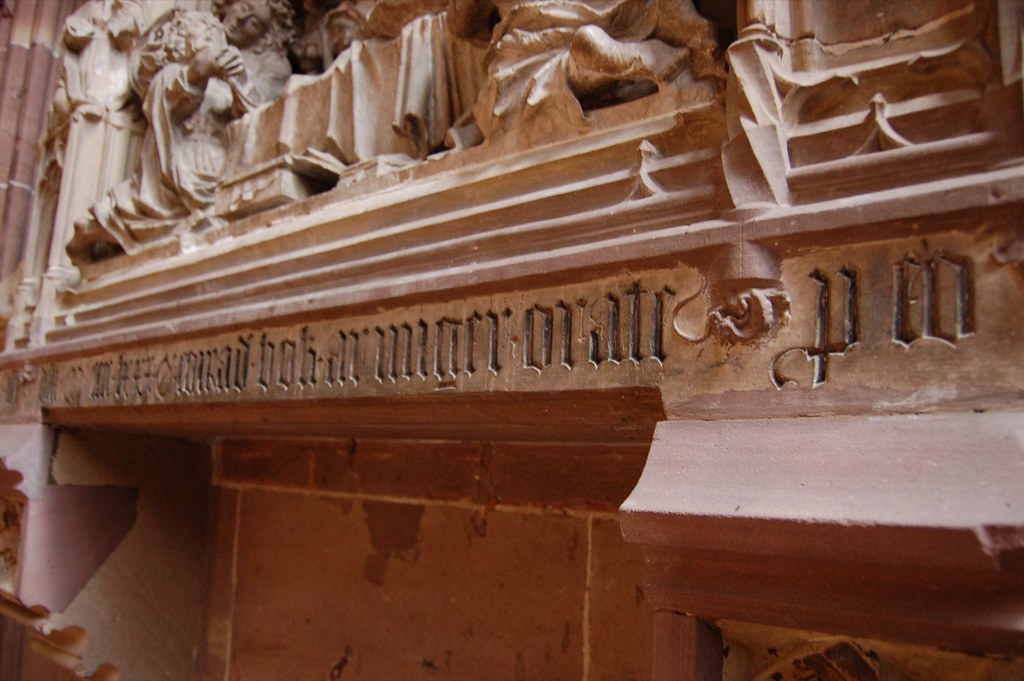
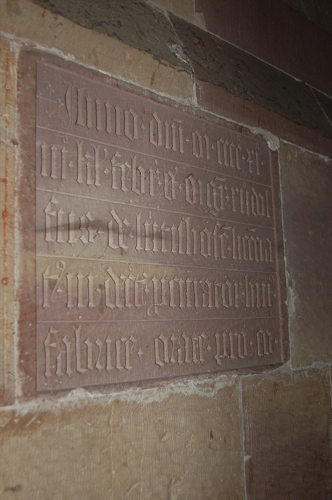
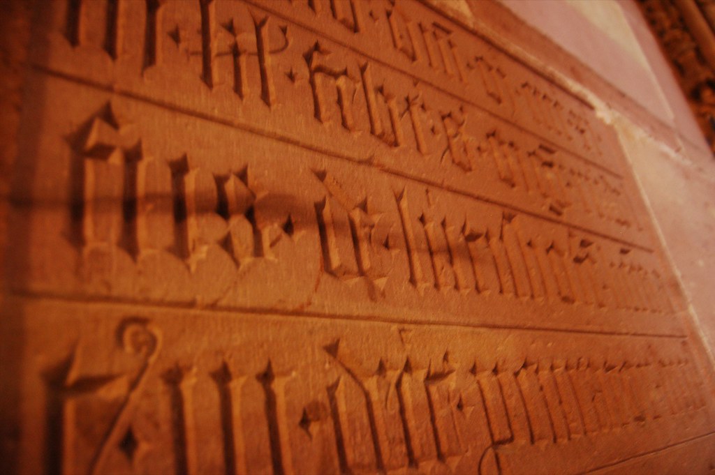
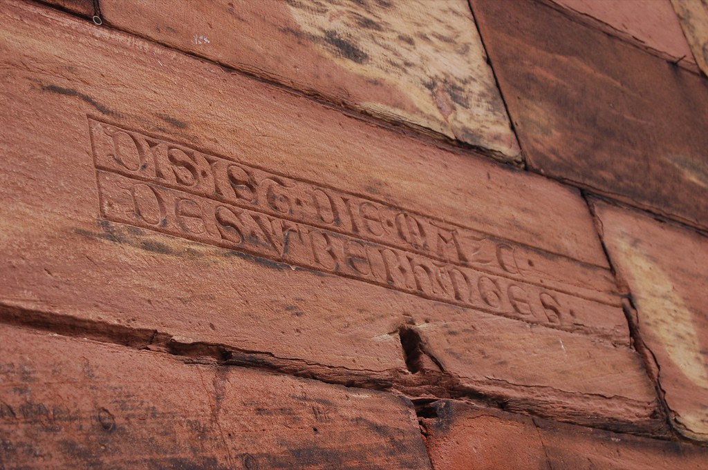
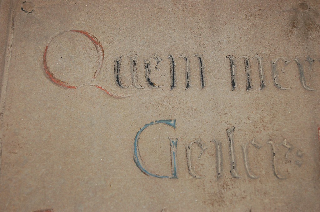
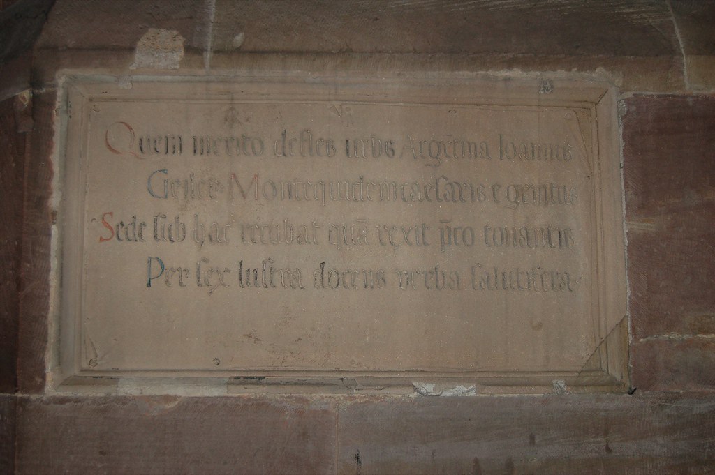
On a recent visit to Strasbourg, I made several photographs of carved blackletter inscriptions from the city’s cathedral.
Strasbourg is the capital of Alsace, in the Alsace–Lorraine region of France. Almost directly across the Rhine from present-day Germany, Strasbourg and the surrounding territories were diputed for centuries, passing hands between the French and German states several times. Although Strasbourg is now French, the city has quite a Germanic-tradition, and many Germans seem to still identify with it on some level.
Strasbourg is interesting for type-lovers on several levels, not least because Johannes Gutenberg may have invented the art of [Western] printing there, instead of in Mainz. (Gutenberg lived in Strasbourg for several years before returing to Mainz somewhere between 1440 and 1450).
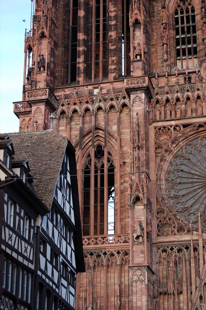
The cathedral of Notre-Dame de Strasbourg is built in the gothic style, and was completed ca. 1439. Interestingly, it was the tallest building in the world from 1625 through 1847.
Gothic architecture is a traditionally French style, although it became quite popular in German-speaking territories by the fifthteenth century. Gothic writing is most likely of French origin as well; the hands used during this time period would develop and influence what we now come to classify as “blackletter” typefaces. Blackletter is a category of type analogous to other large terms like sans serif. There is no single writing hand or typeface that can epitomize it. Rather, the word is best used as an umbrella over several more specific styles, which include Textura, Rotunda, Bastarda, Fraktur, etc.
Textura
Textura is the oldest of the blackletter styles. Its strokes are both very black and very broken; their are more angles than curves. Also called “gothic” or Gotisch, Textura probably developed as a handwriting style in and around Paris, perhaps at the same time as Gothic architecture itself (after ca. 1140).
Although one sees Textura less often today, it was a hit across Europe for centuries. The first printed books were set in Textura types, and it remained a staple of ecclesiastic printing for some time afterwards – even into the modern era, if one looks at display typography. During the late Middle Ages and the Renaissance, quite many stone inscriptions were cut using Textura letters, including several inside the cathedral in Strasbourg.
Lombardic Capitals
Lombardic capitals were often used to offset or ornate bits of texts that were otherwise lettered, or set, in Textura. Although strings of all-Lombard caps are not particularly legible, the practice was quite common.
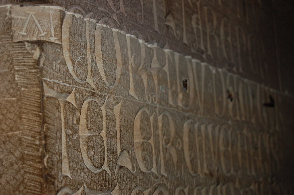
Above is an inscription from the cathedral’s south transet, carved completely with Lombardic capitals.
Rotunda
Rotundas are rounded Texturas. Typefaces in these styles became popular in Southern Europe as the Northern Europeans took to Fraktur. Today, many designers see Rotundas as the “softer, friendlier” blackletter.
Blackletters, particularly of the stone-carved variety, are a favorite of mine. In 2005, I posted a short piece here depicting Lombard letters at Chartres. While I was still in school, I tried my hand at a few Texturas and Lombardic Capitals as well.
All of the photos I made at Strasbourg may be view on my flickr space here – http://flickr.com/photos/typeoff/sets/72157594346039258/.
