As of this writing, there are a number of projects sitting on my hard drive that I’ve meant to upload here for about a year. In 2005, while still studying in Offenbach, I was in a type design course entitled Zeichen zeichnen. We drew numbers.
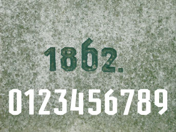
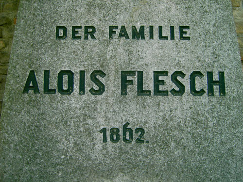
My numbers-only font was inspired by a gravestone I photographed during a trip to Vienna in 2004. The forms on the gravestone, which remind one of sports-like, all-angles sans serif letters, are not what I had expected from 1862 Austria. Particularly noteworthy, in my opinion, is the number “8” on the stone above. It feels quite out of place. The other three numbers fall into the standard proportions of oldstyle figures; the 1 and the 2 align to an “x-height,” while the 6 has an ascender. According to this system, the 8 should ascend as well, but it does not.
I created a font of numbers that has three different number versions. In the first set of numbers, all the numbers have the vertical proportions of the 1, 8, and 2 on the gravestone pictured above. The second set of numbers are all “uppercase;” they have the proportions of the 6 on the Viennese gravestone. The third of numbers descends. These three sets can be combined by the user any way that could be desired; which letters ascend or descend are not dictated by historical convention, but by desire.
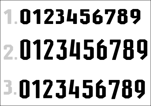
1. “Small Cap” Figures; 2. Ascending Figures; 3. Descending Figures
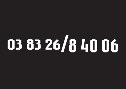
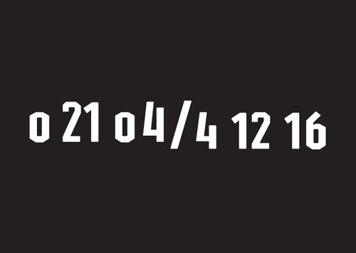
The two images with the white-on-black numbers are from a series of posters that were exhibited at the Hochschule für Gestaltung’s 2005 Rundgang exhibition. Click on either of the images to view the entire poster.
The font is named Alois after Alois Flesch, the name on the photographed gravestone.
