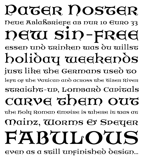
Pater Noster is an uncial-style typeface that Dan Reynolds first created for one of Prof. Dieter Lincke’s illustration projects at the HfG Offenbach.
Instead of looking at insular manuscripts for his inspiration, Dan explored the unknown world of German 20th Century calligraphic uncial interpretations while he was making his initial Pater Noster drawings. Dan hopes that his Irish ancestors will forgive this slight.
As traditional uncial typefaces were often unicase, Dan has made very little differentiation between Pater Noster’s upper and lower cases. In fact, some lowercase letters are just scaled down versions of the uppercase (e.g., t, e, and r).

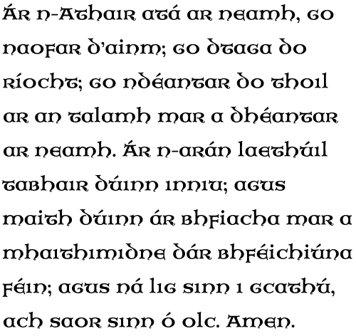
Dan is particularly proud of the Gaelic setting of Pater Noster, as well as the font’s numerals. Please check them out, and let Dan know what you think.