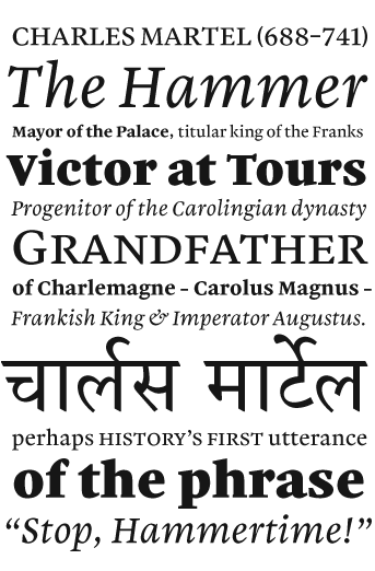
Monday July 7th was the submission deadline here in Reading, and I uploaded my files about an hour or so before the noon requirement. The typeface, pictured rather briefly above, will still need ages of finishing before I could call it properly complete, but I guess that I am proud anyway.
Here are the details: a text face optimized for small-sized running text, supporting both the Latin and Devanagari scripts. This means that the languages supported run a long gamut from Western Europe (English, French, German, etc.) to points further East (Romanian, Slovakian, Turkish) to India (Hindi, Marathi, Nepali, etc.). Variants include Regular (with small caps), Italic, Bold, and Heavy. The fonts have a healthy accoutrement of figure options and a few ligatures added in for good measure. During the typeface’s development as part of the MATD course, I also experimented with a Condensed Roman and Heavy. Hopefully, these will soon see the light of day, too.
For the course, I’ve given the design the name Martel (मार्टेल), after that cheery French fellow Charles Martel. Of course, the world already has at least one display uncial font with the same moniker, so upon eventual release I’ll try something more clever and trademark-able.
More images of Martel are up on Flickr.