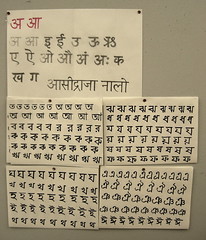
The pressure is on! Even though it isn’t the case that each typeface design student at Reading has tackled a non-Latin component as part of their work, it feels like it. Last week, we rolled up our sleeves and drew out sets of non-Latin scripts for the first time, or at least the first time with other people looking. From Tuesday through Thursday, we participated in a workshop regarding North-Indian scripts—Devanagari, Bengali, and Gujarati. I guess that the point of the workshop was to write out a lot of different kinds of characters in order to get an introduction to—and feel for—these writing systems.
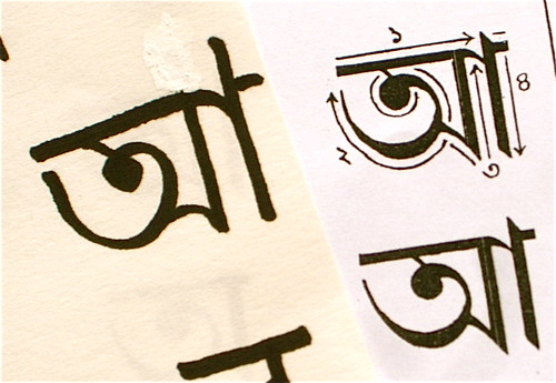
I’d already decided to try and integrate Devanagari into my practical work, but I spent a few hours writing out 45 Bengali characters on Wednesday night and Thursday morning; so delightful! Bengali is curvy, and really a lot of fun. It also looks very difficult. I’ve love to design a Bengali typeface, but the idea of trying to wrangle those shapes with bezier curves—or really with any instrument or technology—makes me want to hide under the table. I didn’t attempt to write much with a proper nibbed or reed pen; Bengali incorporates e number of thick up-strokes. I have no idea how one makes one’s pen do that. Or one’s hand, wrist, etc…
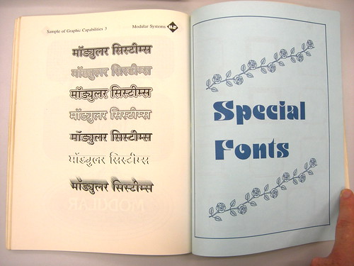
We spent much of the workshop looking at a collection of printed items, type specimens, and language-learning guides from India.
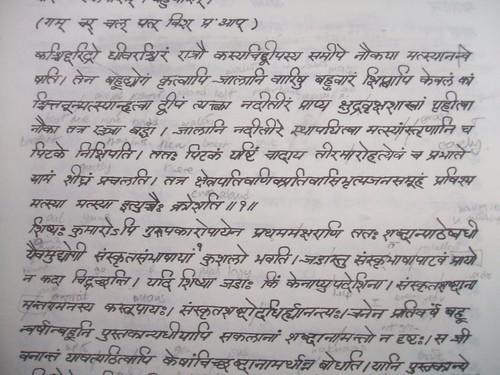
Here is another artefact we viewed. The photo of this example is from Paul Hunt.
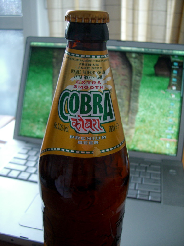
After the workshop had ended, it was time to celebrate! When I went to the store to pick up a few bottles of beer, I found this on the shelf. It was the only beer in stock from India, and moreover, it had this lovely script on the label. I had to buy it! Tastes like any average beer, though.
Mathieu already wrote up some of his thoughts about the workshop over the weekend. As always, they are worth reading.
