This is another post related to the history of Akzidenz-Grotesk.
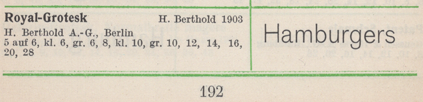
Contrary to Günther Gerhard Lange’s statement in a 2003 interview with Yvonne Schwemer-Scheddin in Typografische Monatsblätter, the Royal-Grotesk typeface was not a product Berlin’s H. Berthold AG acquired in 1908 when they purchased the Ferd. Theinhardt typefoundry. Instead, Royal-Grotesk had already been created at Berthold a few years earlier. The firm probably published it in late 1902, although some sources give 1903 as the year of its release, including [AfB] and [Wetzig].
As I did at the end of the previous paragraph, I’ve indicated below what the sources of my typeface names and date-attributions are, inside square brackets. Where copies of the sources are available online, those particular source names are links to online PDFs. Structure-wise, this may be a bit complicated, thanks to the linked and unlinked references. Still, the post comes in at less than 3,700 words, so it isn’t too long! At the bottom, you’ll find bibliographic details for each source mentioned.
What’s in a name?
I have read several twenty-first-century statements insisting that Royal-Grotesk’s connection to Ferdinand Theinhardt (1820–1906) is proven because the typeface name includes the term Royal. That is quite a leap, though! I’ve written more on why in this post’s next section. First, let me provide a summary of the history of the Theinhardt foundry’s ownership.
Ferdinand Theinhardt established a typefoundry in Berlin in 1849, when he was about 29-years old. Although Theinhardt and his wife had children, their son did not survive childhood. Their daughters, after they grew up, married military officers. This meant that Theinhardt had no heirs who could have eventually taken over his business. In 1885, he sold his foundry to Oskar Mammen and two brothers: Emil and Robert Mosig. At some point after that sale, Theinhardt became a retiree and ceased his punchcutting and typefounding activities. In my next post in this series, I’ll discuss the speculation about exactly when he retired and stopped cutting punches for good. At the time of the sale, he would have been over 65, and at least somewhat well off. Theinhardt died twenty-one years later, in 1906.
The new owners of the Ferd. Theinhardt business never changed the company name. I don’t know when Emil Mosig died, but by 1897, he was no longer involved with the foundry. By 1902, Mammen (1859–1945) most have left the company as well, as by that point he had been replaced as co-owner by Hans Schweitzer. Robert Mosig and Schweitzer ran the company together until 1907, when Robert Mosig would retire (and then die), leaving Schweitzer as sole owner. Schweitzer sold the company to Berthold in 1908.
Berthold operated the Theinhardt foundry as a subsidiary for the next two years. That in-and-of-itself was not uncommon; in 1897, Berthold acquired the Stuttgart and Düsseldorf-based Bauer & Co. foundry, which they kept open as an independent subsidiary until 1930 (just in Stuttgart). Berthold closed its Theinhardt subsidiary down earlier, in 1910 – at least as a business operating on separate premises. Technically, the re-organised “Ferd. Theinhardt G.m.b.H” that Berthold had set up in 1908 remained open into the 1930s. Yet after 1910, the subsidiary’s name was just another company doing businesses from Berthold’s main Berlin factory address.
While Ferdinand Theinhardt was at the helm of his company, it did work for at least Prussian state institutions:
- A Prussian state printing-house was established at Berlin in 1851, and Theinhardt cut type for it. His types were used for printing securities, and perhaps other things.
- Theinhardt cut several academic typefaces for publications written by members of the Königlich-Preußische Akademie der Wissenschaften (Royal Prussian Academy of Sciences). Those academic typefaces included designs for transcribing Ancient Greek and Roman inscriptions, as well as types to set writing systems from antiquity, including Cuneiform and Egyptian Hieroglyphs. Theinhardt also cut punches for Devanagari and Tibetan types, etc.
Since Theinhardt’s foundry – and later Berthold – advertised those typefaces in their type specimen catalogues, I assume that these designs were not owned by the Royal Academy itself and that they were not exclusive to its members’ publications.
As the Royal-Grotesk typeface has the word “royal” in its name, some authors assume that this sans serif must have been produced for publications of the Royal Academy, too – despite the Academy’s name having used the adjective königlich instead of royal. A few of those authors state that, after Germany dissolved its monarchies in 1918, the Royal-Grotesk typeface was renamed Akzidenz-Grotesk, because monarchies were no longer popular in Germany. Their conclusion is incorrect on every front: Berthold had seven members in its Akzidenz-Grotesk family by 1917, and only one style called Royal-Grotesk. That single weight of Royal-Grotesk was not renamed Akzidenz-Grotesk mager (Akzidenz-Grotesk Light) until the 1950s. Additionally, many Germans continued to support the idea of a monarchy after 1918: until the Nazi seizure of power, there were indeed several German political parties and civic organisations that – to one degree or another – strove to restore a monarchy (just not necessarily one headed by the former king–emperor Wilhelm II or his son, the former crown prince also named Wilhelm).
Between 1871 and 1918, Germany was an empire, and its head of state was an emperor. Twenty-two of the twenty-six constituent states within the empire were monarchies, including Prussia, ruled by the Hohenzollern family (the imperial constitution saw it that the King of Prussia also held the imperial crown). Three other constituent states were headed by kings. Grand Dukes, Dukes, or Princes ruled in the other German states with monarchies. The empire also consisted of the Free Cities of Bremen, Lübeck, and Hamburg, which did not have local monarchs, as well as Alsace-Lorraine.
Royal-Grotesk was not the first typeface produced in imperial Germany to have the word “Royal” in its name. Two other typefaces including “Royal” in their names predated its release. A script face with “Royal” in its name came out after it. None of those other typefaces was created for one of Germany’s royal institutions or their documents.
The following typefaces are those I have found so far that were published in Germany before 1918 and include the term “Royal” in their names:
- Royal, published by Ludwig & Mayer in the early 1890s. This was a non-sans-serif display typeface [Reichardt R]. Ludwig & Mayer operated out of Frankfurt am Main, which was then part of the Kingdom of Prussia.
- Royal-Cursiv, published by the Julius Klinkhardt typefoundry at some point before 1891 [Reichardt R]. Klinkhardt was in Leipzig, part of the Kingdom of Saxony.
- Royal-Grotesk, published by H. Berthold AG and Bauer & Co. in 1902 or 1903, depending on the source [AfB, Berthold 1958, VdS, Wetzig]. Berthold was based in Berlin, which was part of the Kingdom of Prussia. Bauer & Co. was in Stuttgart, which was the capital of the Kingdom of Württemberg.
- Royal-Kursiv, published by J.D. Trennert & Sohn. This script face was originally produced by the Leipzig punchcuttery Riegerl, Weißenborn & Co. in 1908, who called it Römisch-Zirkular [Wetzig]. Trennert was in Altona, an independent jurisdiction within Hamburg, which was a free city without a local monarch.
What about “Accidenz,” “Akzidenz” and “Akzidenz-Grotesk” in typeface names?
While I’m on the subject of names, this would be a good place for me to stress how common the term “Accidenz” was in typeface naming during the late-nineteenth and early twentieth centuries. After about 1900, German spelling conventions changed, and Latinate words like Accidenzen – the German term for jobbing-printing, from the Latin accidentia – would be written as Akzidenzen instead.
Often in German typefounding, the term Accidenz was essentially used as an adjective. For example, the Leipzig-base typefoundry J.G. Schelter & Giesecke produced an opulent brochure to advertise its ornaments and border-printing elements in 1902 or 1904. This was titled Accidenz-Zierat und Buchschmuck (jobbing ornaments and book decorations). I am sure if the ornaments presented in that brochure were named “Accidenz-Zierrat” or not. More likely, those ornaments had no names at all. Printers would simply place orders for the ornaments they desired by using the ornaments’ respective product numbers, which are printed near each ornament in the brochure.
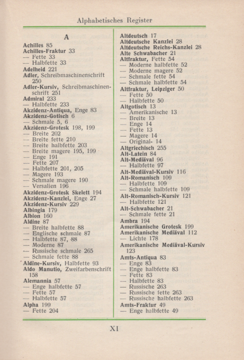
First page of the table of contents from Handbuch der Schriftarten, compiled by Emil Wetzig and published by the Albrecht Seemann Verlag in 1926. Not all the entries Akzidenz-Grotesk brings up on pages 190 through 207 are the now well-known design from H. Berthold AG. Although Wetzig’s handbook is not a thoroughly reliable source, its summary of the number of varying typefaces that contained the term “Akzidenz” in their name in 1926 is not inaccurate.
Here are the examples I have compiled so far. These only include fonts cast as foundry type or produced as line-casting machine matrices. Photo-typesetting and digital-font versions of Berthold’s Akzidenz-Grotesk are not included, for instance. My lists are alphabetical, not chronological. Know some more types that I am missing? Please let me know!
Single-style typefaces that are not sans serif:
- Accidenz-Cursiv, Oskar Laessig [Laessig]
- Accidenz-Cursiv verziert, J. John Söhne [Reichardt A]
- Accidenz-Fraktur, Ferd. Theinhardt foundry, before 1897 [Reichardt A]
- Accidenz-Gothisch, H. Berthold AG [Berthold 1900a]
- Accidenz-Kanzlei, Ludwig & Mayer. 1882 [Reichardt A]
- Accidenz-Ornamente, H. Berthold AG [Berthold 1900b]
- Accidenz-Reklame, Oskar Laessig [Laessig]. Later sold by K. Brendler – who acquired Laessig in 1901 – as Akzidenz-Reklame. According to [Reichardt A], this design originated at Emil Gursch, who called it Zierschrift Gloria.
- Accidenz-Schrift, Bauer & Co. [Bauer & Co.]. An ornamental typeface in three sizes (12, 16 and 20pt). The foundry did not claim it a product that had originated in-house.
- Accidenz-Verzierung, Serie XII, Oskar Laessig [Laessig]. This could be the same design as Gursch’s Akzidenz-Verzierungen below; I have not made a comparison yet.
- Accidenzschriften, Roos & Junge. Probably from before 1899 [Roos & Junge 1]
- Accidenzvignetten, Wilhelm Woellmer [JfB 1894]
- Akzidenz-Grotesk, Eduard Scholz [Scholz]. This is likely the same design as the Haas Type Foundry’s Akzidenz-Grotesk mager, a type whose matrices came from the Wagner & Schmidt punchcuttery in Leipzig and were not usually sold under the name “Akzidenz-Grotesk.” See the entry from Haas’s Akzidenz-Grotesk types further down in this post.
- Akzidenz-Kursiv, Ludwig Wagner. 1908. Also sold by C.E. Weber as Romanisch-Zirkular-Kursiv [Reichardt A, Wetzig]. This was probably cut at Wagner & Schmidt. It looks like a bigger-on-the-body version of the Römisch-Zirkular/Royal-Kurisiv design, mentioned above in this post’s section on “Royal”-named typefaces.
- Akzidenz-Kursiv, Otto Weisert [Reichardt A]
- Akzidenz-Kursiv, Wilhelm Woellmer [Woellmer 1920]. There was also a Halbfette Akzidenz-Kursiv.
- Akzidenz-Ornamente, Emil Gursch [Gursch]
- Akzidenzschmuck, C.F. Rühl. Circa 1912 [Rühl] Designed by Hugo Steiner-Prag.
- Akzidenz-Schmuck, Roos & Junge [Roos & Junge 2]
- Akzidenz-Schmuck, D. Stempel AG [Stempel]. This is the Roose & Junge design mentioned in the previous entry; Stempel acquired the Roos & Junge foundry in 1917
- Akzidenzschrift Baldur, Julius Klinkhardt [Klinkhardt]. It is not clear-cut whether this should “count.” You could argue that the word “Akzidenzschrift” is not part of this typeface’s name. Since I have encountered more than one specimen in which Klinkhardt presented the name in this manner, I’ve decided to include it on this list.
- Akzidenzschrift Lithographia, Julius Klinkhardt [Klinkhardt] (see above)
- Akzidenz-Verzierungen, Emil Gursch [Gursch]
- Akzidenz-Vignetten, Actiengesellschaft für Schriftgießerei und Maschinenbau [Offenbach 2]
- Enge Accidenz-Antiqua, Benjamin Krebs Nachfolger [Krebs 1880]
- Enge Akzidenz-Antiqua, H. Berthold AG [Reichardt A, Wetzig]
- Enge Akzidenz-Kanzlei, C. Kloberg 1883 [Reichardt A, Wetzig]
- Moderne Akzidenz-Kanzlei, Roos & Junge. Before 1904 [Reichardt A]
- Neueste Accidenz-Gothisch, Ferd. Theinhardt foundry [Reichardt A]
- Schmale Accidenz-Gotisch, Krebs. Before 1889 [Krebs 1889]
- Schmale Accidenz-Kanzlei, Actiengesellschaft für Schriftgießerei und Maschinenbau [Offenbach 1]
- Schmale Akzidenz-Gotisch, D. Stempel AG. c.1875 [Reichardt A, Wetzig]. I think that this date might be an incorrect attribution.
- Schmale Akzidenz-Gotisch, Bauer’sche Gießerei, J. John Söhne, and H. Berthold AG [Bauer, Berthold 1900a, Reichardt A, Wetzig]. Originally cut in circa 1876 by Friedrich Wilhelm Bauer for the Bauer’sche Gießerei. It was later sold by his Bauer & Co. foundry, and then by Berthold after they acquired Bauer & Co. Also sold by Emil Gursch, who Berthold acquired eventually, too [Gursch]. The two typeface-entries mentioned above are almost certainly this same design.
Wilhelm Woellmer’s Accidenz-Cursiv – not a sans serif, but available in more than one style, so it gets a unique entry here:
- Accidenz-Cursiv, c. 1892 [Woellmer 1894]. Also shown together with the Halbfette Accidenz-Cursiv in [JfB 1892] under the title Neuste Accidenz-Kursiv.
- Halbfette Accidenz-Cursiv, c. 1892 [Woellmer 1894]. Also shown together with the Accidenz-Cursiv in [JfB 1892] under the title Neuste Accidenz-Kursiv.
H. Berthold AG’s Accidenz-Grotesk styles. During the First World War, or shortly thereafter, these names’ spelling changed to Akzidenz-Grotesk. The styles were initially distributed by H. Berthold AG in Berlin together with its Stuttgart-based subsidiary Bauer & Co.:
- Accidenz-Grotesk, 1898 [Reichardt A, Berthold 1900a, Berthold 1958, Wetzig]
- Accidenz-Grotesk breit, 1908 [Reichardt A, Berthold 1911, Berthold 1958, Wetzig]
- Accidenz-Grotesk breitmager, 1911 [Reichardt A, Berthold 1911, Berthold 1958, Wetzig]
- Accidenz-Grotesk fett, 1909 [Reichardt A, Berthold 1911, Berthold 1958, Wetzig]
- Accidenz-Grotesk halbfett, 1909 [Reichardt A, Berthold 1911, Berthold 1958, Wetzig]
- Accidenz-Grotesk Skelett, between 1911 and 1914 [Reichardt A, Berthold 1911, Berthold 1958, Wetzig]. Not every copy of Berthold 1911 I’ve viewed had it (some catalogues were printed later). Wetzig and Berthold 1958’s attributions for it read 1914.
Ludwig & Mayer’s Accidenz-Grotesque/Accidenz-Grotesk, separate designs from the Bauer, Berthold, or Krebs Accidenz-Grotesk/Akzidenz-Grotesk families:
- Accidenz-Grotesque, 1901 [SGM, Ludwig & Mayer 1902, Reichardt A]. Ludwig & Mayer filed for a three-year design patent on this typeface at the Frankfurt am Main Muster-Register on 12 June 1901.
- Breite Accidenz-Grotesk. I first saw this design in [Ludwig & Mayer 1934], an undated Ludwig & Mayer catalogue from about 1934. This design not related to the Bauer or Berthold typefaces named Akzidenz-Grotesk, but it probably is the same face sold by Haas under the name Akzidenz-Grotesk breithalbfett.
- Breite magere Accidenz-Grotesk [Ludwig & Mayer 1934]. See above; this might be the same face sold by Haas as Akzidenz-Grotesk breitmager.
C. Kloberg’s Accidenz-Mediaeval Kursiv – also not a sans serif, but available in more than one style:
- Accidenz-Mediaeval Kursiv [Reichardt A]
- Accidenz-Mediaeval Kursiv halbfett [Reichardt A]
The Akzidenz-Grotesk from Flinsch (and later, from the Bauer’sche Gießerei):
- At some point between 1891/2 and 1915, Flinsch renamed ten sizes of a typeface they had previously just been selling as Grotesk – product numbers 1747–1756 – as Akzidenz-Grotesk [Flinsch]. Whatever name Flinsch sold the typeface under, it was not an original product. Its design was Doric, No. 4 from the Caslon foundry in London. Curiously, Flinsch filed for a German design patent on all ten of these sizes in 1892. Indeed, Flinsch filed for German design patents on several designs its seems to have gotten from Caslon, which is not something I can explain at this point. After the Bauer’sche Gießerei acquired Flinsch in 1916, the continued to sell the design as Akzidenz-Grotesk [Wetzig].
- More Caslon: When Flinsch renamed their Doric, No. 4 version (Grotesk) to Akzidenz-Grotesk, they also renamed their Doric, No. 3 fonts (Breite Lapidar) to Akzidenz-Grotesk-Versalien. Bauer continued selling this after acquiring Flinsch [Wetzig].
H. Berthold AG’s foundry-type Akzidenz-Grotesk family members designed by Günter Gerhard Lange:
- Akzidenz-Grotesk extra, 1958 [Reichardt A, Berthold 1958]
- Akzidenz-Grotesk extrafett, 1966 or 1967 [Luidl, Reichardt A]
H. Berthold AG’s other Akzidenz-Grotesk family members produced as foundry type and Linotype matrices:
- Akzidenz-Grotesk Serie 57, 1962 [Reichardt A]
- Akzidenz-Grotesk Serie 57 Kursiv, 1967 [Reichardt A]
- Akzidenz-Grotesk Serie 58, 1962 [Reichardt A]
H. Berthold AG’s other Akzidenz-Grotesk family members:
- Akzidenz-Grotesk breitfett, 1957 [Reichardt A, Berthold 1958]
- Akzidenz-Grotesk breithalbfett, 1961 [Reichardt A]
- Akzidenz-Grotesk eng, 1912 [Reichardt A, Berthold 1911, Berthold 1958, Wetzig]
- Akzidenz-Grotesk mager, 1902/1903 (depending on the source). Originally named Royal-Grotesk [AfB, Reichardt A, Berthold 1958, Wetzig]
- Akzidenz-Grotesk schmalfett [Bertheau, Berthold 1958, Wetzig]. Originally sold as Halbfette Bücher-Grotesk. Produced before 1911 – perhaps as early as 1896, and perhaps by Bauer & Co. in Stuttgart.
- Akzidenz-Grotesk schmalhalbfett [Berthold 1911, Berthold 1958, Wetzig]. Berthold began selling this typeface in about 1896 under the name Enge Steinschrift; see this Flickr post about the origin of that design. Most of Enge Steinschrift’s sizes were not cut in-house, but Berthold eventually recut some portion of them to better match the rest of the Akzidenz-Grotesk family.
- Akzidenz-Grotesk schmalmager 1953 [Reichardt A, Berthold 1958]
Haas’s Akzidenz-Grotesk:
- Akzidenz-Grotesk breitfett, after 1915 [Kupferschmid, Reichardt A, Wetzig]. Haas acquired matrices of the Wagner & Schmidt punchcuttery’s Neue moderne Grotesk, which they had originally produced c.1914. Ludwig Wagner AG, the Leipzig typefoundry owned by Wagner & Schmidt’s co-founder, began selling type that was cast from those matrices as Edel-Grotesk in c.1915. The Stuttgart foundries C.E. Weber and Otto Weisert also bought matrices, selling the design under the names Aurora-Grotesk and Favorit-Grotesk, respectively.
- Akzidenz-Grotesk breithalbfett [Reichardt A, Wetzig]. See details for Haas’s breittfett style, above.
- Akzidenz-Grotesk breitmager [Reichardt A, Wetzig] (see above)
- Akzidenz-Grotesk fett [Reichardt A, Wetzig] (see above). F.A. Brockhaus printed a small brochure that included their Neue moderne magere Grotesk, Neue moderne halbfette Grotesk, and Neue moderne fette Grotesk typefaces. These have the same basis as the Haas Akzidenz-Grotesk types – their matrices came from Wagner & Schmidt. The cover of that F.A. Brockhaus brochure referred to these types as “Akzidenz-Grotesk,” but the pages showing the types do not have that term on them. [Brockhaus]
- Akzidenz-Grotesk halbfett [Reichardt A, Wetzig] (see above)
- Akzidenz-Grotesk mager [Reichardt A, Wetzig] (see above)
- Akzidenz-Grotesk schmalmager [Wetzig] (see above)
Benjamin Krebs Nachfolger’s Akzidenz-Groteske:
- Schmale Akzidenz-Groteske [Krebs 1907]. This is an independent condensed sans serif design that is not part of the Akzidenz-Grotesk families from Bauer, Berthold, or Haas/Ludwig & Mayer.

32pt and 20pt sizes of Benjamin Krebs Nachfolger’s Schmale Akzidenz-Groteske typeface, scanned from the typefoundry’s 1922 catalog.
Sources
- [AfB] Deutscher Buchgewerbeverein (ed.): Archiv für Buchgewerbe, vol. 40, no. 1 (January 1903). Verein des Deutschen Buchgewerbevereins, Leipzig 1903, p. 19
- [Bauer] Konrad Friedrich Bauer: Werden und Wachsen einer deutschen Schriftgießerei. Zum 100jährigen Bestehen der Bauerschen Schriftgießerei. Bauer’sche Gießerei, Frankfurt am Main 1937
- [Bauer & Co.] Bauer & Co.: Proben. Schriftgießerei Bauer & Cie. Stuttgart. Undated, circa 1885. Almost certainly before 1890. No page numbers. The copy I examined is at the German National Library in Leipzig. Its call number is Cba 84, [3]
- [Bertheau] Philipp Bertheau (ed.): Buchdruckschriften im 20. Jahrhundert. Atlas zur Geschichte der Schrift, ausgewählt und kommentiert von Philipp Bertheau unter Mitarbeit von Eva Hanebutt-Benz und Hans Reichardt. Technische Hochschule Darmstadt 1995, p. 92
- [Berthold 1900a] H. Berthold AG: H. Berthold, Messing-Linien-Fabrik, Schriftgiesserei A.G., Berlin S.W. H. Berthold AG, Berlin. Undated, circa 1900. This bound collection of type specimen sheets is rare. The copy I examined is in the Staatsbibliothek zu Berlin. Its call number is RLS Fp 2434 [Link to catalogue]
- [Berthold 1900b] H. Berthold AG: Export-Katalog. Ausgabe 1900. H. Berthold AG, Berlin 1900, p. 653
- [Berthold 1911] H. Berthold AG: Hauptprobe unserer Schriftgießerei- und Messing-Erzeugnisse. H. Berthold Aktien-Gesellschaft, Berlin SW. Fabriken in Berlin SW, Stuttgart, Wien, St. Petersburg und Moskau. H. Berthold AG, Berlin and Bauer & Co. Stuttgart. Undated, circa 1911 [Link to one copy of the catalogue]
- [Berthold 1958] H. Berthold AG (ed.): 100 Jahre Berthold. Festschrift zum einhundertjährigen Jubiläum der H. Berthold Messinglinienfabrik und Schriftgießerei A.G. Berlin/Stuttgart, am 1. Juli 1958. H. Berthold AG, Berlin/Stuttgart 1958
- [Brockhaus] F.A. Brockhaus.: Schriftgießerei F.A. Brockhaus Leipzig. Romanische Mediäval, Akzidenz-Grotesk. F.A. Brockhaus, Leipzig. Undated, c.1915. [Link to the specimen brochure]
- [Flinsch] Flinsch: Schriftgießerei Flinsch Frankfurt a. M. Flinsch, Frankfurt am Main. Undated, c.1915.
- [JfB 1892] Ferdinand Schlotke (ed.): Journal für Buchdruckerkunst, Schriftgießerei und verwandte Fächer, vol. 59, no. 32 (18 August 1892). Verlag von Ferdinand Schlotke, Hamburg 1892, col. 803–804
- [JfB 1894] Ferdinand Schlotke (ed.): Journal für Buchdruckerkunst, Schriftgießerei und verwandte Fächer, vol. 61, no. 24 (21 June 1894). Verlag von Ferdinand Schlotke, Hamburg 1894, col. 549
- [Gursch] Schriftgießerei Emil Gursch: Gesamtprobe. Schriften, Ornamente, Vignetten, Messinglinien. Schriftgießerei und Messinglinienfabrik Emil Gursch, Berlin. Undated, c.1915, p. 64, 241, and 248
- [Klinkhardt] Schriftgießerei Julius Klinkhardt: Der Schriftgießer. Mitteilungen und Neuheiten für das graphische Gewerbe, vol. 1, no. 2 and vol. 2, no. 5. Schriftgießerei Julius Klinkhardt, Leipzig 1906 and 1912, no page numbers.
- [Krebs 1880] Benjamin Krebs Nachfolger: Untitled folder filled with loose type specimen sheets. Benjamin Krebs Nachfolger, Frankfurt am Main. Undated, c.1880. Part of of the Deutsches Buch- und Schriftmuseum’s collection. The folder has the call number Cna 37, [17].
- [Krebs 1889] Benjamin Krebs Nachfolger: Typographische Neuigkeiten der Schriftgiesserei Benjamin Krebs Nachfolger. No. 8 (May 1889). Benjamin Krebs Nachfolger, Frankfurt am Main 1889
- [Krebs 1907] Benjamin Krebs Nachfolger: Schrift-Proben. Benjamin Krebs Nachfolger, Frankfurt am Main 1907
- [Krebs 1922] Benjamin Krebs Nachfolger: Schriftproben Januar 1922. Benjamin Krebs Nachfolger Schriftgießerei, Frankfurt am Main 1922
- [Kupferschmid] Indra Kupferschmid: “A Comparison.” In Victor Malsy and Lars Müller (ed.): Helvetica forever. Story of a typeface. Lars Müller Publishers, Baden/Switzerland 2009/2011, p. 113–125, here p. 114–115. See also this video of hers from ATypI 2014
- [Laessig] Oskar Laessig: Schriftgießerei, Stereotypie, Galvanoplastik, Messinglinienfabrik Oskar Laessig, Wien. 3. Bezirk, Custozzagasse 5 u. 7. Holzplakatschriften, Utensilienlager, Buchdruck-Maschinen. Oskar Laessig, Vienna. Undated. According to Friedrich Bauer’s 1928 Chronik, this catalogue may have been published in 1881 or 1889. The copy I viewed was in the Tholenaar Collection at the Letterform Archive.
- [Ludwig & Mayer 1902] Ludwig & Mayer Schriftgießerei: »Nutzbringend im Gebrauch«, single-page advertisement. In: Julius Maser (ed.): Typographische Jahrbücher, vol. 23, no. 8. Technikum für Buchdrucker, Leipzig 1902. No page numbers.
- [Ludwig & Mayer 1934] Ludwig & Mayer: Neue Schriften und Ornamente. Ludwig & Mayer, Frankfurt am Main. Undated, c.1934. No page numbers.
- [Luidl] Luidl, Pulipp (ed.): Günter Gerhard Lange G.G.L. Typographische Gesellschaft München 1983, p. 79
- [Offenbach 1] Actiengesellschaft für Schriftgießerei und Maschinenbau: Schrift-Proben. Nachtrag zur Hand-Ausgabe. Erste Folge. Actiengesellschaft für Schriftgießerei und Maschinenbau, Offenbach am Main. Undated, p. 7–8
- [Offenbach 2] Actiengesellschaft für Schriftgießerei und Maschinenbau: Haupt-Probe über Schriftgießerei-Erzeugnisse und Messing-Material. Actiengesellschaft für Schriftgießerei und Maschinenbau, Offenbach am Main 1911, p. 507
- [Reichardt A] Hans Reichardt (ed.): Internationaler Index der Bleisatzschriften. On the website of the Klingspor Museum, Offenbach. [Link to the A chapter]. No date of publication, last accessed on 8 Feburary 2019
- [Reichardt R] Hans Reichardt (ed.): Internationaler Index der Bleisatzschriften. On the website of the Klingspor Museum, Offenbach. [Link to the R chapter]. No date of publication, last accessed on 8 Feburary 2019
- [Roos & Junge 1] Roos & Junge: Schriftgiesserei Roos & Junge Offenbach am Main. Roos & Junge, Offenbach. At the Universitätsbibliothek J.C. Senckenberg in Frankfurt, this catalogue has the call number 44/8111; the library gives this catalogue’s date as being from c.1910, but it must be older than that – likely from before 1899. The Staatsbibliothek zu Berlin also has a copy, which they date as being from c.1889. Their copy has the call number An 1744/5
- [Roos & Junge 2] Roos & Junge GmbH: Germania Grotesk. Akzidenz-Schmuck (Original-Erzeugnisse unseres Hauses). Roos & Junge GmbH Schriftgiesserei, Offenbach am Main. Undated, after c.1910. Bound by the Staatsbibliothek zu Berlin into a larger volume of Roos & Junge type specimen brochures. The volume has the call number An 1744. Roos & Junge’s Germania Grotesk is almost certainly not an Original-Erzeugnis, or “original creation” of Roos & Junge’s. The typeface itself looks just like a commonly distributed sans serif design that originated at the Leipzig punchcuttery Wagner & Schmidt. Roos & Junge’s claim of intellectual property on this brochure’s cover is likely referring to Akzidenz-Schmuck only.
- [Rühl] C.F. Rühl: Neuer Akzidenz- und Kalender-Schmuck nach Entwürfen von Prof. H. Steiner-Prag. C.F. Rühl, Leipzig. Undated, c.1912
- [Scholz] Eduard Scholz: Schriftgießerei Eduard Scholz Wien. Eduard Scholz, Wien. Undated. At the Buchstaben-Bibliothek inside the Pavillon-Presse in Weimar, this catalogue has the call number C:1 S049
- [SGM] Schweizer Graphische Mitteilungen, vol. 19, no. 24 (15 August 1901).
- [Stempel] D. Stempel AG: Die Hauptprobe der Schriftgießerei und Messinglinienfabrik D. Stempel Akt.-Ges. Frankfurt a. Main-Süd, Leipzig-R. und Budapest. D. Stempel AG, Frankfurt am Main. Undated, c.1925, p. 977
- [VdS] F. Gerhardinger (ed.): Verzeichnis der Schriftnamen vom 1. Juli 1950. Abgeschlossen am 30. Juni 1950. Typescript. Verein der Schriftgießereien, Offenbach am Main 1950. No page numbers. At the Gutenberg Museum library in Mainz, this document has the call number GM D/80
- [Wetzig] Emil Wetzig (ed.): Handbuch der Schriftarten. Albrecht Seemann Verlag, Leipzig 1926. [Link].
- [Woellmer 1894] Wilhelm Woellmer’s Schriftgießerei (ed.): Muster-Sammlung. Wilhelm Woellmer’s Schriftgießerei, Berlin 1894, p. 122–123
- [Woellmer 1920] Wilhelm Woellmer’s Schriftgießerei (ed.): Hauptprobe der Schriftgiesserei und Messinglinien-Fabrik. Wilhelm Woellmer’s Schriftgießerei, Berlin. Undated, c.1920, p. 292–295