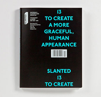
For about two years, I’ve been wanting to write a short piece about current typeface design in France. Of course, writing about the type design output of just about any country with a rich typographic history is a much larger undertaking; something more book like, e.g., Jan Middendorp’s Dutch Type (2004) or the ATypI + Adpf book Lettres Françaises (1998). But, Flo and Julia from the Slanted editorial board humored me this past January. In the newest issue of Slanted, readers may find my brief text, “Some new sans serif typefaces from France.”
For the article, I selected nine typefaces that I think are selective enough of what French type designers are drawing in terms of sans serifs today. Most of the faces are humanist sans serifs; in fact, Slanted #13 is wholly dedicated to this genre.
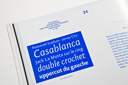
The typefaces I included are:
- Ardoise, by Jean François Porchez
- Achemine, by Bruno Bernard
- FF Yoga Sans, by Xavier Dupré
- Panorama, by Jean-Baptiste Levée (unpublished)
- Ficus Sans, by Malou Verlomme (unpublished)
- Capucine, by Alice Savoie
- Malaussène Sans, by Laure Afchain (unpublished)
- Grotesque 6, by Émilie Rigaud
- Cassius Sans, by Mathieu Réguer (unpublished)
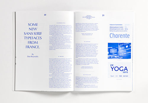
In an interesting twist, Slanted’s designers opted to set the article in Optima nova, from Hermann Zapf and Akira Kobayashi, rather than in one of these nine typefaces (or Aeris, Antique Olive, Parisine, Frutiger, Univers, etc., which are also mentioned in the text).
It is quite easy to find copies of Slanted in Germany now; the magazine seems to be sold almost everywhere. International readers may best be served by Amazon. Slanted is a German-language publication, but many of the articles—including my own—are printed in English.
General information
The following is Slanted’s press text about Issue 13 (slightly edited by me for publication here):
Slanted #13—Grotesk 1 (To Create A More Graceful, Human Appearance)—deals with both contemporary and historic humanist sans serif typefaces. Their origin goes back to the letters for the signage system of London Underground, from the early 20th century in England, and to Gill Sans typeface that them. Depending on the cultural sphere or classification, this genre may be referred to as humanist sans, lineal humanist, semi-grotesk, younger grotesk, lineal sans-serif typefaces with dynamic form principle, etc. With great pleasure, we present a large number of corresponding and related sans serif typeface design in the issue, as well as illustration and other design projects. Especially worth reading are the photo stories »Heterotopien«, by Karsten Kronas (Bielefeld); “A Marriage With God,” by Anusha S. Yadav (London); and “Power To The People,” by Christian Minke (Hüttenberg), who was recently in Egypt during its revolution. The type essays by Flo Gaertner (Karlsruhe), Alexander Negrelli (Berlin), and Dan Reynolds (Berlin) deal with humanist sans typefaces. A number of interviews are published, too, including those with Erik Kessels (Amsterdam), Jonathan Barnbrook (London), Don Karl aka Stone (Berlin) & Pascal Zoghbi (Beirut), Christian Minke (Hüttenberg), Eiko Nagase (Tokyo), and Yamaguchi (Tokyo). Last but not least, Slanted #13 includes the third part of the Tokyo Report series by Ian Lynam, and a musical travelogue by Frank Wiedemann (Berlin).
Slanted #13 and #14 are conceived as a double-issue, featuring the wide field of sans serif fonts. Issue #14 (to be published in June 2011) will explore newer typeface-concepts in the tradition of American, neo-grotesk, or geometric sans serifs.
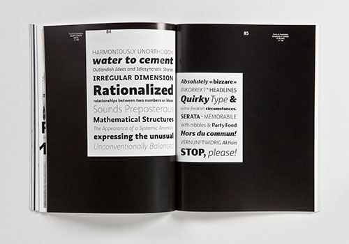
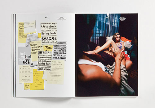
Type specimens for Mark Caneso’s Ratio, and Emanuela Conidi’s FS Blake. Two of 12 humanist sans serif typefaces featured in this issue.
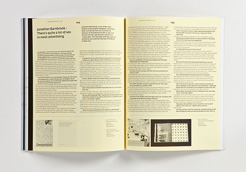
Lars Harmsen’s interview with Jonathan Barnbrook. One of seven interviews in this issue.
Purchasing information
Slanted Magazine #13
Grotesk 1
Spring 2011
148 pages
Order at slanted.de